


Workout Wednesday Week 13, 2026
 Meagan Longoria
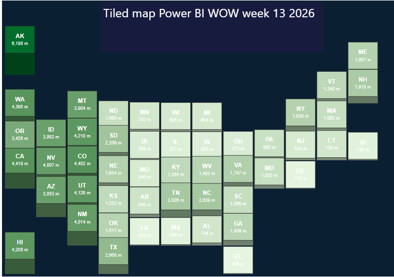
This workout Wednesday took me around 7+ hours to do, as I had to plan out steps of cleaning, chart planning and learning a new tool. While Power BI's standard visuals can handle a lot, this exercise required a much more customized visual, a grid-style map of the United States where each state was positioned manually and its height and color represented a value in meters.
This made the exercise a great opportunity to learn Deneb, a custom Power BI visual that allows you to create highly customized charts using native languages Vega and Vega-Lite.
Preparing and Cleaning the Data
(you can skip this if you decided to copy and paste the data from the exercise instead of extracting it)
Before getting into Deneb, the first challenge was getting the data into the right structure. The data was extracted from a pdf and then put into a table (using Power BI's native extraction when you upload a data source). Here's how the initial data looked:
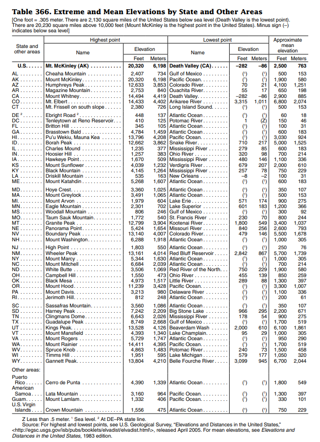
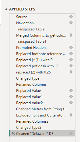
The original dataset needed some reshaping before it could be used effectively in Power BI. This involved using Power Query to clean and transform the data, including pivoting and unpivoting fields so that the information was stored in a format that Power BI could analyze properly.
The goal was to reach a structure where each state had its own record, with the relevant measurement associated with it.Tools generally work much better with data in a long or tabular format, rather than having individual categories spread across multiple columns. Restructuring the data meant that the same fields could then be referenced consistently within the visual.
Here were the applied steps:
The data went from (post-extraction)
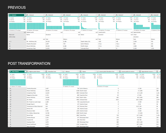
Once the main dataset was cleaned, I still needed a way of telling Power BI where each state should appear on the grid.
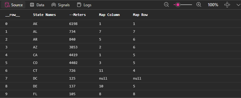
To do this, I created Map Row and Map Column fields. These assigned each state a specific X and Y position. I used DAX SWITCH calculations to manually assign the appropriate coordinates to each of the 50 states.
For example, instead of relying on geographical latitude and longitude, a state might simply be assigned:
Map Column = 5
Map Row = 3
These coordinates could then be passed into Deneb and used as the X and Y positions of each state tile.
Here's what the table should look like:
What is Deneb and Why Was It Useful?
Deneb is a custom visual for Power BI that allows users to build highly customized visualizations using Vega and Vega-Lite specifications.
Instead of relying entirely on Power BI’s standard Visualizations and Format panes, Deneb gives you much more direct control over how the data is displayed.
A useful comparison is to think of it a little like the difference between using a website builder and writing CSS yourself. Power BI’s native visuals give you a set of predefined charts and formatting options, whereas Deneb allows you to describe much more precisely how each part of the visual should appear.
It is not actually CSS, however. Deneb uses Vega and Vega-Lite, which are JSON-based visualization languages. They allow you to define things such as:
- X and Y positions
- Shapes and sizes
- Colors
- Text and labels
- Tooltips
- Calculated values
- Filters
- Multiple visual layers
After bringing my Power BI fields into Deneb, I could use Map Column to control the horizontal position of each state and Map Row to control its vertical position. State Names were used for the labels, while the Meters field controlled how the data itself was represented.
One of the biggest advantages of Vega-Lite was the ability to build the visual using multiple layers. The first layer created the main square tiles representing each state. The color of each tile was driven by the meter value, allowing differences between states to be seen immediately.
I then added another rectangular layer underneath each tile to create a depth effect. The meter value was used to calculate how far this section extended below the main tile, creating an almost three-dimensional or extruded appearance.
Additional text layers were then added to display the state abbreviation and the corresponding meter value directly on each tile.
This is where Deneb became particularly useful. Creating a visual with custom positioning, separate rectangles, calculated heights, dynamic colors, labels and multiple layers would be difficult using Power BI’s native visuals alone.
Deneb therefore gave me a way to use Power BI for the underlying data model and interactivity, while using Vega-Lite to control exactly how the final visual was drawn.
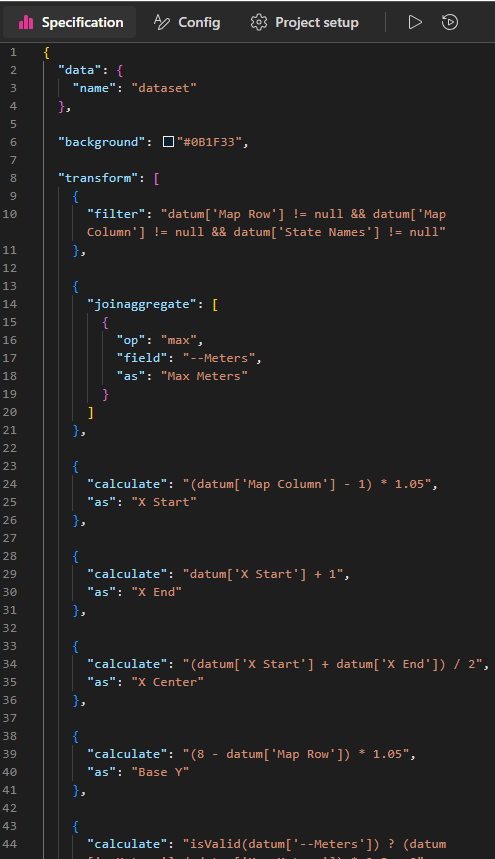
Here are the first 44 of 273 lines of Vega-lite
What I Learned
This exercise helped me understand that Deneb is especially useful when you need further control of your visualization.
With this exercise there was definitely more setup involved. The data needed to be cleaned and reshaped first, the states needed their own grid coordinates, and I had to become familiar with the structure of Vega-Lite specifications.
However, the trade-off was a much greater level of control over the final visual.
OUTPUT:
Feel free to email me with any questions with this exercise!
dev.bhatnagar@theinformationlab.com