So your charts are built, and now you need to arrange them on to your dashboard. You have a vision for the layout, but getting each chart positioned and sized the way you want can be challenging. Then you open the item hierarchy and find a confounding maze of nested containers hiding your sheets. We’ve all been there. Thankfully, there’s a specific way to use containers that makes dashboard design much easier and can even be saved as a reusable layout template for future projects. In this post, I’ll walk you through building one.
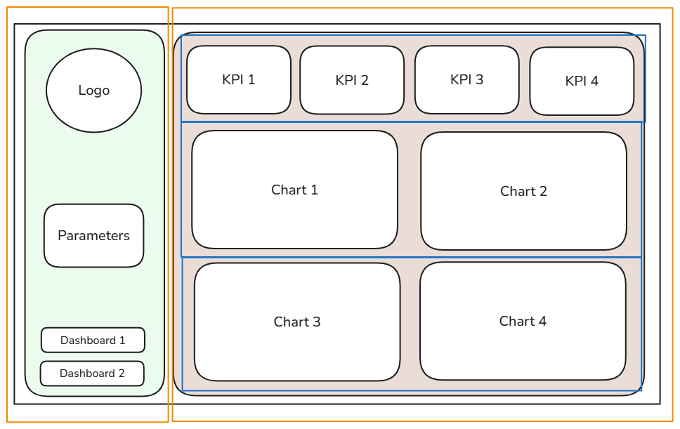
Before you open Tableau, sketch your dashboard layout by hand or in the software of your choice (I used Excalidraw, which is free and easy to use). A dashboard sketch makes the process of arranging containers in Tableau much easier and keeps your build focused.
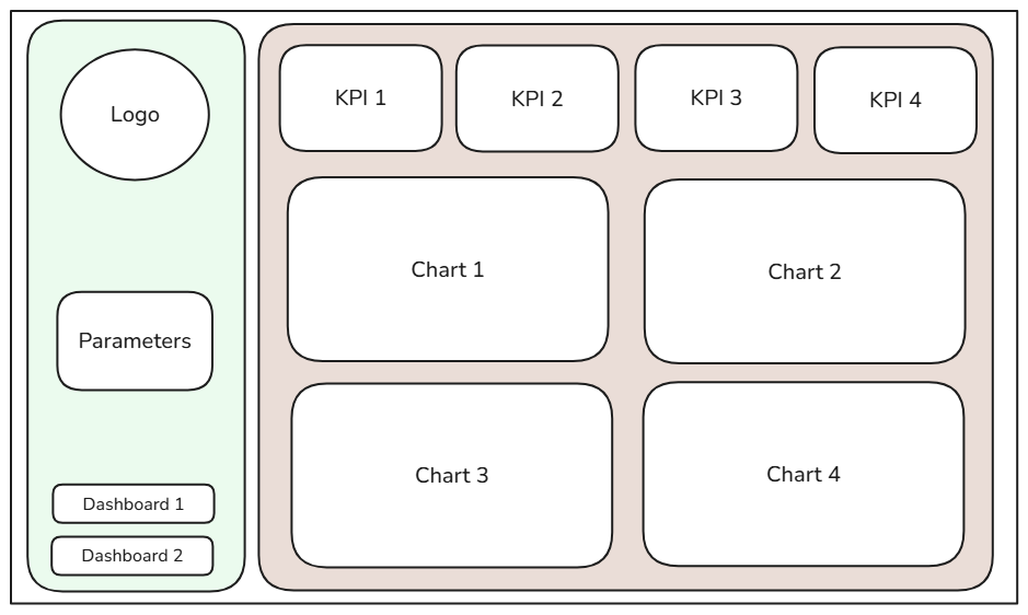
Set your sketch aside, open your Tableau workbook, and create a new dashboard. Before dragging in any sheets, we’ll build the container layout first. This is crucial, because if you drag sheets in directly, Tableau auto-generates a container labeled ‘Tiled’ in your hierarchy.
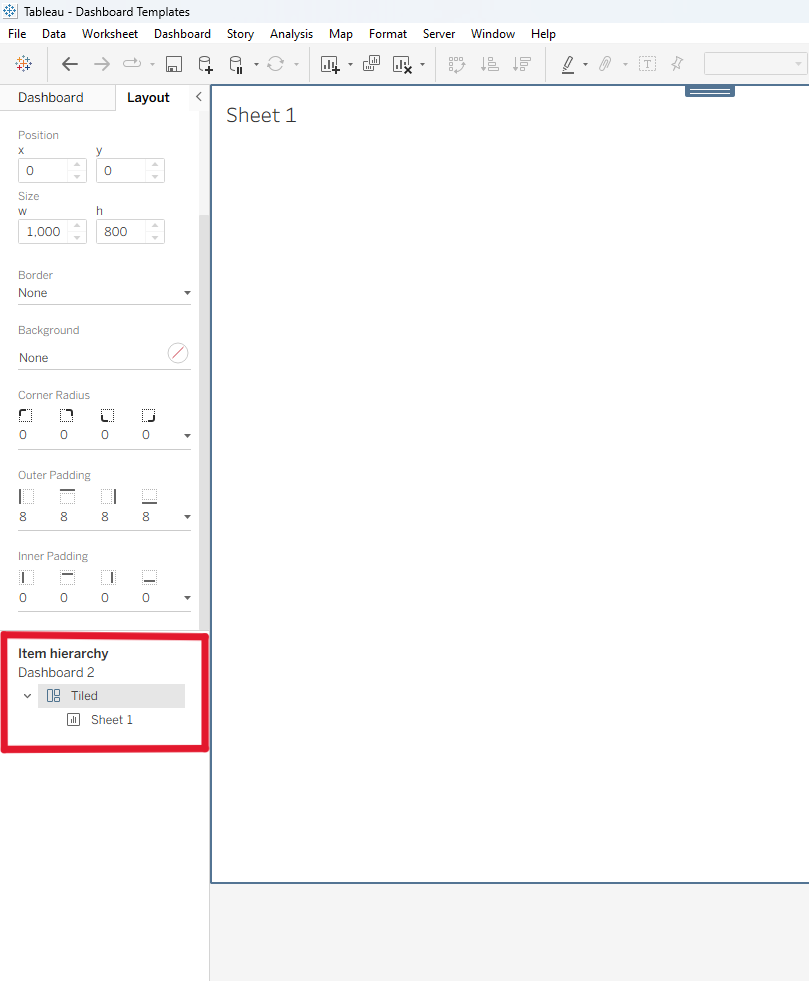
These auto-generated containers are difficult to edit, and because Tableau creates one every time you add a sheet, they’re often the culprit when your sheets won’t move where you want. To avoid this, we’ll place our own containers before adding any sheets.
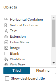
In the Objects panel, you’ll find Horizontal and Vertical Containers, the building blocks of our layout. Horizontal Containers arrange items side by side, while Vertical Containers stack them top to bottom. Keep this in mind as you build. You can also choose whether to add objects as Tiled or Floating. Apart from our outermost container, always choose Tiled, since it keeps your dashboard aligned.
We’ll start with a trick: an outer Master Container that will house all our other containers and objects. Look at your sketch. At the outermost level, is your content arranged side by side or top to bottom? In my sketch, it’s side by side, with the navigation panel on the left and the main body on the right.
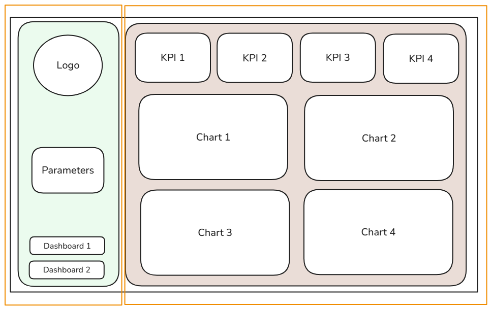
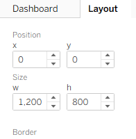
Because of this, I’ll use a Horizontal Container as my Master Container. For this container only, select Floating and drag it onto the canvas. In the Layout panel, set its position to x: 0, y: 0 and its size to match your dashboard’s dimensions so it covers the entire dashboard.
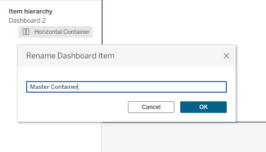
Then rename it Master Container in the Item Hierarchy by right clicking on it.
With the foundation in place, we can build the rest of the layout inside it. As a general rule of thumb, alternate container types as you nest them. In my example, the Horizontal Master Container holds two Vertical Containers side by side: one for the navigation panel and one for the KPIs and charts.
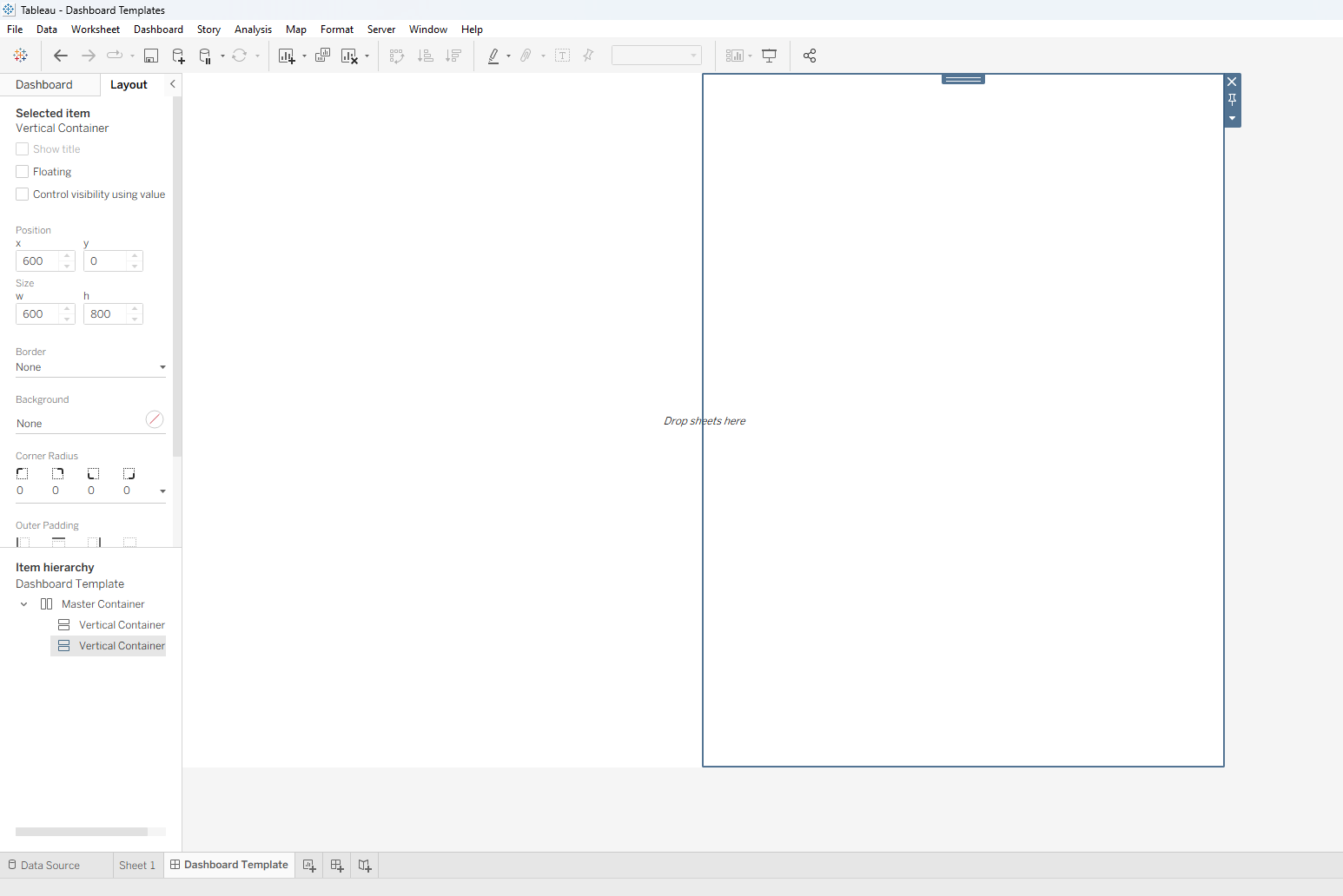
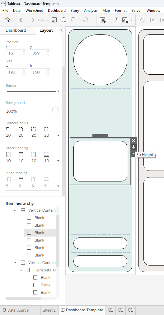
In the Layout panel, you can color a container’s background, round its corners, add a border, and set outer and inner padding. To resize a container, either drag its edges or right-click it and select Edit Width.
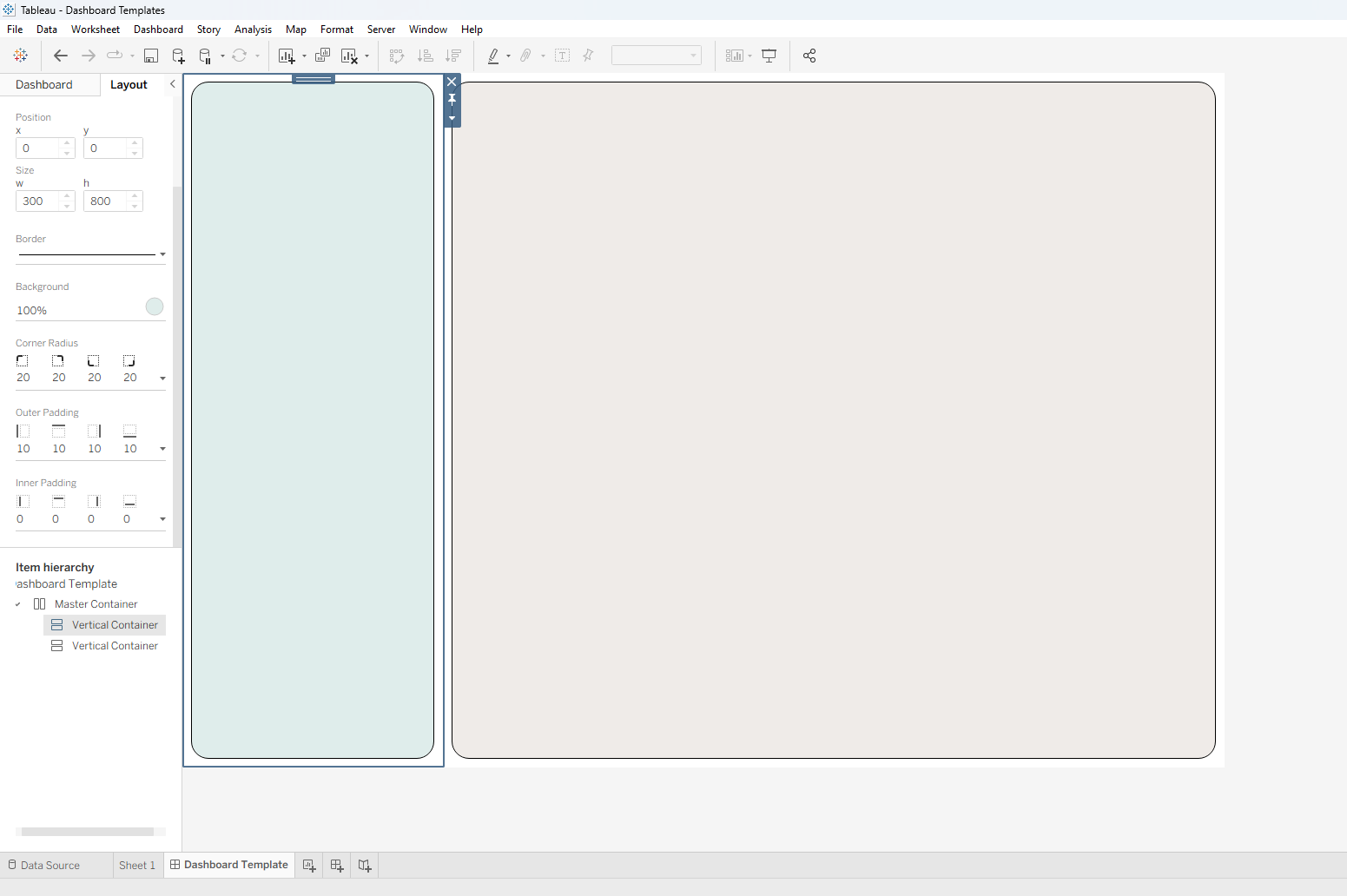
Warning: when you resize by dragging, Tableau may show suggested guides. If you snap to one and release, it will auto-generate one of those Tiled containers, so avoid snapping to them.

Our navigation panel container is ready as is, as we’re only stacking items vertically in this design, and we’re already using a Vertical Container. The main body, however, needs both vertical and horizontal arrangements.
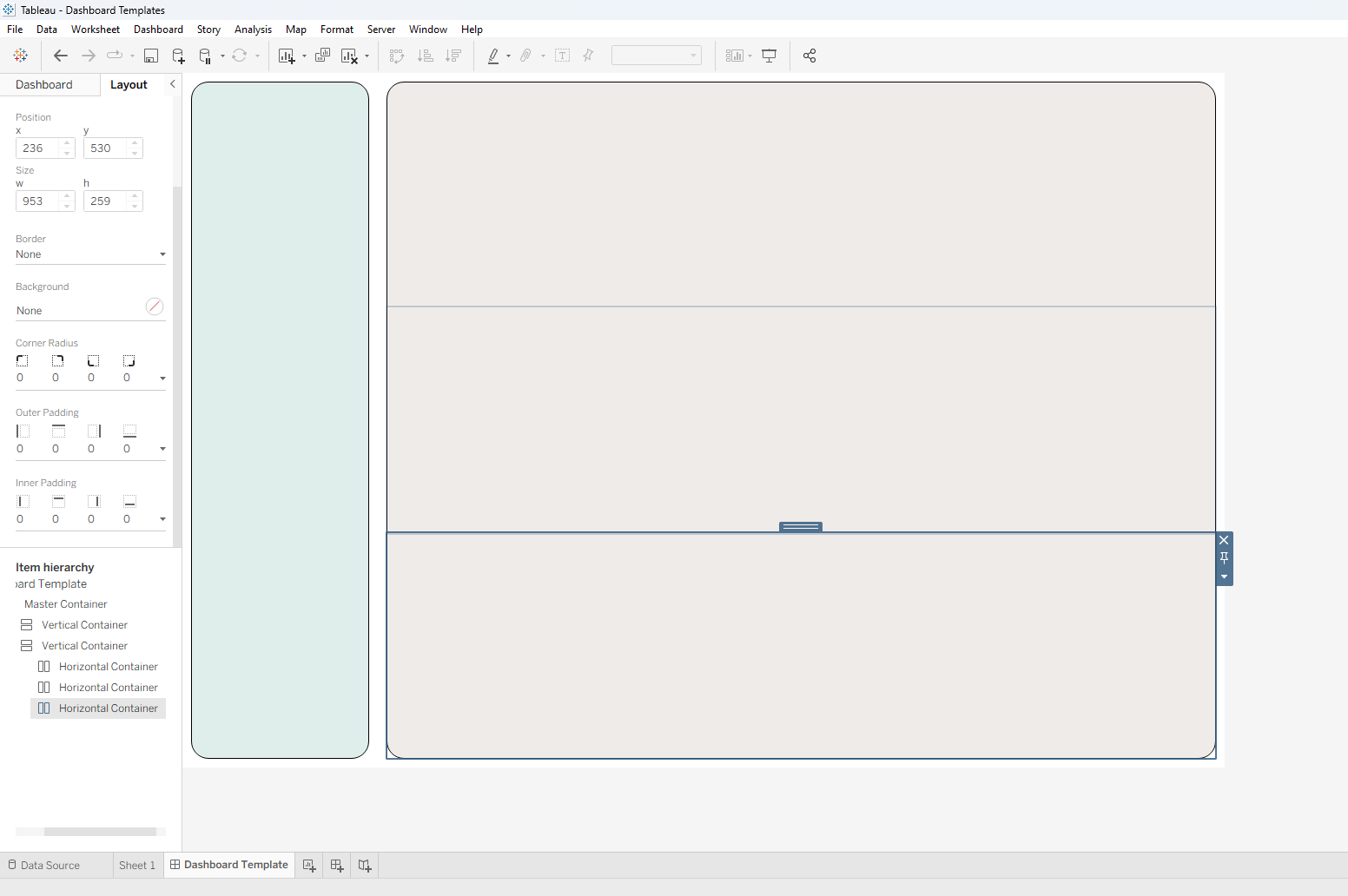
Since the body is a Vertical Container, we’ll add three Horizontal Containers inside it to create three rows for our sheets.
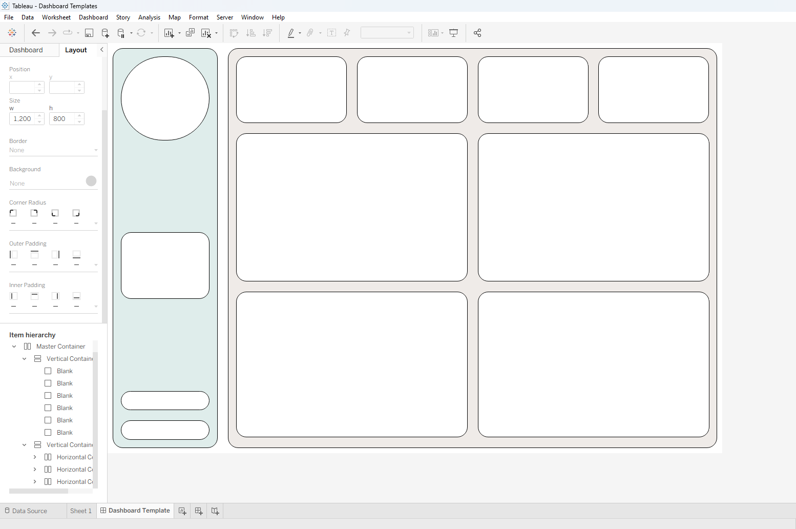
Now we’re ready to add and arrange sheets! For this example, and for any template you build before your sheets exist, you can use the Blank object as a placeholder. I’ll start by adding four Blanks to my top row to represent my KPIs.
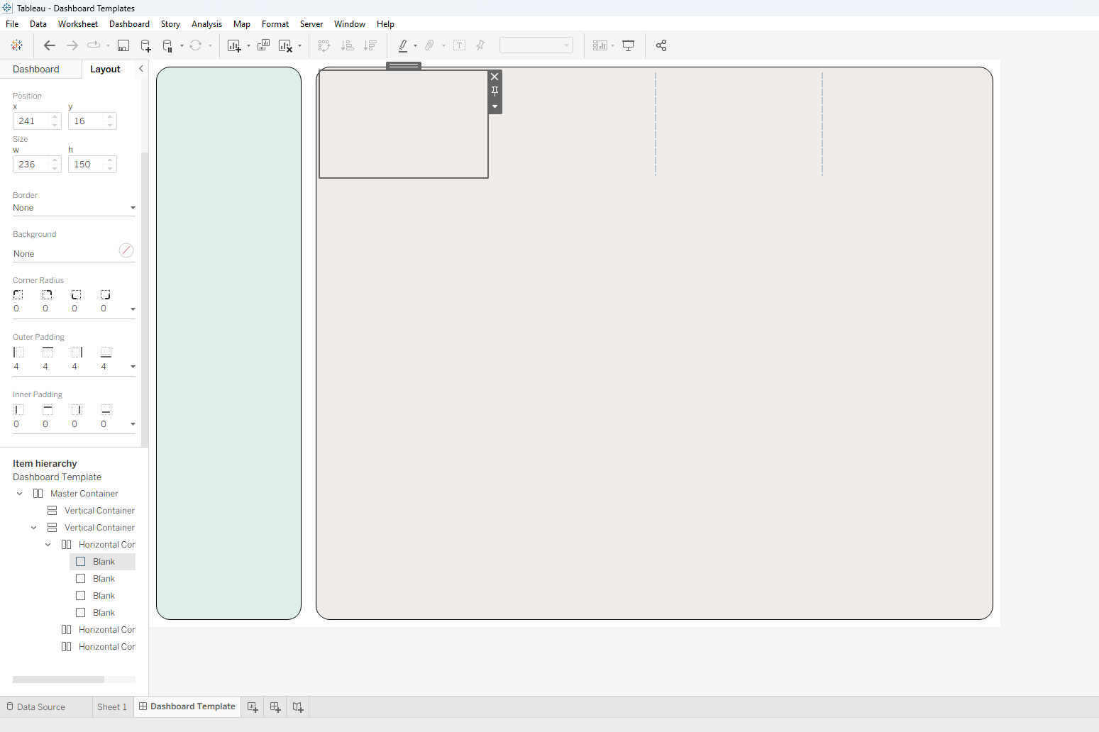
Then I’ll use the Layout panel to adjust the background, corners, borders, and padding. We can see in the Item Hierarchy that the Blanks sit within our containers.
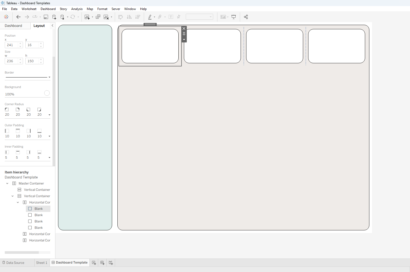
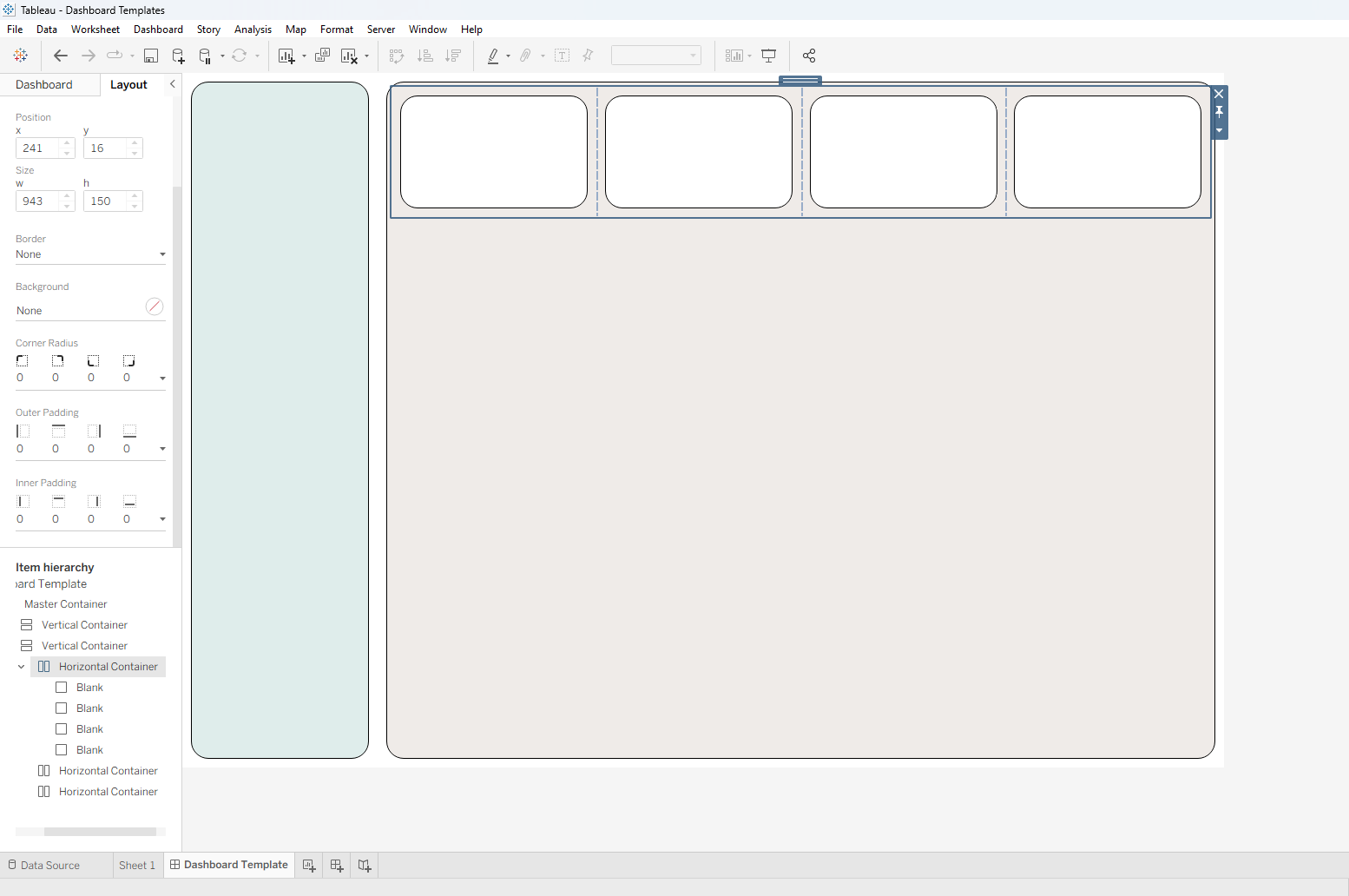
To change a container’s size or styling later, select the container itself (outlined in blue when selected) by either clicking on it in the Item Hierarchy, or by clicking any item inside it and then double-clicking the shaded box in the center.
Next, I’ll add sheets to the other two rows of the body. Adding a sheet can sometimes compress the container and leave empty space in the outer container.
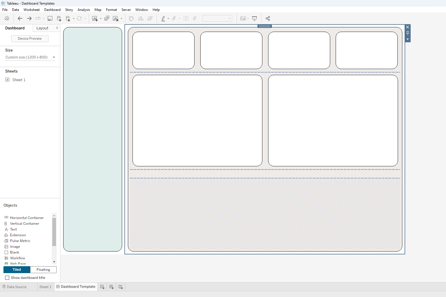
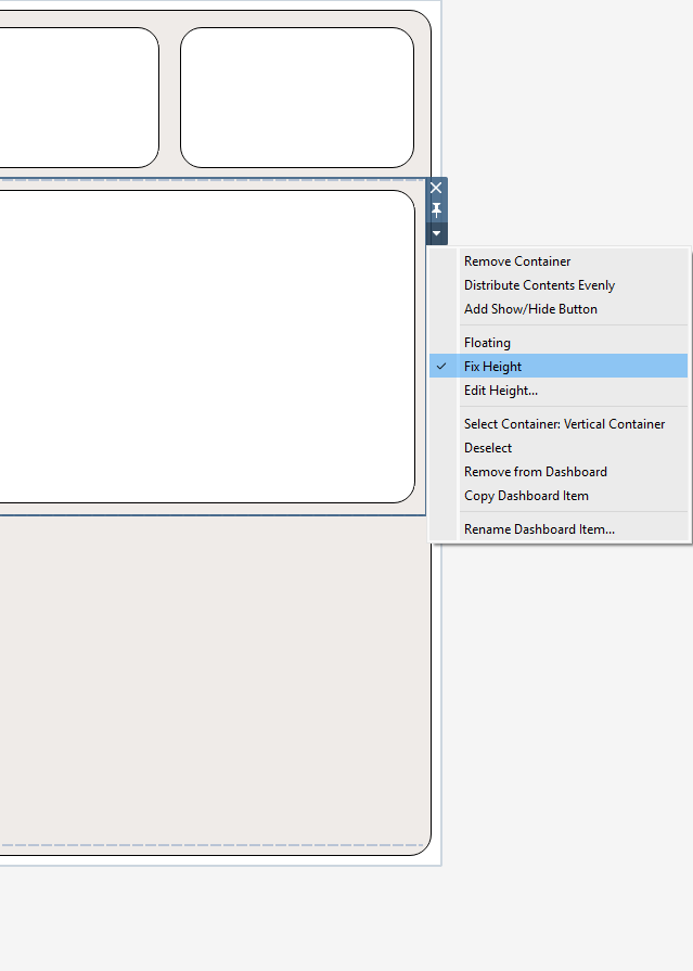
You can either resize it manually, as before, or right-click the empty space (marked by hatched blue lines) and select Distribute Contents Evenly to give every item in that container equal size. You can also lock an object’s size by selecting Fix Height or Fix Width.
Now let’s finish the navigation panel. My sketch has four objects (logo, parameters, and toggles for Dashboards 1 and 2) separated by two significant gaps. For the template, I’ll stack six Blanks vertically: four to stand in for the objects and two to act as the gaps.
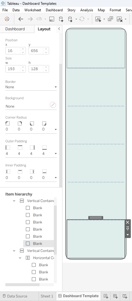
Then I’ll place my items and adjust the sizing of both the items and the gaps.
One final step: once your layout is done, double-check your Item Hierarchy for auto-generated containers. Legends, parameters, and filters attached to a sheet can sometimes cause them to appear. If you see one, delete it and re-add the legend, parameter, or filter to one of your own containers.
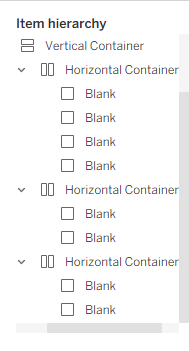
And with that, our layout is done! Now you can place your sheets with ease, or save this as a template for the next time a deadline is looming.