Before Tableau introduced map layers, using dual-axis maps was a common workaround to simulate a multi-layered effect and combining diverse information in one view. However, this method was limited to only two layers. With the introduction of map layering in Tableau, visualizations are not restricted. Now, you can overlay multiple types of information like demographics, geographic boundaries and sales data, on one single map. This fearure allows for deeper analysis and better decision making. In this guide, I’ll walk you through the steps to create map layers in Tableau.
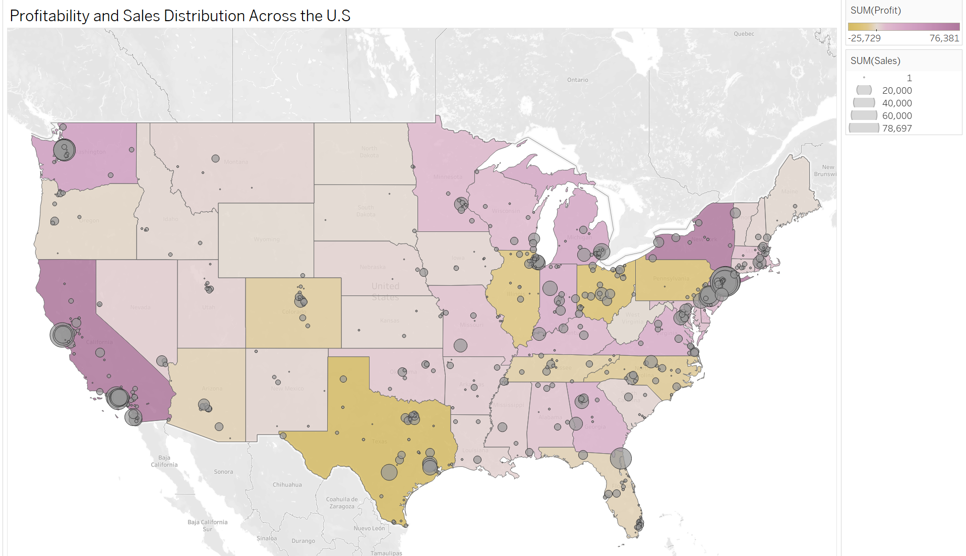
I chose a simply example: visualizing the USA map with two layers.
Layer 1: states colored by profit
Layer 2: postal codes sized according to sales
1) Let's start with layer 1:
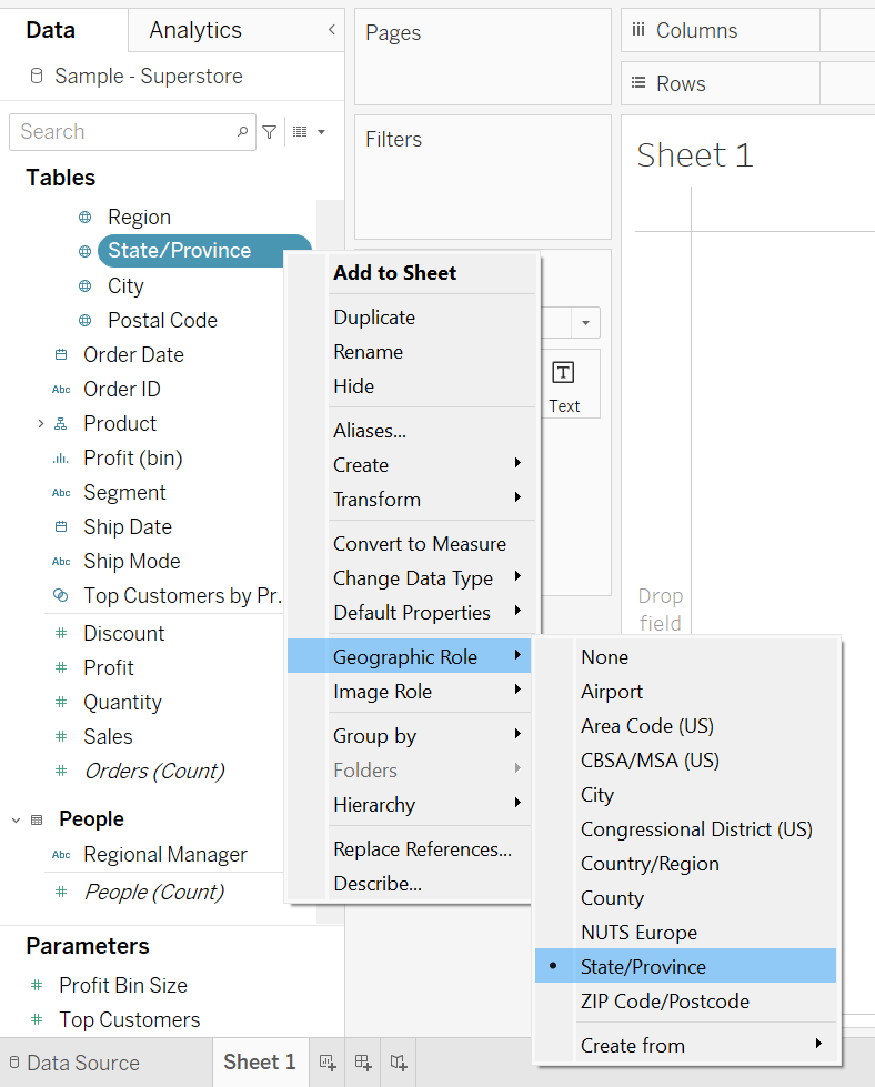
Make sure you have spatial data to visualize a map. In this example I use the superstore data. The state field has a globe symbol and the correct geographic role as state. All good so far.
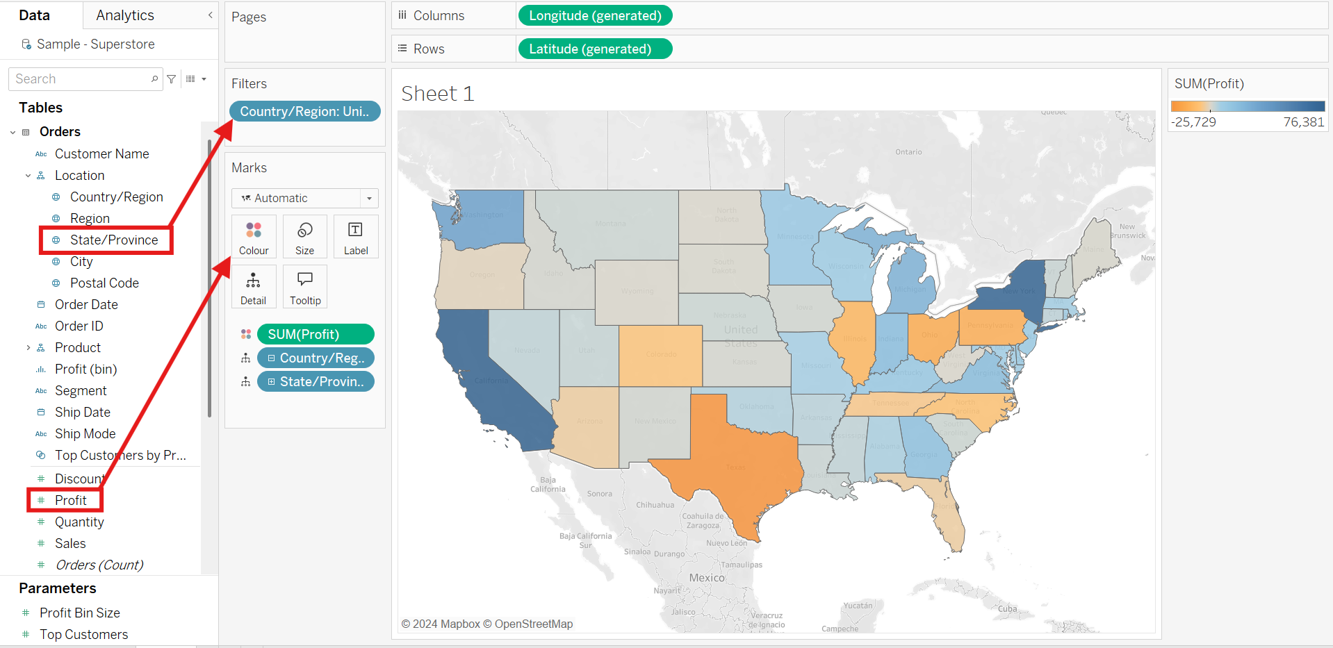
Double click "State/Province" field and drag "Profit" into the newly created marks card on color. In addition, you can use a filter to only show the US states, excluding the Canada states that are included in the data.
2) Now we can add layer 2:
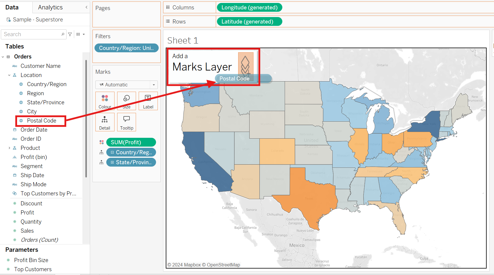
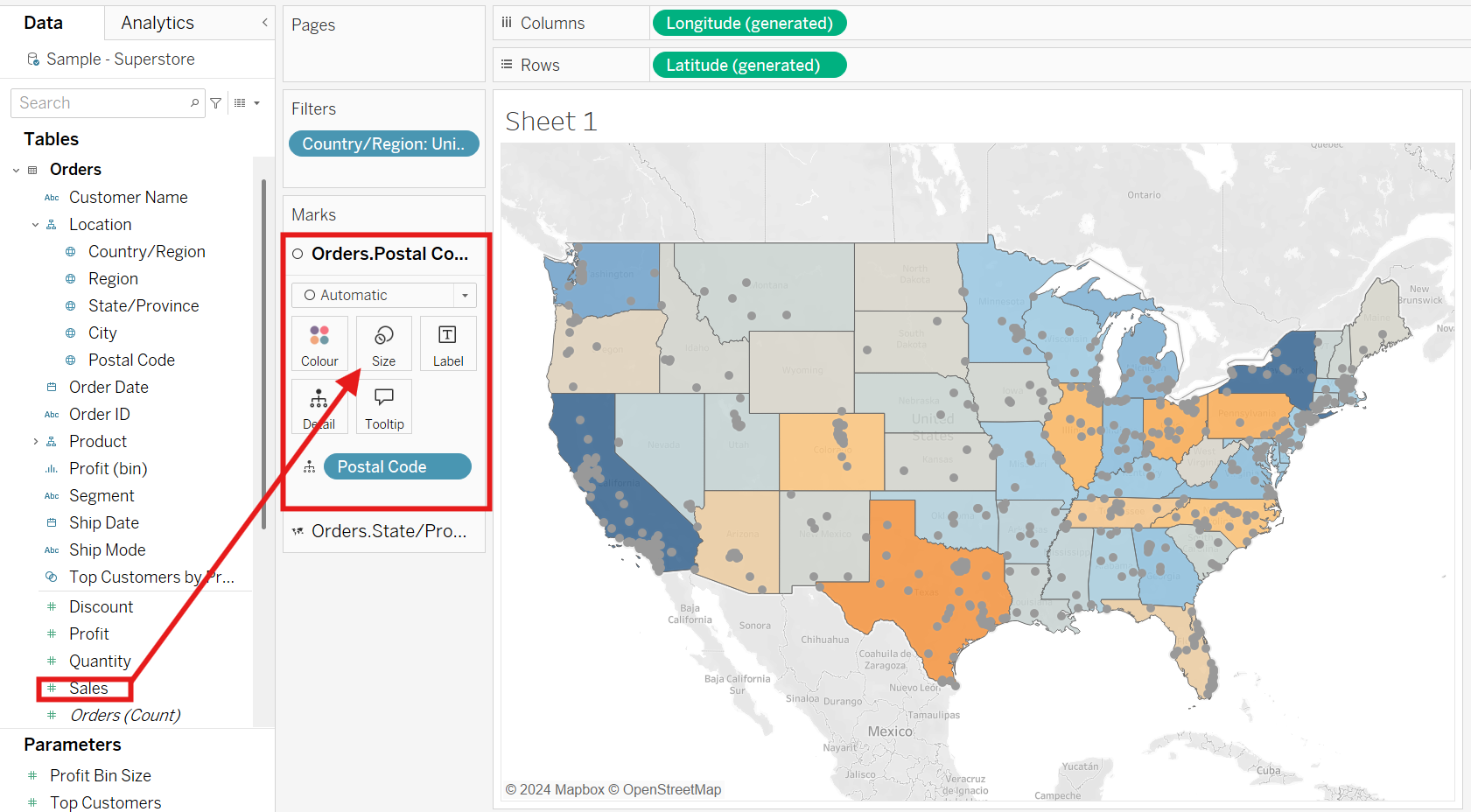
Don't blink, since the magic starts now. Drag postal code into the canvas and hold, you will see a small box called "Add a Marks Layer" pop up, drag your field into it, it's that easy! Last step is to drag Sales onto the size card of the newly created layer and you have postal codes sized according to their sales!
3) Format Marks Card
Each new map layer in Tableau comes with its own marks card, allowing you to customize each layer. In this example, I changed the color of the states and adjusted the transparency of the postal code circles while increasing the size for better visibility. Now you can see which states are highly profitable and, within those states, where the highest sales volumes occur. This direct layering helps identify if high sales correlate with high profit areas or if some states with high sales volumes are actually less profitable.
Conclusion
In conclusion using map layers reveal patterns and correlations that might be missed if you build separate maps. It is possible to create as many layers as you want but performance will start to lag as you add more complexity to the visualization. In addition too many layers can lead to visual clutter, making it difficult to read the key information of the visualisation. As solution you can use transparency, different colors and stacking order of the marks cards to reduce clutter and make each layer visually distinct. Try it out!
