Jitter plots are a powerful tool for identifying outliers, especially when analyzing data with overlapping points. By spreading data points slightly, jittering helps reveal hidden clusters and stand-out values that usually go unnoticed. In this tutorial, I will demonstrate how a jitter plot can be used to analyze customer complaint data and handling times, making it easier to spot unusual cases that need further attention.
I want to identify groups who take an unusually long time handling customer complaints and determine which types of complaints or sources contribute to these delays. This can lead to actionable insights, such as pinpointing groups who may need additional training or resources to manage their workload more effectively. But where do I begin? I have mock data from a fictional airline’s customer complaints. Simply visualizing complaint types and resolution times as circles won’t take us far. For the starting point of this analysis:
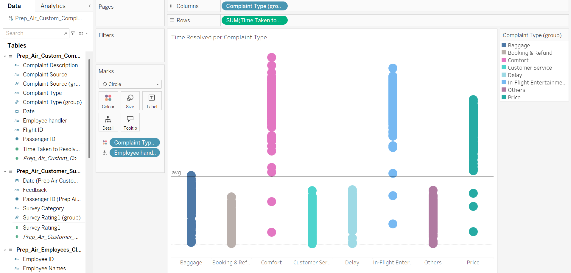
- drag Complaint type groups on columns
- drag Time Taken on rows
- drag an additional field on detail to split the single marks into multiples, in this case I chose employee ID
-optional: drag complaint type on colour

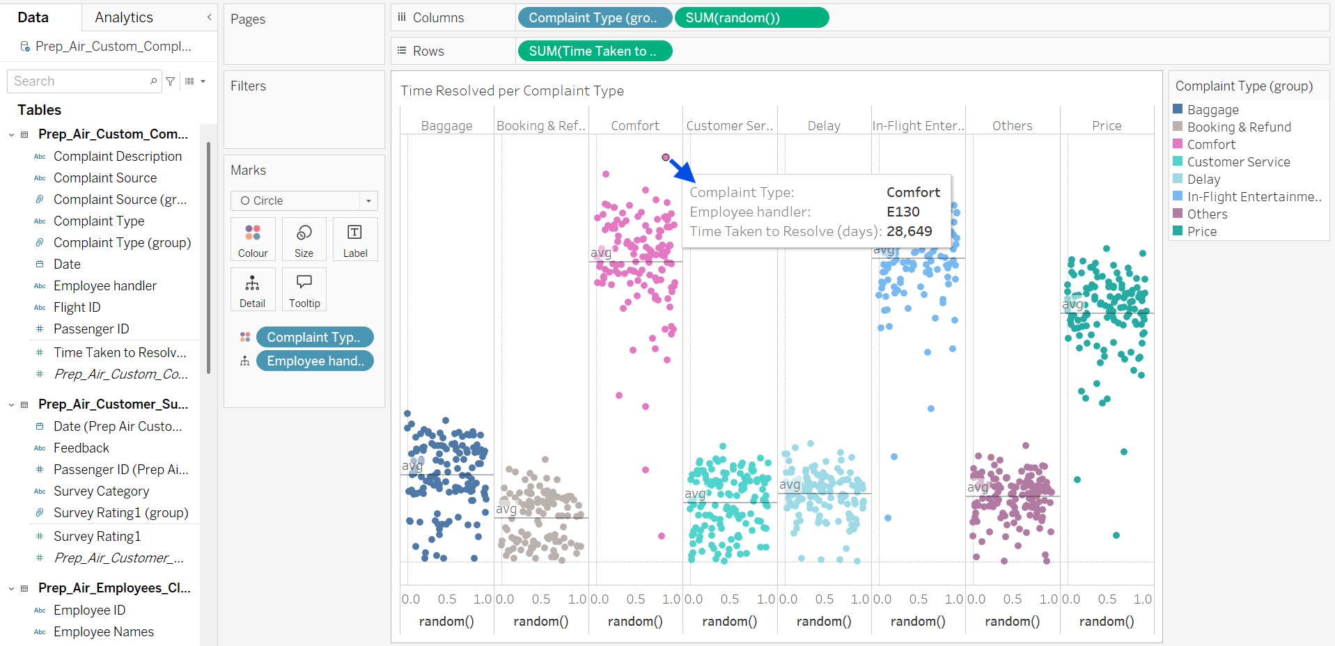
A lot of marks are overlapping and a simple adjustment of transparency is useless. In order to have a less cluttered view, you can spread the marks by creating a new field. Simply double click into the columns area and type random() and confirm with enter. This function asigns a random number between 0-1 for each row, click the random() pill and set it to dimension.

This looks already like a jitter plot but doesn't really help to find outliers yet. Looking at the tooltip of one mark reveals that we're lacking a higher level of granularity and details. So let's add some.

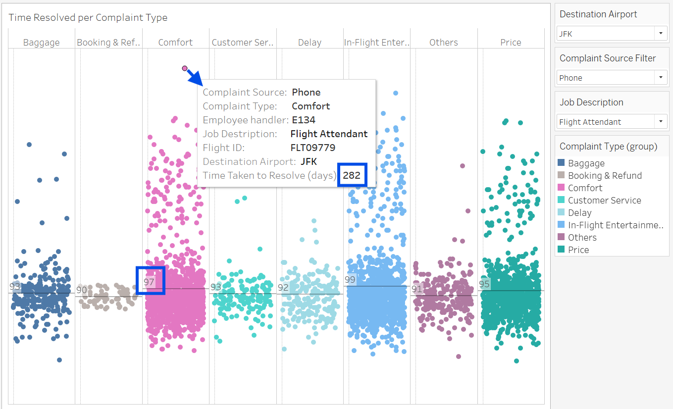
Adding filters like flight number and destination, job type, and complaint source helps you further break down the data, allowing you to compare not only the visual dots but also the time this person spent on the complaint relative to the average. This comparison can reveal insights and provide a starting point for deeper investigation. Of course, this chart alone doesn't tell the whole story, to fully understand what’s happening, you need to examine the data from all angles. It might not even be an outlier, so it’s essential not to jump to conclusions too quickly. Thorough analysis across different aspects is important to uncovering the true context and meaning behind the data.
Conclusion
Jitter plots are more than just visually appealing, they’re a valuable tool for uncovering outliers hidden in overlapping data.
(Also no fake employee was harmed during the making of this tutorial)
