Interactivity is part of what makes Tableau so great. The end user can select values for things like parameters, filters, and sets. If you've already learned about these, there are still things you can learn to make your dashboard even more interactive. Using parameter actions, you can allow users to change the value of parameters by interacting directly with a chart rather than with a separate parameter menu. Let's walk through a simple example using parameter actions to highlight a bar in a bar chart and to filter a line chart.
Setting up the Charts and Dashboard
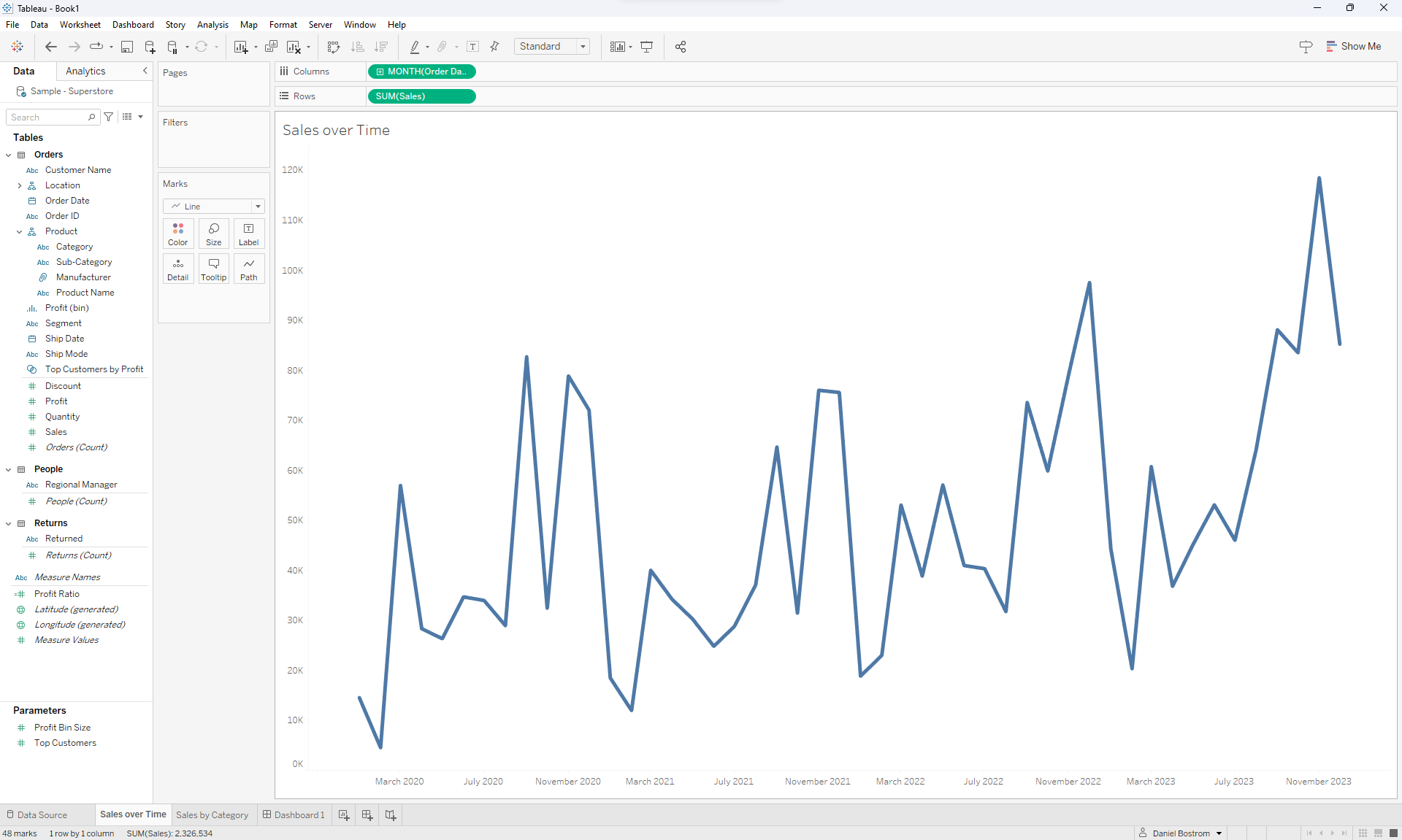
For this example, I'll be using Tableau's superstore dataset to make a simple dashboard. Let's start by making two basic charts. Here's my Sales Over Time chart:
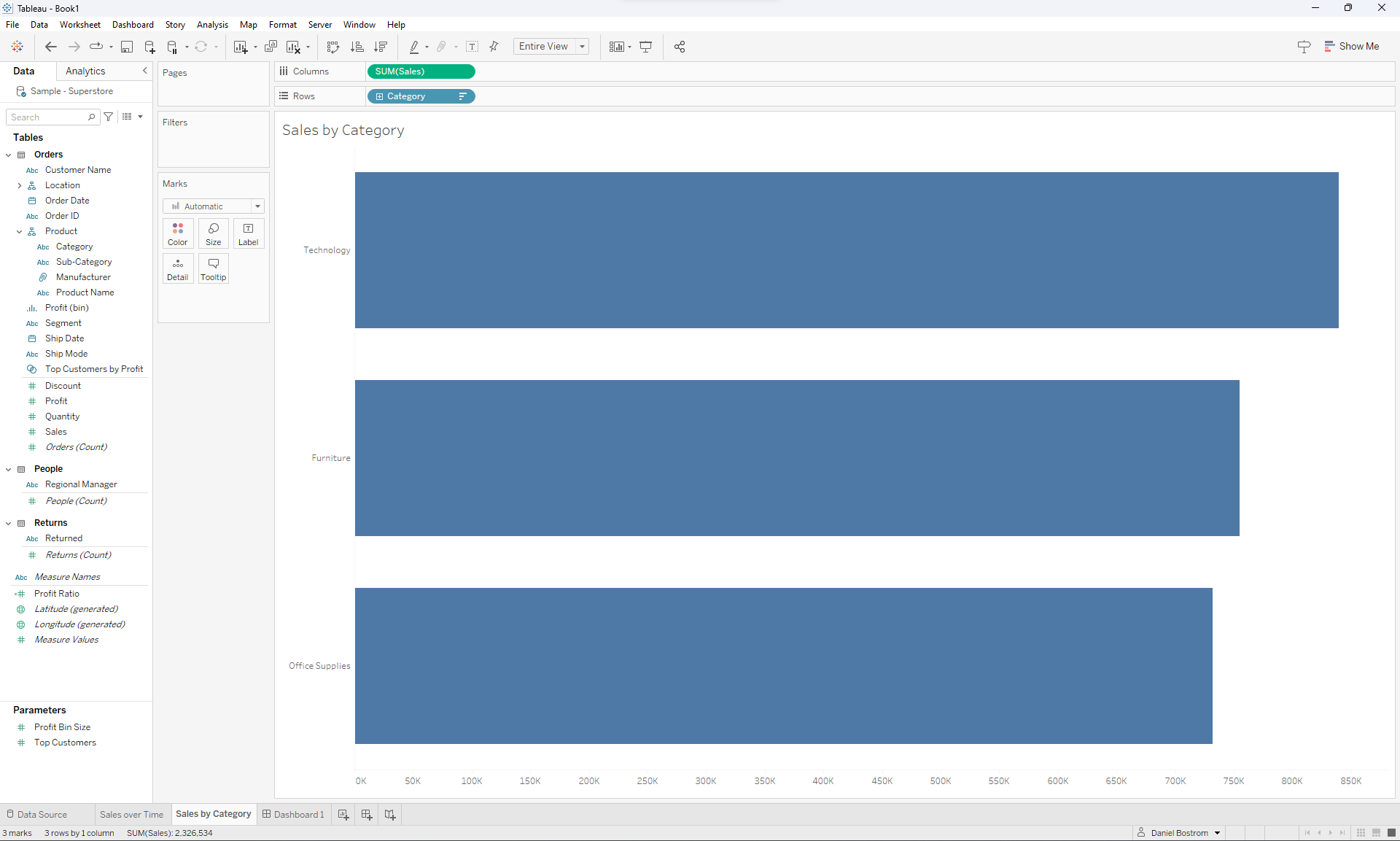
And here's my Sales by Category chart:
Now I'm going to create a parameter called Select Category. Depending on the category selected by the user, the line chart will filter to only include sales from that category. Here's how I created the parameter:
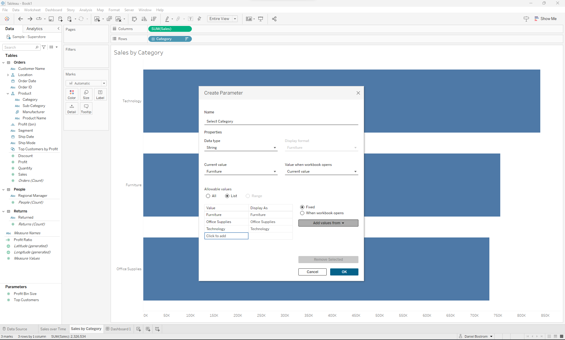
I changed the data type to String, chose List for the allowable values, and chose to add values from the Category field, which filled in Furniture, Office Supplies, and Technology as the choices for the parameter.
Next I'll have to create a calculated field that evaluates whether or not a record in the data is from the selected category. We can do that like this:
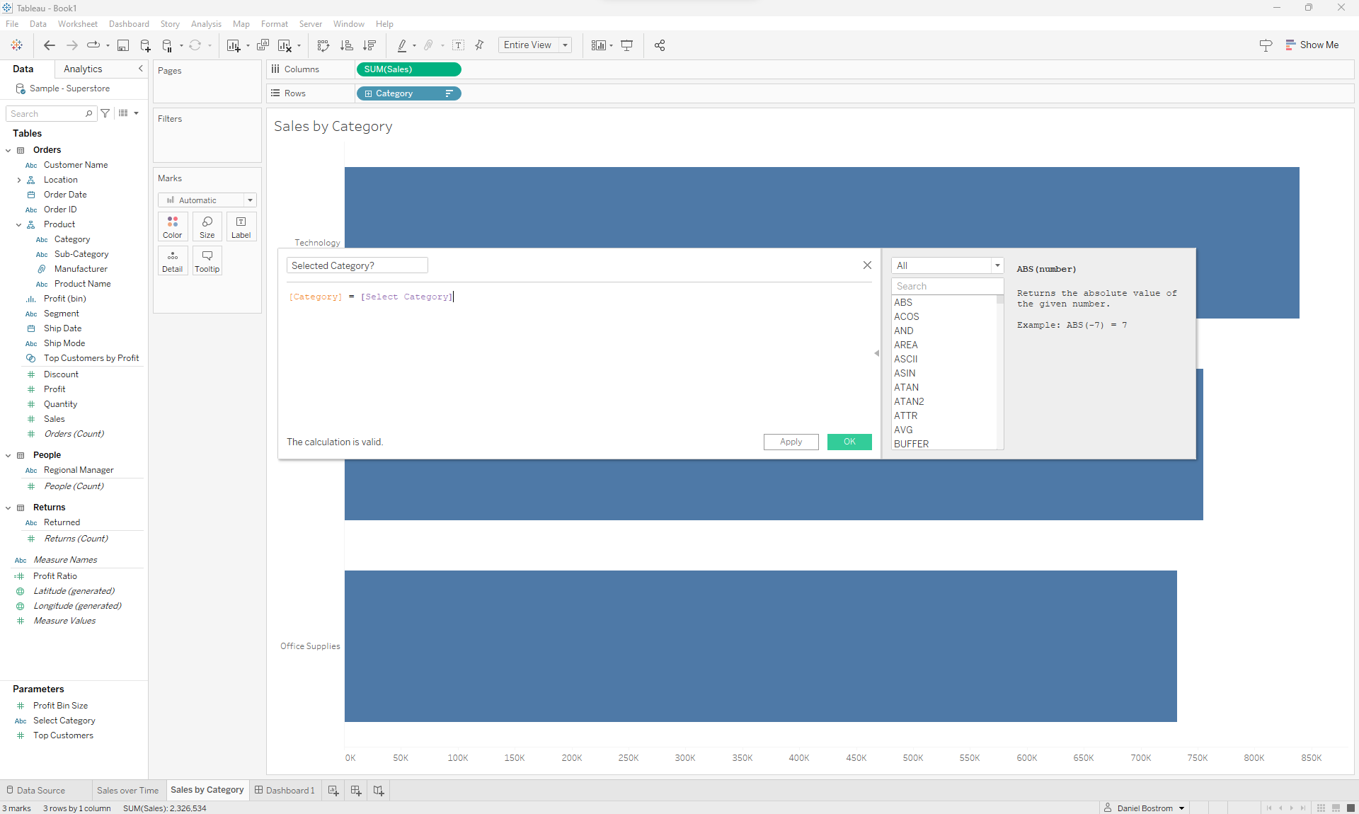
Each value in this field will be a boolean so I'll drag this to the Filters shelf of my line chart and select True in order to filter the line chart to only show the sales of that specific category over time.
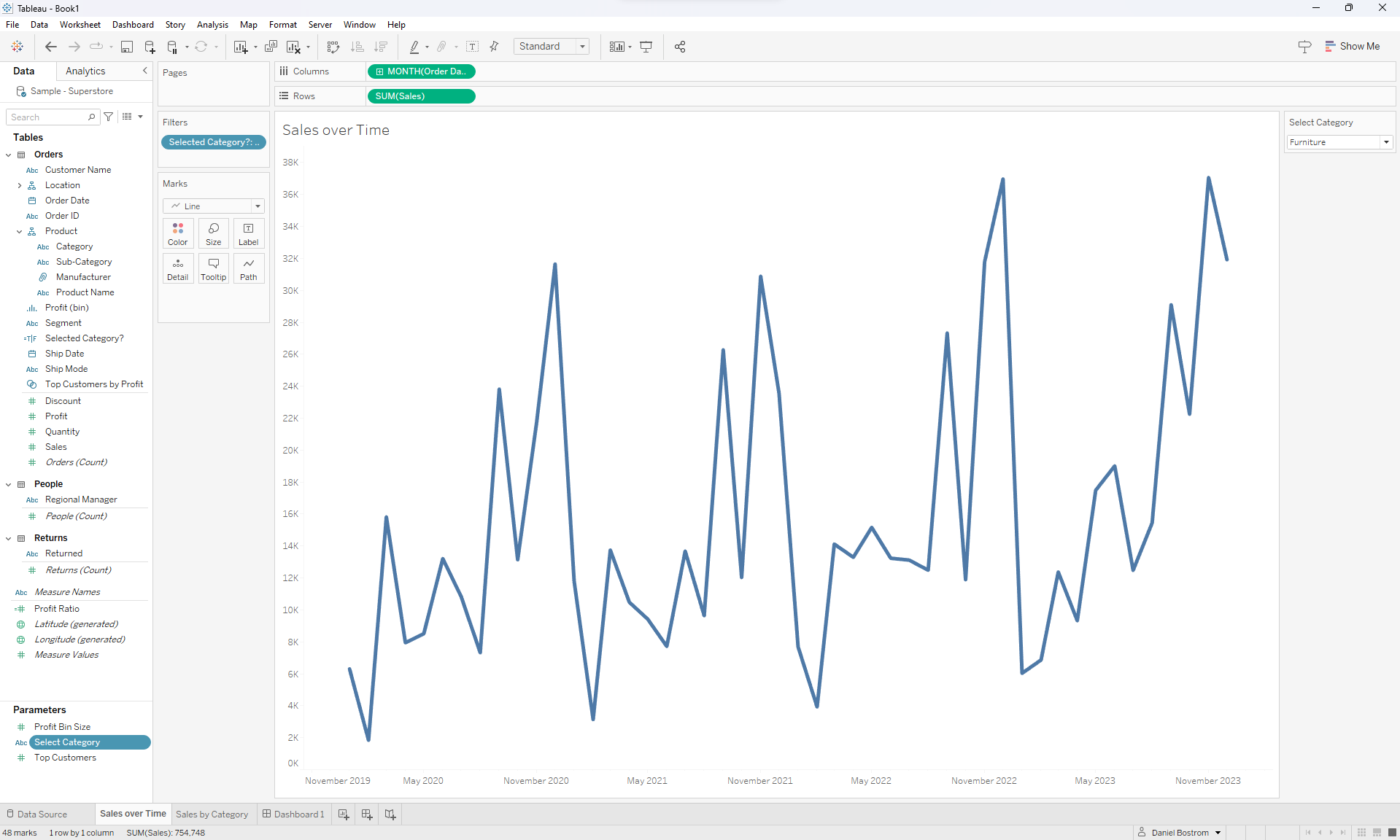
The line chart has changed to only show the sales of furniture (as you can see by the parameter that I displayed on the right side of the image).
Next I'll change the title of the chart to reflect this change by double clicking the title above the chart. This will allow me to edit the chart's title. Currently it's set to match the title of the sheet, which looks like this:
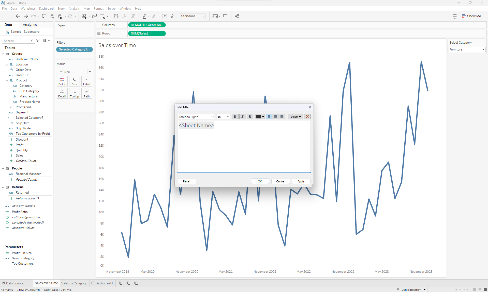
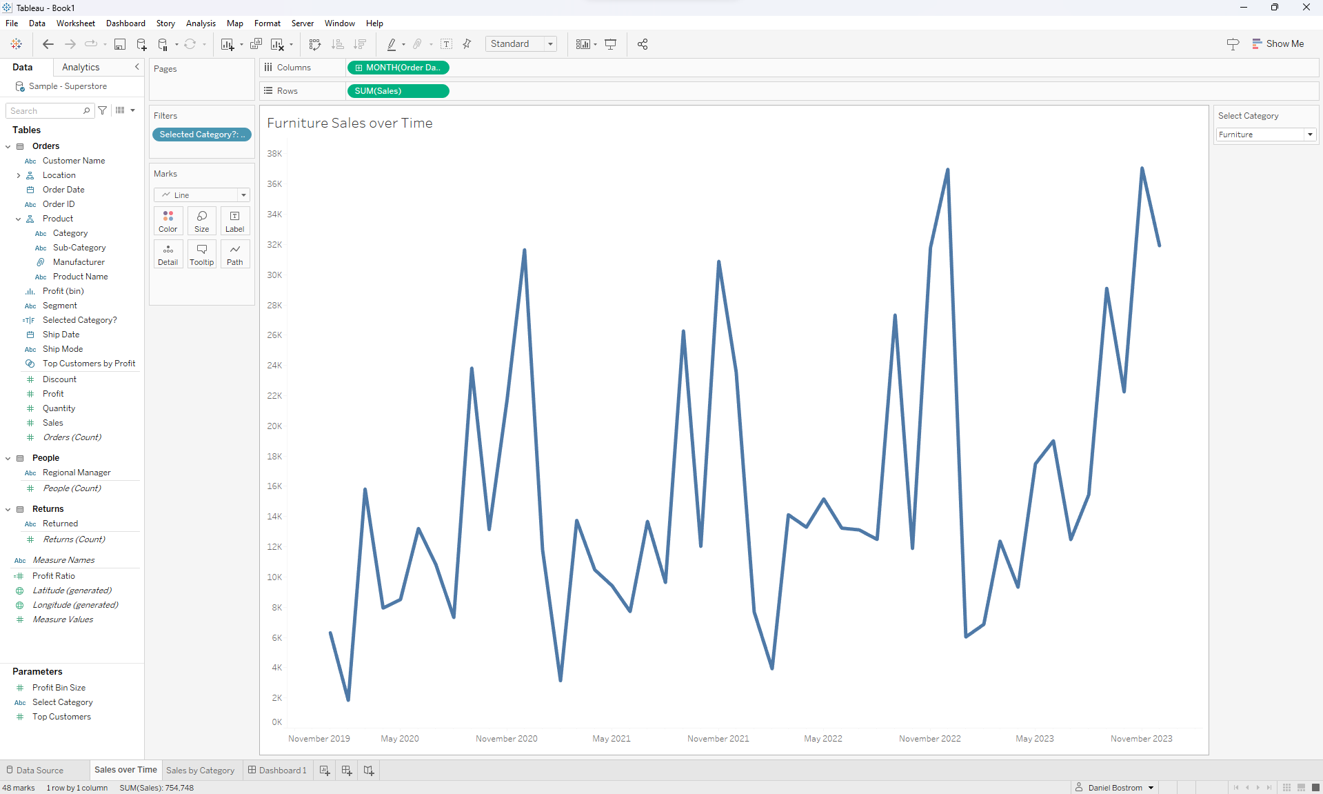
I'll click on Insert at the top right of the Edit Title window and choose the Select Category parameter. This will bring the parameter into my title, which I can move where I want it to be. Here's the final result:
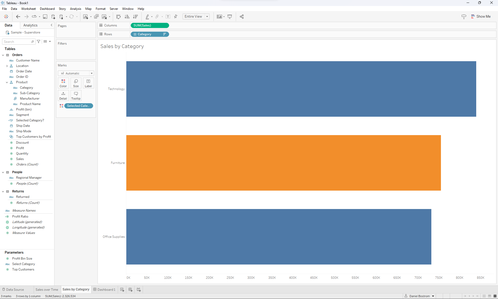
Next I'll drag the Selected Category? calculated field to the color shelf of my bar chart. The selected category will be highlighted in a different color, which will look like this:
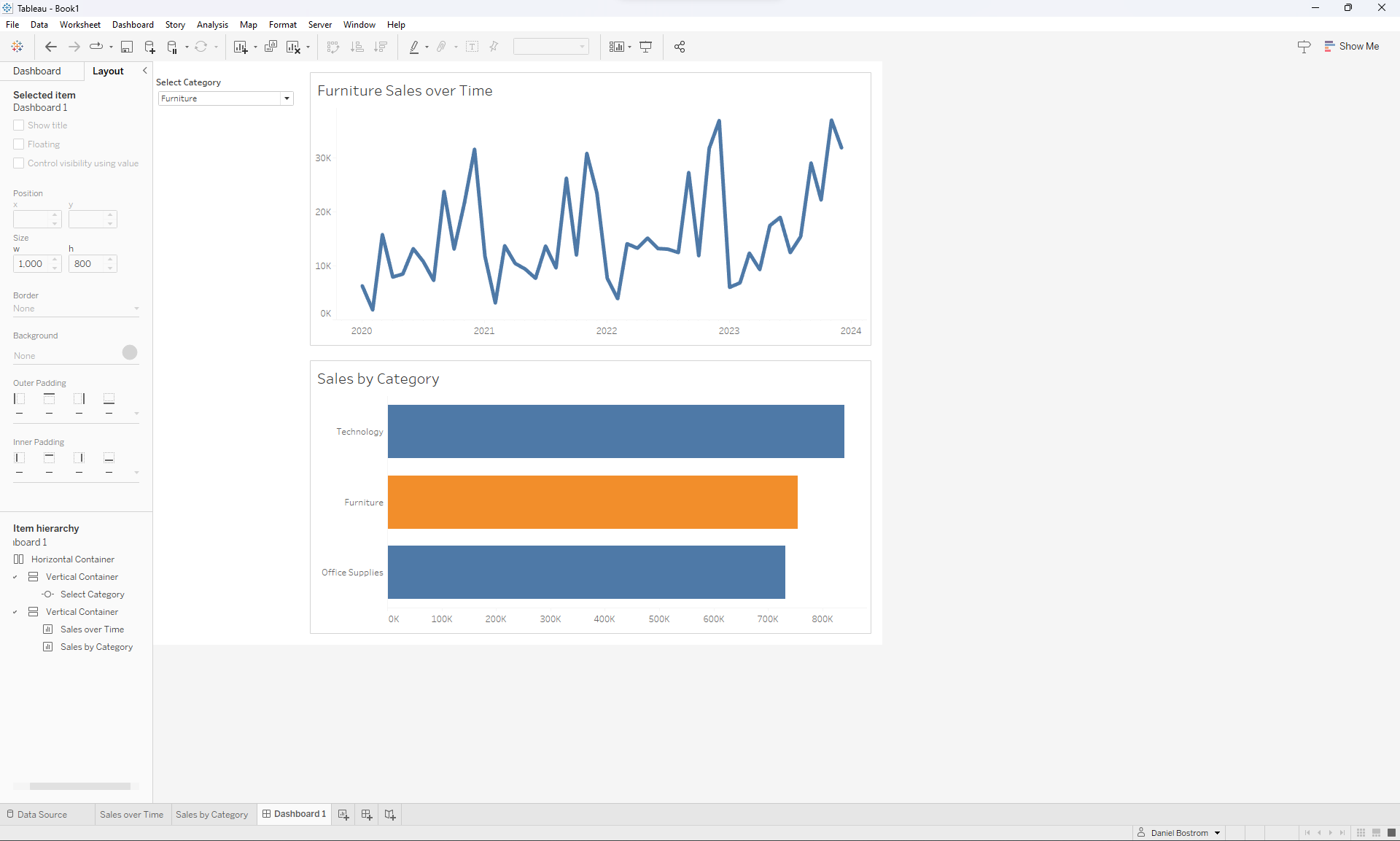
I can then put these charts and the parameter into a simple dashboard, which looks like this:
Implementing Parameter Actions
Currently I can reassign the parameter by choosing a new value for the parameter from the Select Category dropdown menu. Parameter actions allow us to do this by simply clicking. If I add a parameter action, I can click on a bar to reassign the parameter to that category. So clicking on the Technology bar will change the parameter to Technology, which will highlight that bar and adjust the line chart accordingly.
I'm working on a dashboard so I'll add a dashboard action (there are also worksheet actions, which operate on individual sheets rather than an entire dashboard; if your actions aren't working properly, this is a good area to troubleshoot. You can find more info on Tableau's forum).
Click Dashboard all the way at the top of the screen and then select Actions. Then click Add Action -> Change Parameter. The source sheet is the sheet (or in this case the dashboard) you want to click on in order to update the parameter so I'll select Dashboard1 (the name of the dashboard I'm working on). From the choices below that, I'll select the chart (or charts) I want to click to reassign the parameter value. In this case, that's the Sales by Category bar chart. Target Parameter is the parameter to reassign (Select Category) and Source Field is the field from that chart that will become the new parameter value (Category). Here's how that looks:
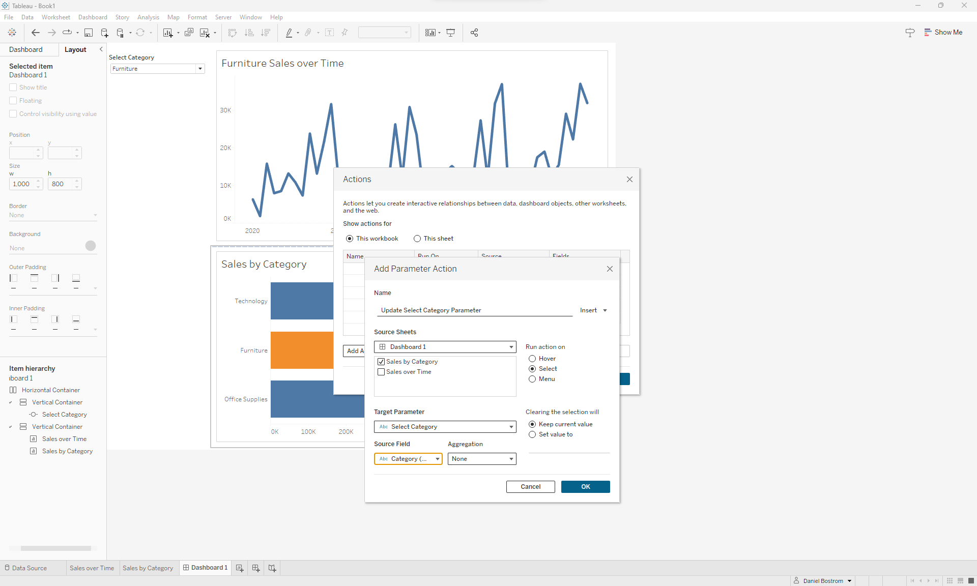
You'll notice that under Run Action On, the Select option is ticked by default. This means that selecting (or clicking) on something reassigns the parameter's value, which is what I want. I'll now hit OK. And that's it! Clicking on bar in the Sales by Category chart will change the Select Category parameter, highlighting the selected bar in orange and filtering the line chart. I hope that helped!
