


So you want to join the Data School? Having been in your shoes a little over a month ago, I still have the application process fresh in my memory. With my first week in the books, I've decided to look back at the application process and share some tips on how you can make your application stand out.
Apply Before the Feedback Deadline
One of the great things about the Data School is that they truly want to help you succeed (even if you're not an employee yet). Each application cycle has two deadlines: a hard deadline and a feedback deadline, which is usually about a week earlier. If you apply prior to the feedback deadline, a current data schooler will review your dashboard and get back to you with feedback and suggestions on how you can improve it. Then you can make any changes you'd like before the hard deadline. Both of my dashboards improved significantly after I received feedback and it definitely helped me get here. It may require additional hard work and planning to meet an earlier deadline but it's well worth the effort!
Demonstrate Insight
While your dashboard is very important, it's not the only thing on which you're being evaluated. It's important to show that you're really thinking about the data instead of just mindlessly making beautiful charts. The dataset for the final dashboard for my cohort was about horror movies. Take a look at a bar chart of movies released by month of the year from that dataset.
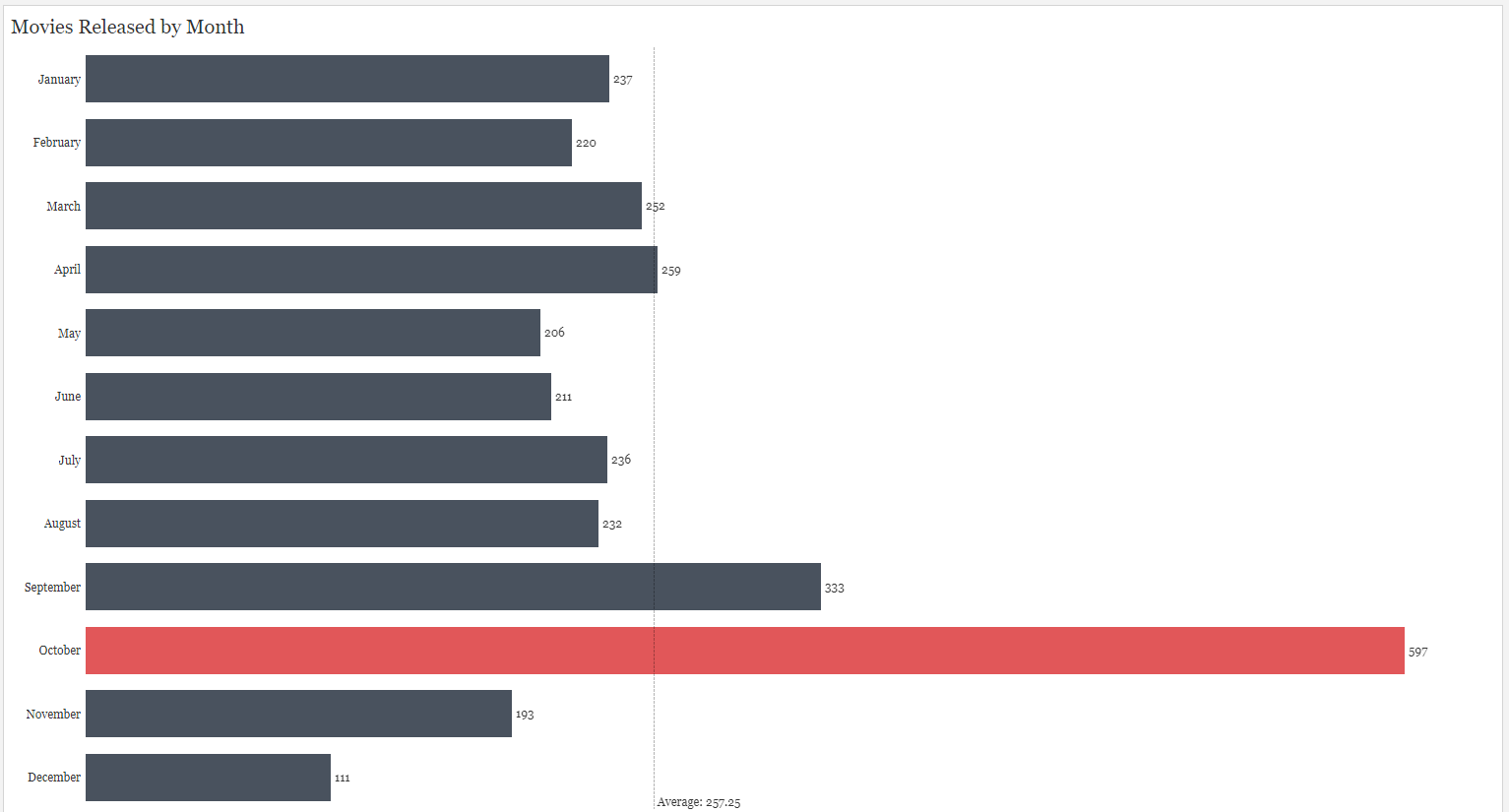
There's a huge spike in horror movie releases in October. Any idea why? It may have something to do with Halloween (the day this dashboard was due). Being able to interpret the data will show that you're really thinking about it.
Eliminate Chart Junk
Chart junk is one of the easiest ways to separate experienced and inexperienced Tableau users. It has to do with the data-to-ink ratio. This is the amount of information conveyed by a viz divided by the amount of ink you would need to use to create it. Things that are considered 'chart junk' contribute to the ink used without providing additional information. Eliminating things like grid lines, tick marks, and axis headers that have already been explained in the chart's title will help to make your dashboard neat and clean.
That's all for my application advice. Good luck and happy vizzing!