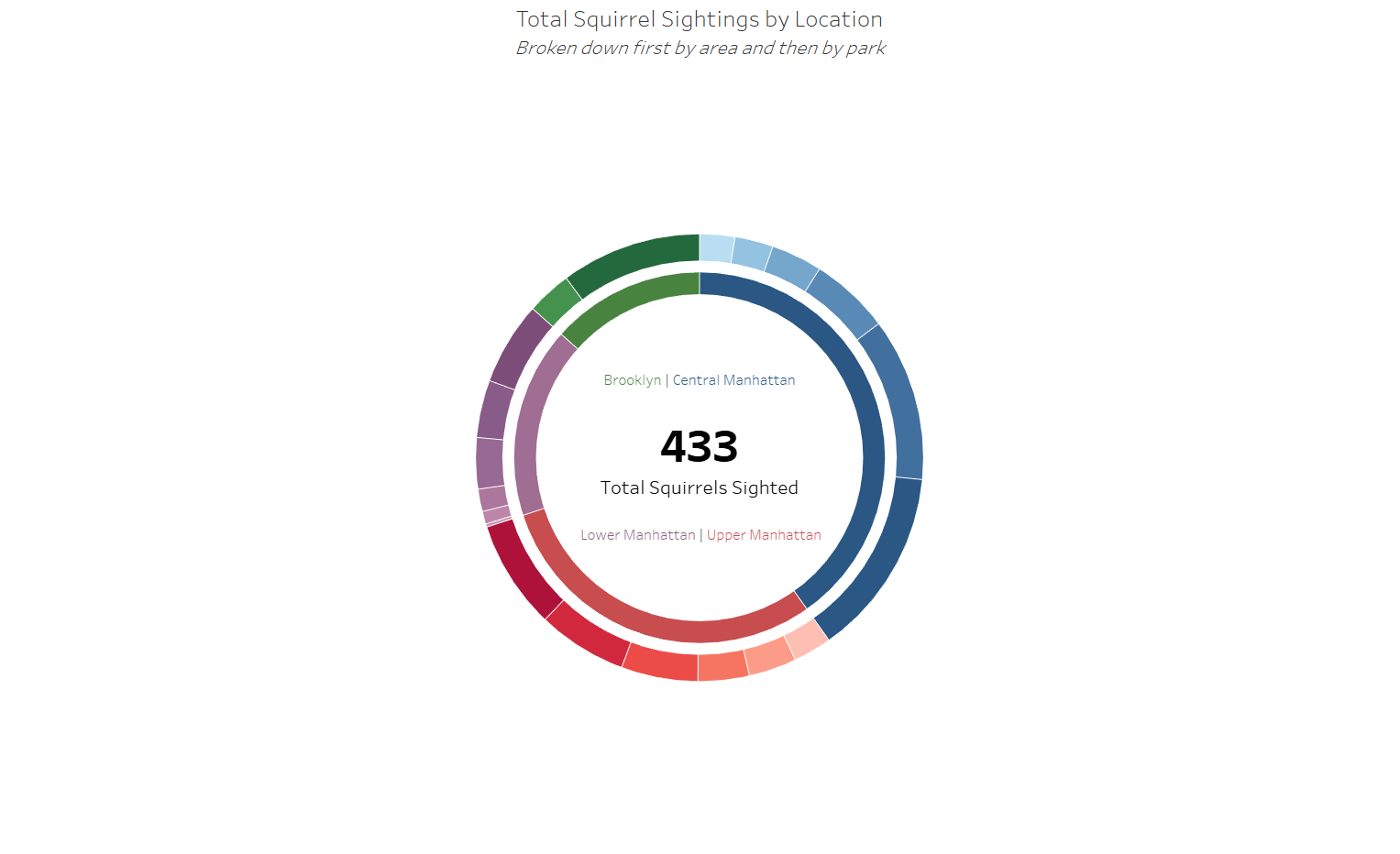
On March 1st, 2020, the latest NYC Squirrel Census took place. 72 volunteer census takers flocked to parks throughout Manhattan and Brooklyn to observe and document squirrel appearance and behavior, taking important notes along the way, like "Pretty fat" and "Great jumper".
Today we were given a link to the squirrel census website (which you should absolutely check out because it's both funny and beautifully designed) and were told to get creative and try out different chart types. I had a few ideas that I thought were good but they required data from a wider time range than just two hours in one day. With such minimal data, there weren't many interesting insights that I could find so I decided to just lean into the creative side and make some charts I had never used before.
Having focused almost entirely on business dashboards throughout training, I haven't had many opportunities to try out funky chart types. I ended up making a sunburst chart, which was a lot of fun. Here's the link to view it on my Tableau Public.