In Tableau, Parameters can be used in a dashboard to change how the date is displayed in a time chart. This is a great way to give users some control so they can drill deeper into the data without having to create extra charts, using valuable screen space. The below example uses Sales and Order Date in the Superstore dummy data that comes with Tableau Desktop.
Step 1: Create a parameter
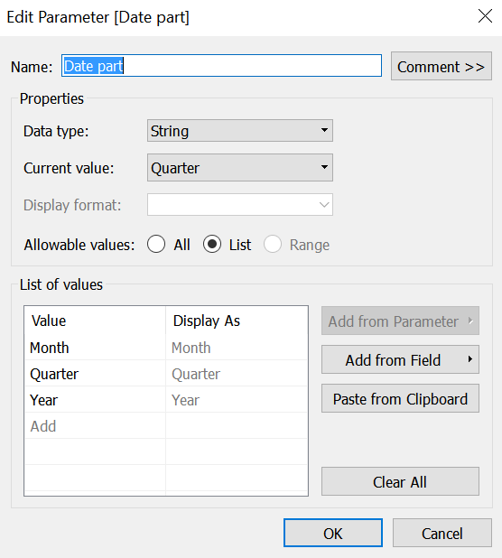
Select ‘String’ for the data type and ‘List’ for the allowable values. You can then enter in the the different options you want your users to have. In this example I have gone for month, quarter and year.
Step 2: Create a calculated field
Next you need to create calculated field called ‘Selected Date Part’.
if [Date part] = ‘Month’ then DateName(‘month’,[Order Date])
ELSEIF [Date part] = ‘Year’ then DateName(‘year’,[Order Date])
ELSEIF [Date part] = ‘Quarter’ then DateName(‘quarter’,[Order Date])
END
This calculation is using the value selected in the Date part parameter to decide how to aggregate the date. Here is the full list of date parts that you can use in this function:
| DateName | Values |
|---|---|
'year' |
Four-digit year |
'quarter' |
1-4 |
'month' |
“January”, “February”, and so on |
'dayofyear' |
Day of the year; Jan 1 is 1, Feb 1 is 32, and so on |
'day' |
1-31 |
'weekday' |
“Sunday”, “Monday”, and so on |
'week' |
1-52 |
'hour' |
0-23 |
'minute' |
0-59 |
'second' |
0-60 |
Note that you need to spell the DateName exactly as shown in the table above and it all needs to be lower case.
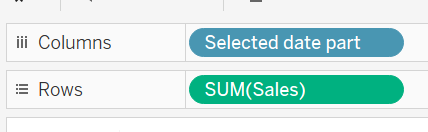
Step 3: Drop the Calculated field (Selected Date Part) on to the column shelf
Now all we need to do is drop our calculated field (Selected Date Part) onto the row shelf and sum(Sales) on to the column shelf.
Show the parameter to test if your chart updates when you click through the different options.