


With tools like Tableau, it's tempting to utilize all the fancy features available to you.
Unfortunately, all too often, charts can be unclear and confuse the reader. Today’s session at The Data School we spent time covering the visual elements of data analysis in order to improve our storytelling with data.
One of those visual elements that can be a real winner or loser for your chart is the use of colour. Color can be your best friend in data visualization, but less truly is more.
An excellent way to use colour is to highlight the data your want your reader to pay attention too.
For example, you want to know when the sales target was met throughout the year.
The chart on the left does a good enough job at displaying which months has higher or lower sales values but it’s not as clear which months hit the sales target.
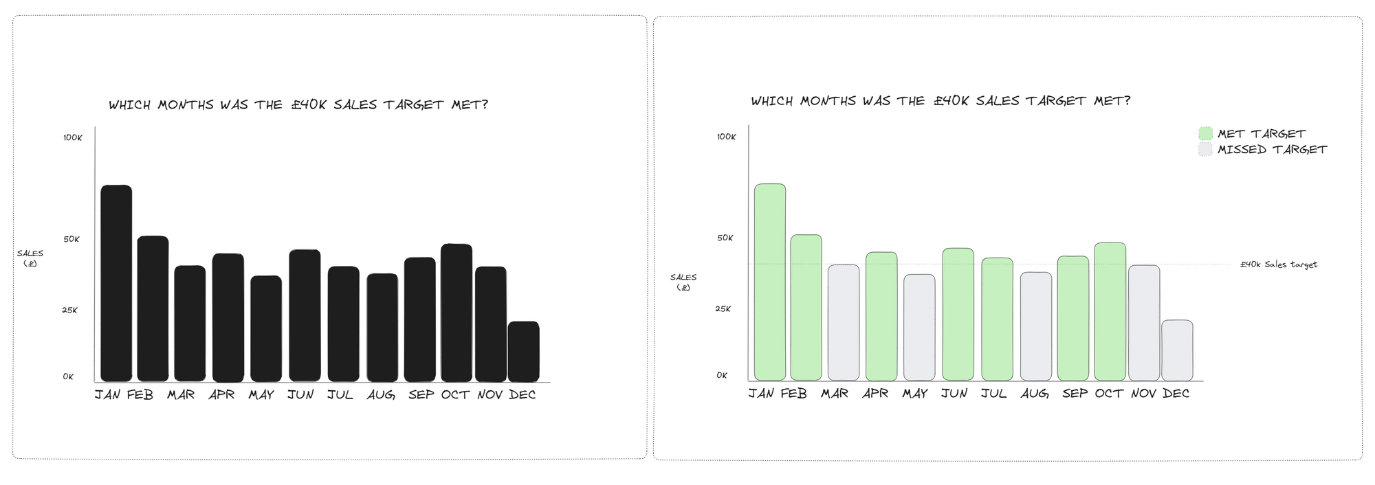
A simple addition of colour lures the reader towards the green bars. Combined this with a clear colour legend and reference line and you’ve transformed the chart to something the reader can use to answer their question.