Day 5 at The Data School meant it was DS42's first Makeover Monday challenge.
Makeover Monday is a popular data visualization and data analysis project that takes place on social media. The project's main aim is to encourage individuals to improve and redesign existing data visualizations, charts, and graphs. Every week, a new dataset is shared, and participants are invited to create better, more informative, and engaging visualizations based on the data.
I've participated in a few of these challenges as part of my Tableau development prior to The Data School so I was in familiar territory. Luckily this week was not a complicated dataset and therefore only a simple visualization was needed.
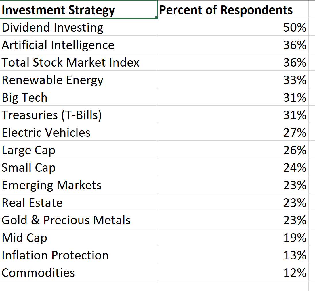
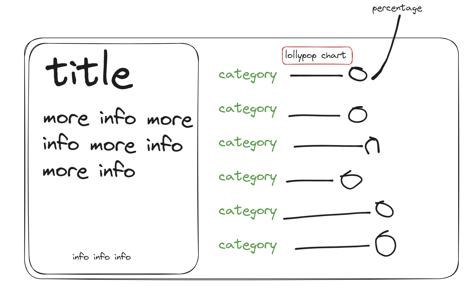
My first first step was to review the data, followed by reading through the existing blog post from Visual Capitalist to understand the data source and context in more detail. Next, I went over to Excalidraw to draft out my initial design, thinking about how I wanted my data to be displayed.
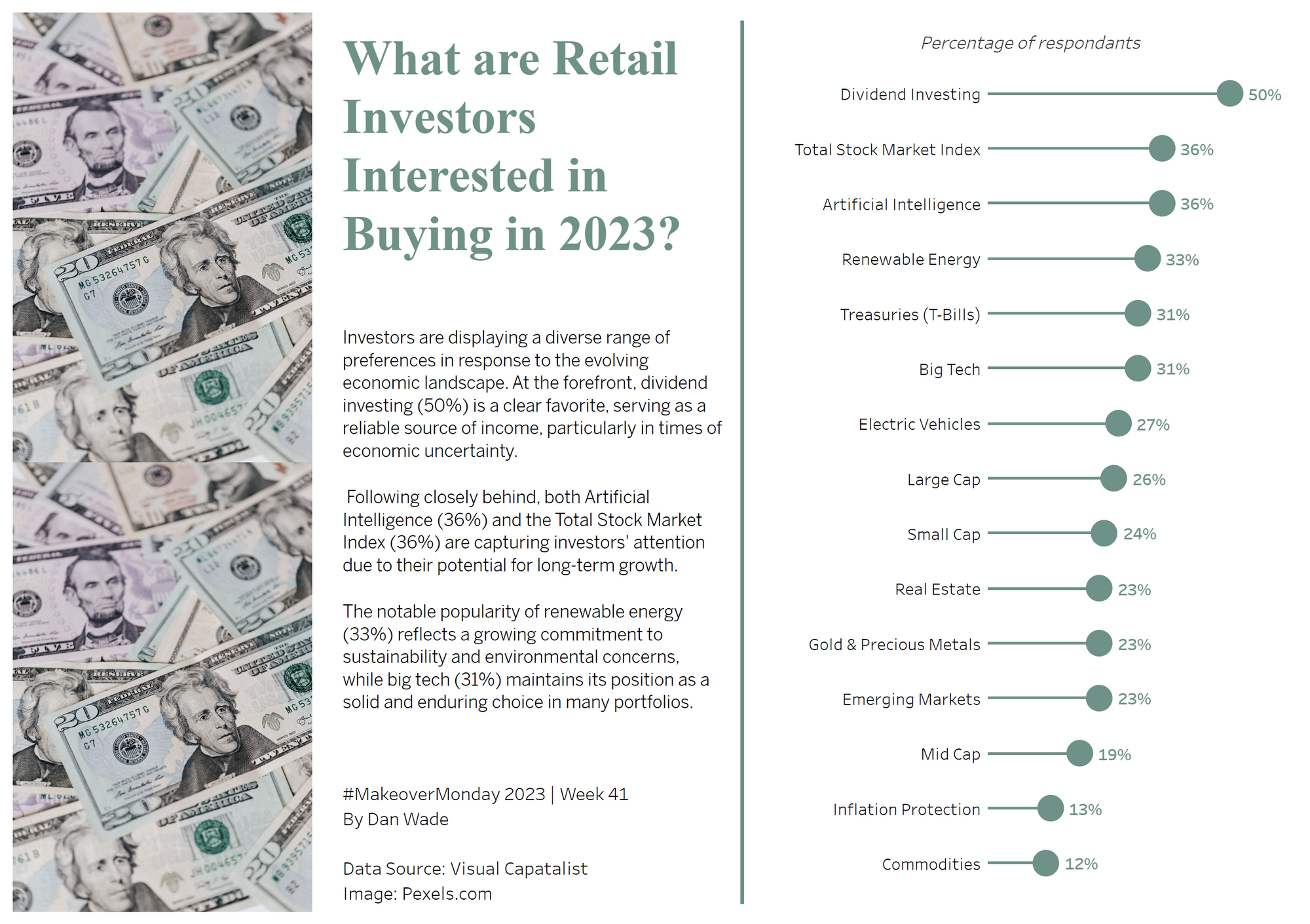
Final step was to go in and build the design. Here is the final product.