In 2023, after learning how to make dendograms in Tableau, I had the idea of taking this a step further and making a tournament bracket for the Women's World Cup which was on at the time. The finished product didn't come out as I'd expected, but it was a cool project to attempt nonetheless (You can find the link here). Now, 12 months later, I tackled the challenge again for the UEFA Men's Euros. After discovering Eric Parker’s family tree viz, I knew I had to revisit the tournament bracket by repurposing Eric’s work.

For those unfamiliar with a tournament bracket it is primarily used in sport to display the progression of teams or players throughout a competition.
Different sports follow various knockout structures with the number of teams and rounds varying between competitions. For the sake of simplicity, I’ve focused on the UEFA Euros knockout round structure, consisting of 4 rounds which occur after the group stage. This being the Round of 16, Quarter finals, semi final and final. Some competitions also have a third place play off but the Euros scrapped that due to lack of fan and sponsor interest in the match. So in total we are working with 16 teams and 15 matches.
You can download the workbook and excel template here.
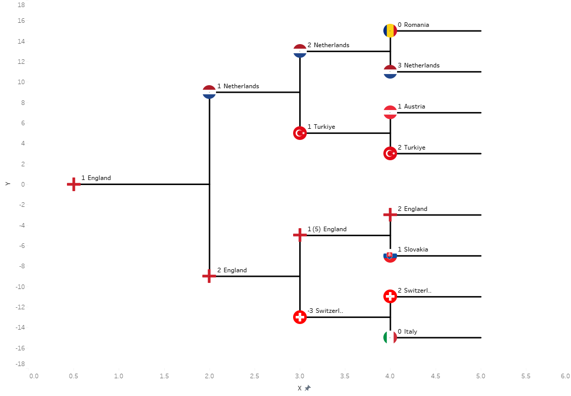
So for the tournament bracket we essentially we have a dual axis chart. Circle marks for the flags and lines for the progression of the teams. Each of these circle marks and lines are given x and y coordinates which connect them all together. But first, let’s dive into the Excel sheet which contains all these values.
In our first sheet we have all the match results. For the columns in yellow you can add your teams and scores. For the columns in orange, you can add match location information. You can add more in columns here if you want to add more detail or your sport requires it. In grey you have all the columns which should not be edited. We have our x and y co-ordinates for plotting the circle marks. Our bracket field which we use as a filter which we apply to our left bracket sheet and right bracket sheet respectively. From here I also made fields so that I can easily format my tooltips in Tableau with the match result and any additional info.

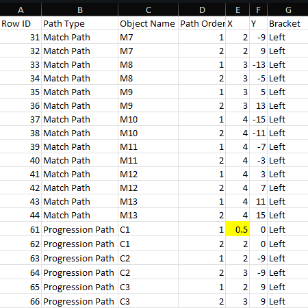
In our second sheet we have the paths. We’ve got our path type label which either creates the lines between the two teams or create the path of progression to the next round of the tournament. These fields aren’t used in Tableau but will help if you are adding more matches to the tournament bracket. Next we have our object name. We then have our x and y coordinates which will place marks on our chart. Then we have our path which will connect each of the x,y co-ordinates together which have the same object name. Finally we have the bracket field again, so we can filter to either the left or right bracket.
It’s not necessary to edit any of these values on this sheet. however if you want to change the height or length of your marks you can play around with your co-ordinates. For example, I have changed Row ID 61 and 105 to 0.5 instead of 0. This is so my final lines are closer together along their x-axis when in the dashboard. To increase the height of your lines you edit the y fields and the length with the x fields.
Now we have our template, let’s talk through building this in Tableau.
You can download the workbook here, but if you’re planning on starting from scratch, follow these steps.
- Connect to your Excel sheet
- Select your Paths A table by dragging in to the canvas
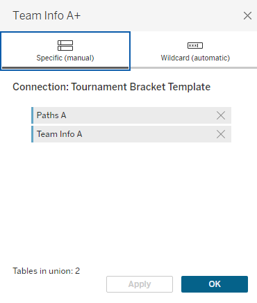
- Union your tables by dragging Team Info A onto the Paths A table.
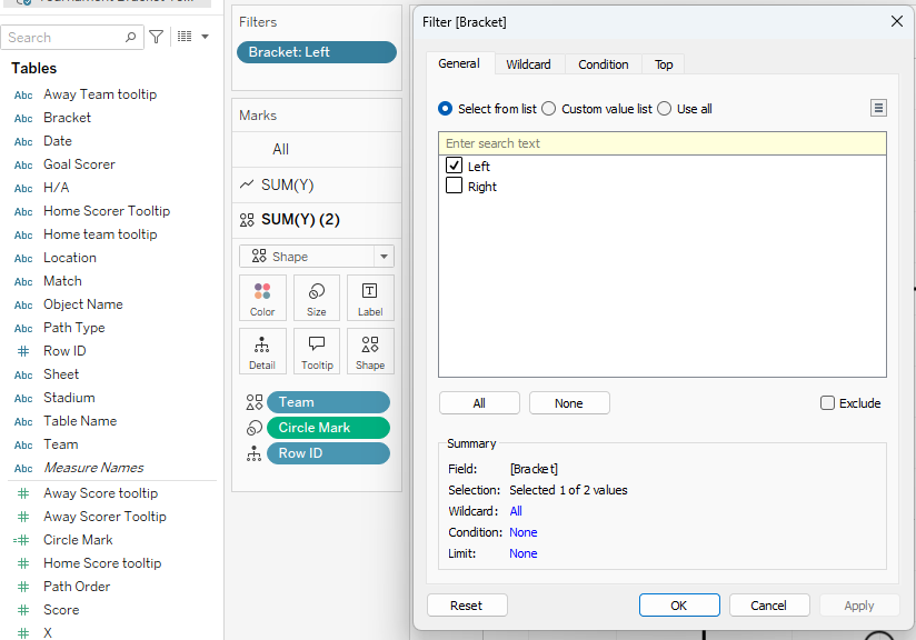
- Create a sheet and label it “Left”. Then drag your Bracket field to filter and select “Left”.
- Drag your “X” field to the columns shelf and “Y” field to the rows shelf.
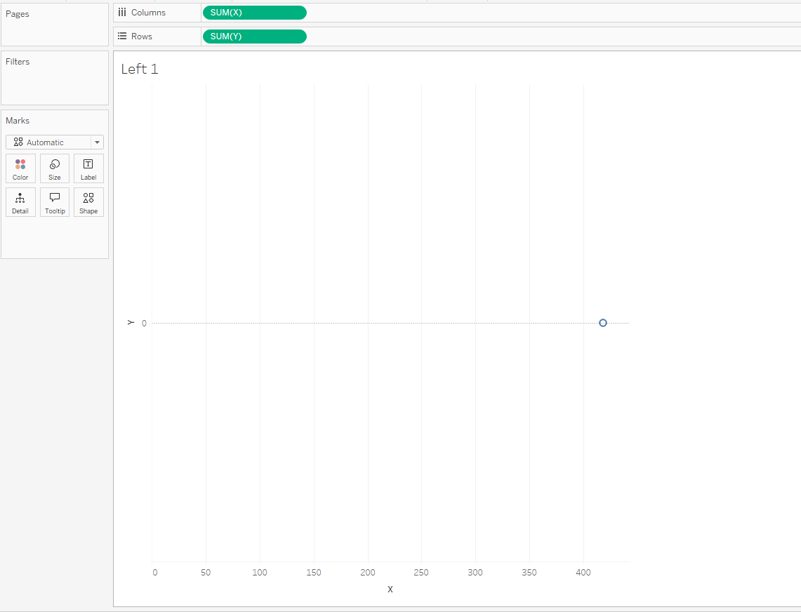
- Right click on your x axis and to edit axis and reverse the axis and it should look like below.
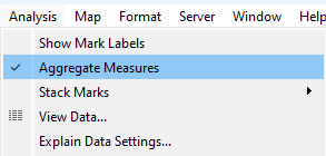
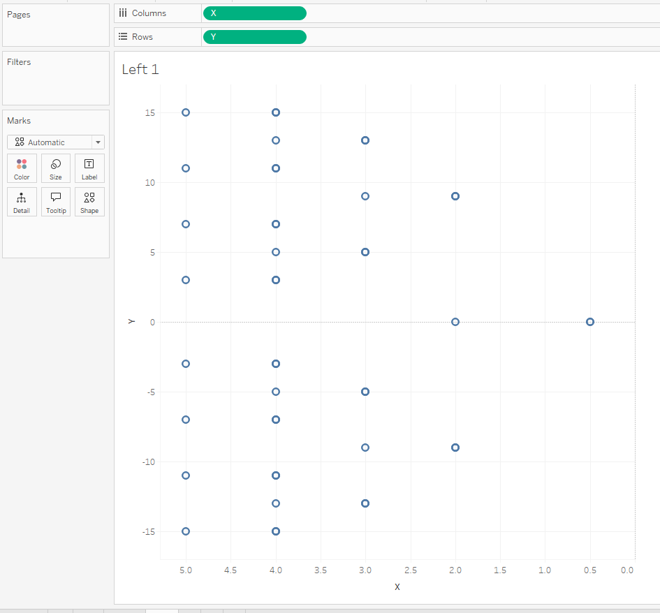
- On the menu select analysis and turn off “Aggregate Measures”.
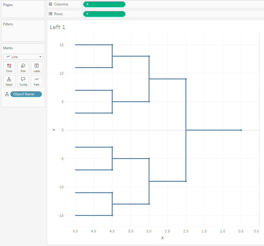
- Change your mark from automatic to line and drag “Object Name” to detail.
- Drag your “Y” field onto the rows shelf next to the existing “Y” pill. Right click dual axis and sync axis by right clicking on the second y axis. Then change mark type to shape.

- Drag “Row ID” to detail and remove object name.
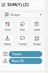
- Next we need to hide our additional marks that form the line ends, to leave a mark only for our flags. To do this we create a new calculated field. Name this field “Circle Mark” and enter the following calculation:

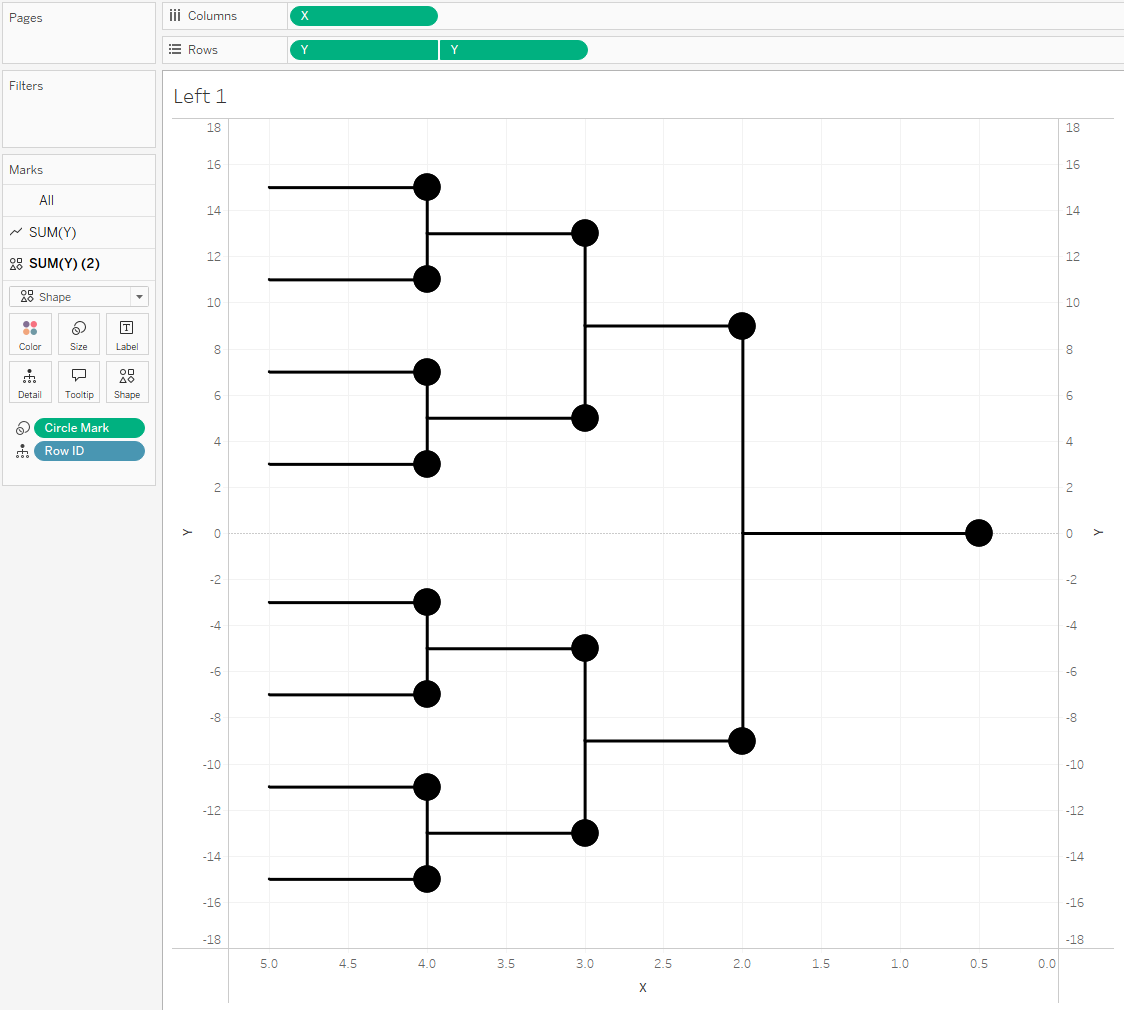
- Now drag this to our size card and resize as needed, to produce the following:
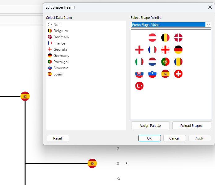
- Next we format our shapes. From here you can do what ever is useful to your design. I want flags to represent the country of each team. I’ve gone with flags, but you can add a team crest or change to another shape. (I get all my flags from this website [Link].) Add in your custom flags, crests or whatever you’re using. You can find a tutorial on how to use custom shapes here.
- Next we add our text labels, but first we need to create a calculated field to act as whitespace so that I can create distance between the shape mark and the text. Adding spaces from your keyboard doesn’t work in this scenarios, otherwise you lose text behind your shape.
- To do this copy and paste the whitespace from this website. Now create a new calculated field called “Whitespace” and enter the following:

- Drag “Team”, “Score” and “Whitespace” to text and customize the format that works for you.

- Next step is tooltip and in here you can add in whatever match info you desire by populating the Excel sheet. I’ve gone with the following:

- Once your happy with all your formatting and sizing, you can hide headers to leave just the bracket.
- For the right bracket, duplicate your Left sheet and rename this Right.
- Change the filter on the Bracket to Right
- Now right click on your x-axis and untick ‘Reversed’
- Update any shapes and text alignment where required.
The final piece of the puzzle is brining these sheets together.
- Open a New Dashboard and drag in a horizontal container. Now drag your Left bracket and your right bracket.
- How you display the winner is up to you. I simply created a new sheet called winners and dragged Team to Detail and changed my mark to shape, before filtering to only display the winners flag. Then dragged this onto the dashboard as a floating container.

All customization and presentation is over to you from here on.
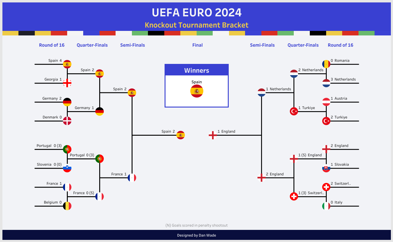
I hope you found this useful. If you go on to build something, be sure to tag me on socials and on Tableau Public so I can see what you come up with.
Dan
