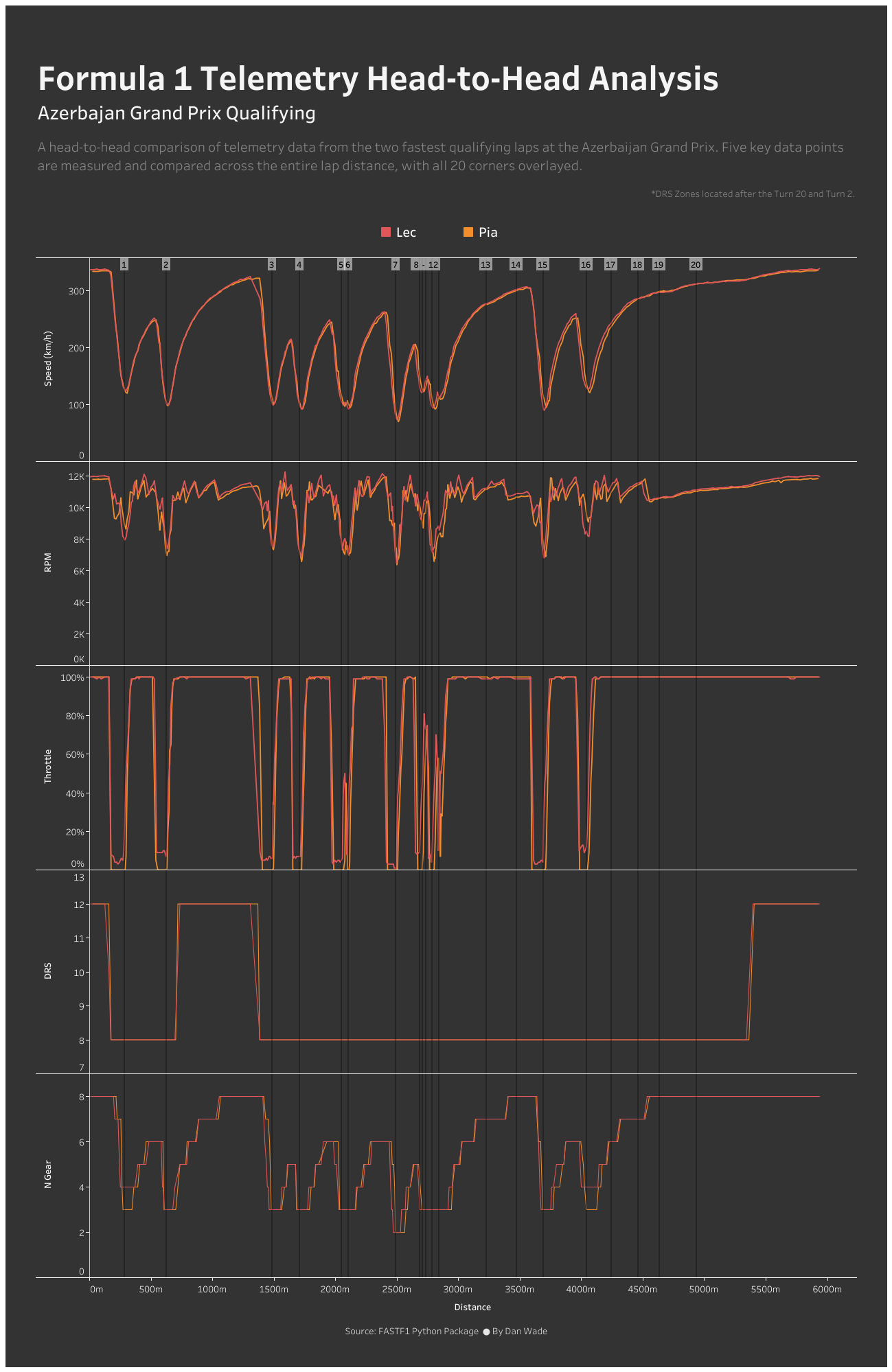
I’m a big Formula 1 fan, so at the start of 2024 I set myself a challenge to complete 24 data projects relating to the sport. I decided on that many projects since there are 24 races in this years season This would give me plenty of opportunity to try new things in data analysis and data visualisation to expand my knowledge and development at a cadence that was challenging but not too intense.
At the beginning of the challenge I wrote down a list of things I wanted to learn, data I wanted to work with and visualisations I wanted to build. On that list was to play around with Python and to work with some telemetry data. For this weeks project, I did exactly that. So to reinforce what I’ve learnt, I’ve wrote this blog.

What is telemetry in Formula 1?
Telemetry in Formula 1 refers to the real-time collection and transmission of data from a car's sensors to engineers, allowing them to monitor performance and make adjustments during a race or session. It provides critical insights to optimize car setup and strategy.
Where do you you get the data from?
Formula 1 has a big data community and those in the community have developed The Fast F1 Python package. This is a tool that simplifies the retrieval and analysis of Formula 1 data, enabling users to access timing, lap data, and telemetry directly from the F1 data feed. It utilizes the official F1 API, which can be obtained by pulling data from various sessions, such as practice, qualifying, and races.
What inspired you for this project?
On the TV they speak about telemetry metrics all the time and sometimes flash graphics up on the screen which all use telemetry data under the hood. Plus I see a lot of visualizations and projects shared amongst the formula 1 data community such as F1-tempo.com, who has built a website specifically for sharing telemetry data.
What tools did you use for the project?
I ran python to get the data within Jupyter Notebooks which is an open-source web-based tool that allows users to create code. I’m still new to Python so instead of completing my visualisations in there, I used Tableau.
Here’s a written summary of my process, and you can find the code further down.
First, I obtained the session data for the Azerbaijan Grand Prix or Round 17 and filtered to qualifying. I then obtained the fastest lap times from the top 2 qualifiers who were Leclerc and Piastri. I then got the telemetry data for each of those two laps and added distance to my data before unioning both datasets into one. My final step of this part was to gather a second dataset which contained the circuit information where each corner was located which I would use as reference points for the telemetry. I dropped all but the distance column and then pivoted my distance data so each corner was a column.
Now I had the two datasets I joined these together in Tableau, by creating a join calculation of 1 = 1. This means that for every row in my telemetry data, it would be joined to by corner data effectively repeating my corners for every record of telemetry data.
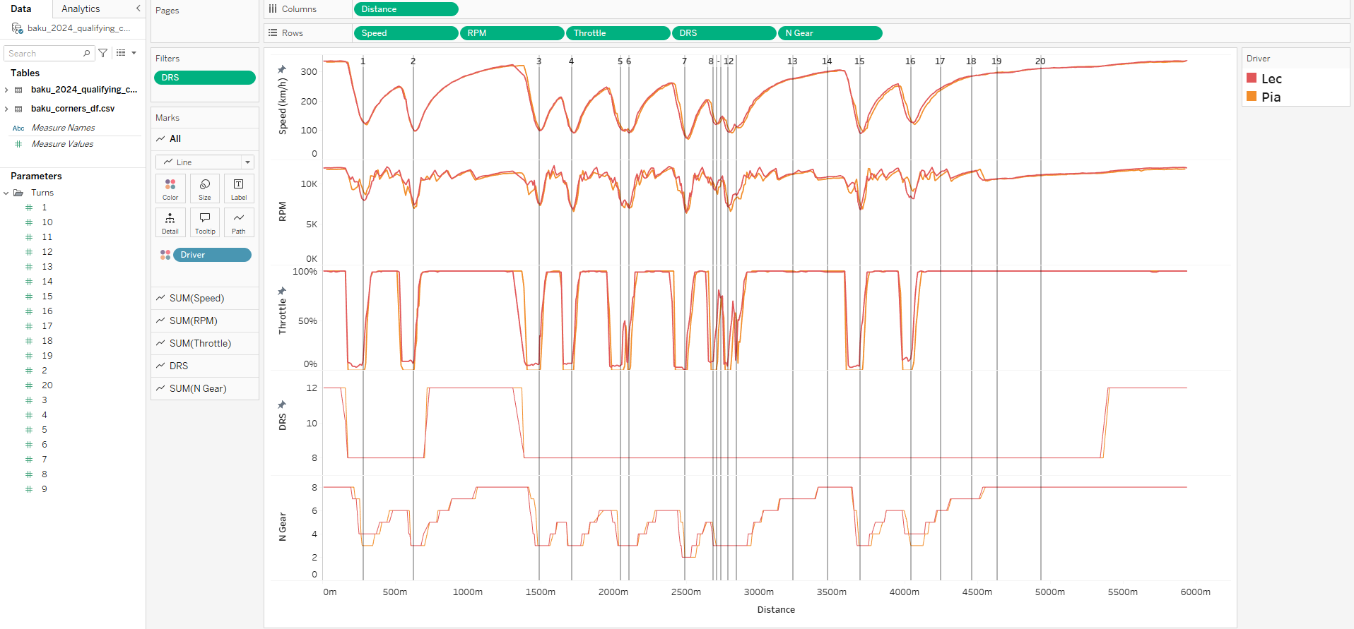
With my data prep complete, I moved into Tableau to create my viz which was more of my simpler projects vs. previous weeks. I added distance on to my column shelf and each telemetry metric onto my rows shelf. To get my corners was a bit more tricky as I wanted references lined to run through the entire viz. To do this I created parameters for each of my corners. The final steps were some formatting and putting it all together in a dashboard.
You can download the Tableau workbook here.

Some basic analysis and findings
I’m no race engineer, but some familiarity of the circuit and racing in general I can share a basic analysis of the speed data. Leclerc was able to carry more top speed into most of the corners. Crucially, when approaching turn 16, Leclerc achieved a greater top speed, followed by smaller reduction of speed in the breaking zone. This effectively allowed him to get onto the throttle sooner, enabling him to carry more speed out of the corner exit, presumably due to more confidence, grip or other factors which gave him a speed advantage into the faster flowing sector 3 which gave him the final advantage to steal pole position.
However, when going through the data in finer detail, I noticed an issue. When viewing the charts online I assumed for each driver telemetry was recorded at the same distance so that when conducting your analysis you can say that driver 1 was carrying more speed than driver 2 at this distance mark. However, in turns out that the telemetry data is not equal at every distance so for the same point in the track no data may have been recorded.
So when you look at the same section of the track described earlier, where Lec has higher speed entering turn 16, it could infact be a lack of data whereby Piastri was reaching similar speeds, but the sensors did not record any datapoints at that distance. Discussions online suggest this could be due to sensor issues or signal issues due to be a street circuit with buildings surrounding the track, impacting the reception.
Conclusion
This was great to finally get stuck into Python and working with data you are familiar with certainly helps when it comes to becoming familiar with the language so you know what your desired outcome is. There’s some more telemetry work I’d like to do so more to come.
Code Snippets
!pip install fastf1
import fastf1
import pandas as pd

ff1.Cache.enable_cache('cache')  # optional but recommended
# load a session
session = fastf1.get_session(2024, 17, 'Q')
session.load()
print(session)
# Select the fastest lap of driver we want to compare
lec_lap = session.laps.pick_driver('LEC').pick_fastest()
pia_lap = session.laps.pick_driver('PIA').pick_fastest()
# Get the telemetry data for each driver
# We also add a ‘Distance’ column to the telemetry dataframe as this makes it easier to compare the laps.
lec_tel = lec_lap.get_car_data().add_distance()
pia_tel = pia_lap.get_car_data().add_distance()
#Add driver column
lec_tel['Driver'] = 'Lec'
pia_tel['Driver'] = 'Pia'
#Union the datasets together
both_tel = pd.concat([lec_tel,pia_tel])
print(both_tel)
# Save the dataframe as a CSV for Tableau import
both_tel.to_csv(r'C:\Users\DanWade\Downloads\baku_2024_qualifying_comparison.csv', index=False)
#Get circuit info
circuit_info = session.get_circuit_info()
#Get corner info for that circuit
corners_df = circuit_info.corners
#Pivot the corners data so that each corner is a column instead of a row
corners_pivot = corners_df.set_index('Number').T
# With each corner being a column, I want to take only the 4th row which contains by distances
baku_corners = corners_pivot.iloc[[4]]
# Save the dataframe as a CSV for Tableau import
baku_corners.to_csv(r'C:\Users\DanWade\Downloads\baku_corners_df.csv', index=False)
