What is Explanatory and Exploratory Analysis? When do you use them? What are the pros and cons of both?
In data visualization, there are two ways to communicate to our audience. Exploratory analysis allows the user to interact with the visualizations to uncover their own findings. Whereas, explanatory analysis is more prescriptive and guides the user to specific findings.
When might they both be used?
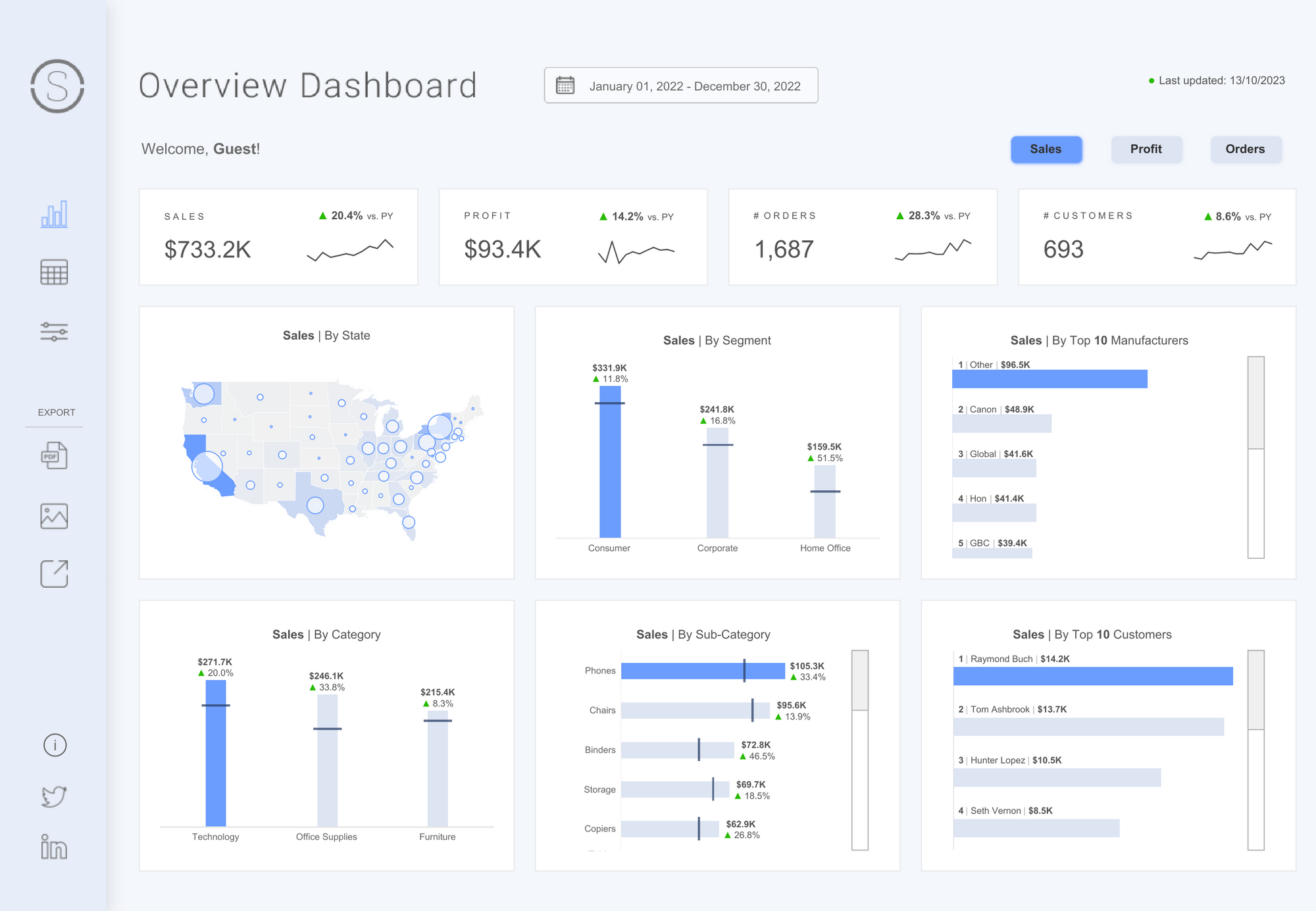
Exploratory Analysis is often considered the starting point of analysis. An exploratory dashboard might be built without a specific question or answer defined. Instead, allowing the user to explore the data in their own way and find what matters most to them.
It will likely contain elements of interactivity such as filters to do this and can often contain lots of data. As data analysts, we may start here to understand our data a little more, before moving onto more exploratory analysis. Because of the self-guided nature of this analysis, you would typically expect subject matter experts to also engage with this form of communication but it can also be tailored to wider groups in one design.
Check out the following Exploratory analysis example by Priya Padham. The interactivty built into this dashboard allows your to filter down to paticular areas of interest.

Priya Padham via Tableau Public
Explanatory analysis on the other hand, will often be used when there are pre-defined questions to answer. The order of your visualizations will be able to guide you through a story that leads you to the answer of these questions, painting a clear picture for your audience. This could begin with a high level summary of key information which then goes into more detail with each additional visualization. This would be particularly useful when your user is not a subject matter expert as you can guide them to specific findings. Althlough, explanatory analysis can also be used with subject experts to highlight key findings in a concise way.
Check out the following Exploratory analysis example by Simon Beaumont. The dashboard flows from viz to viz with questions that frame the story around the Human Development Index.

What are the pros and cons of each?
| Exploratory | |
|---|---|
| Pros | Cons |
| Allows the user to make their own findings | Less data-fluent users may struggle to navigate |
| Allows for new data to be added over time | Main findings could be missed |
| Maintains detail in the data | Could lead to scope creep as more questions come up |
| You can learn more about the wider dataset | |
| Explanatory | |
|---|---|
| Pros | Cons |
| Answers a clear question | Users may not trust your findings |
| Can construct a clearer story | Could lead to scope creep as more questions come up |
| Can highlight your expertise | Findings can expire over time |
| Adds lots of value |
Can you use both together?
Both styles have distinct structures but what if you need to create a design with both exploratory and explanatory elements? This can be done for the right user but can often be difficult to achieve. Considerations need to be made to not confuse the user with too much information or too much interactivity. Instead, using a tailored blend that guides the user through the story with the ability for them to tailor what story they see. There are some things to consider when combining styles:
- Who is going to be exploring and why?
- What are the questions that need to be answered?
- What elements need to be fixed and which elements can be more dynamic?
- How do each visualization relate and interact together?
You may have noticed an interactive element in the last section of Simon's dashboard on the Human Development Index. This is a great way for users to explore the dashboard and find additional details after the explanatrory story of the main dashboard.
Explanatory analysis is often the most difficult to communicate. For inspiration check out the #IronViz dashboards which are mostly explanatory in design. Check them out here:
https://public.tableau.com/app/search/vizzes/%23IronViz
