


Dashboard design is fundamental in data visualisation. In week 2 of The Data School, we spent some time covering dashboard design to understand how to step yourself up for success.
After covering the theory and going through some good and bad examples of dashboard design, we we're given a dataset to redesign ourselves.
Here is the before. What can you spot? What would you change here?
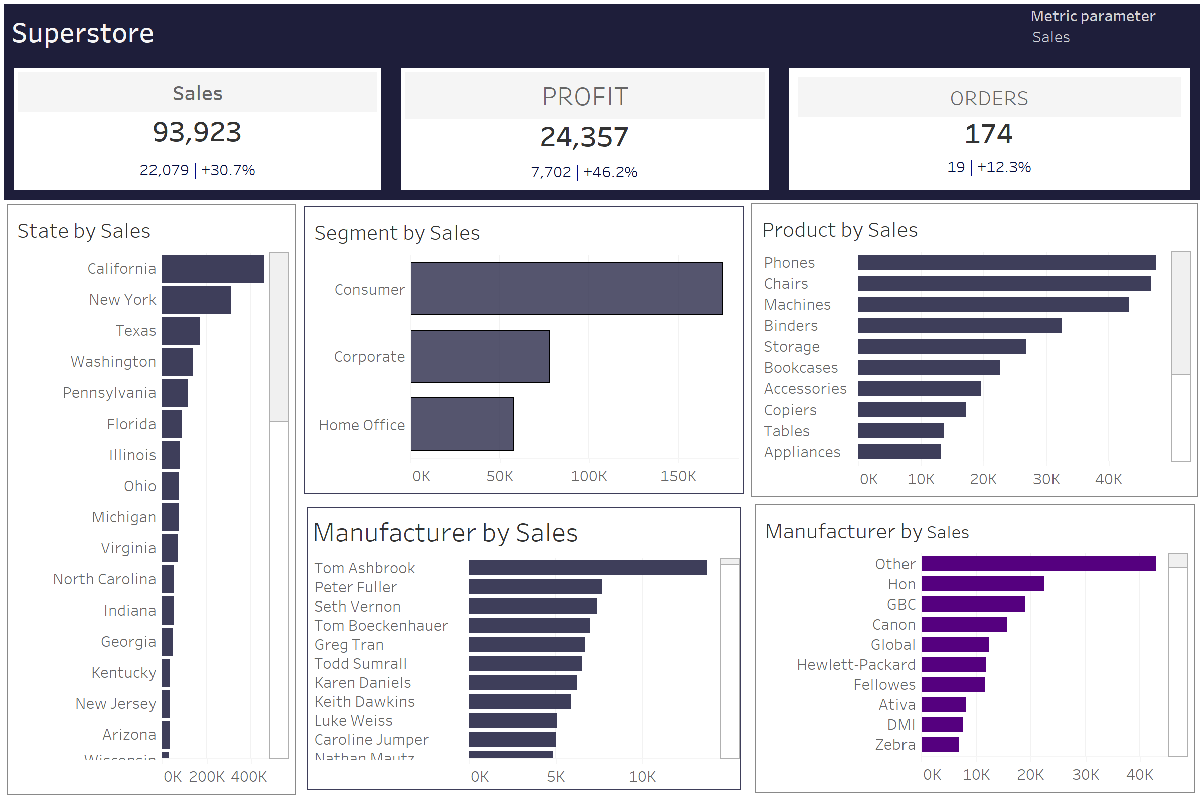
Firstly, there's a lot of inconsistencies. Font, colours, sizes, alignment. Next is the colour scheme itself, navy blue is bold colour choice. There's also not much context to what we're looking at, no dates, no currencies or comparisons for the percentages. Finally, it all feels quite compact.
Overall not the worst design in the world, but definitely not the best.
Now the after. Notice what's changed?
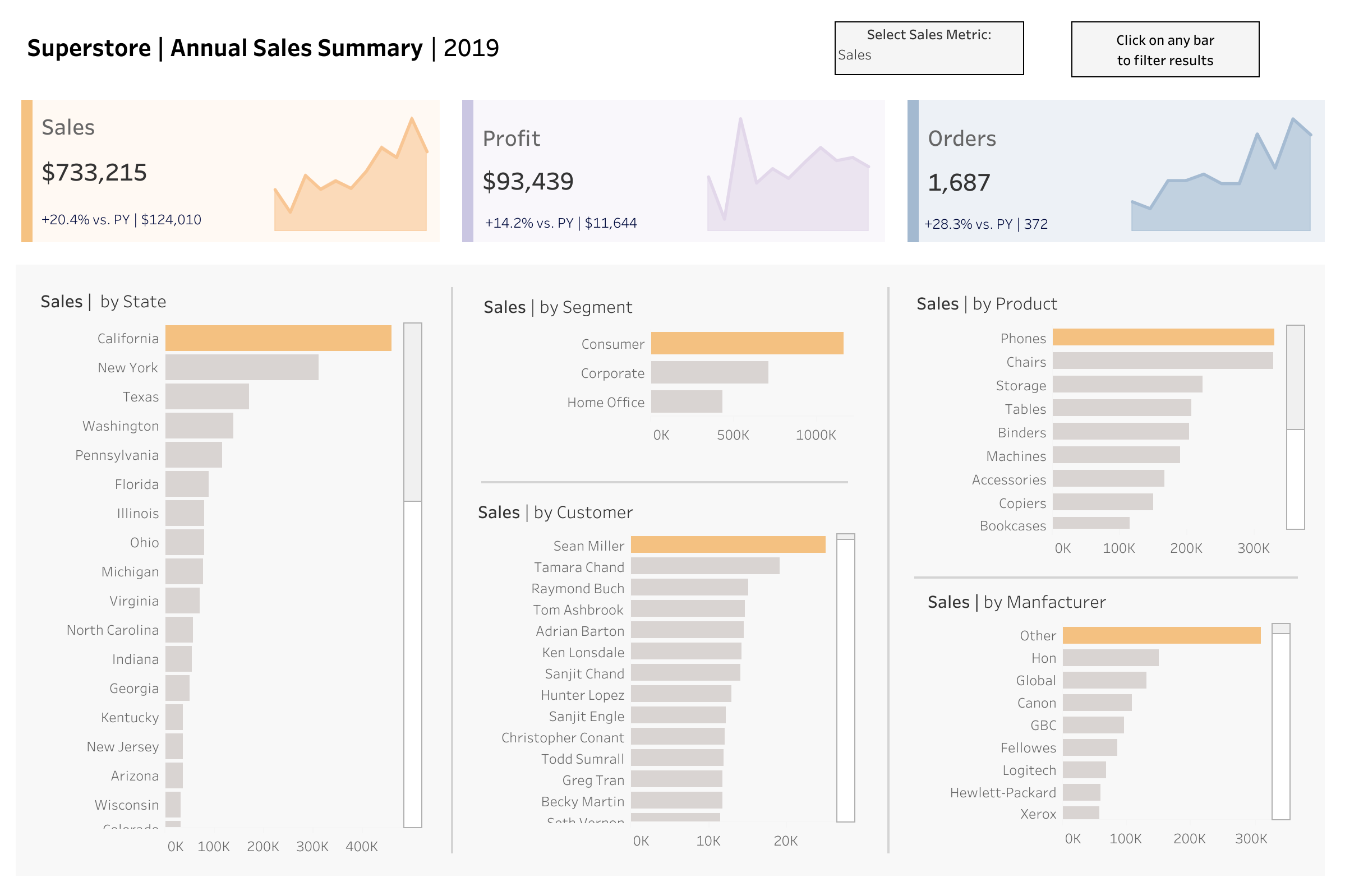
Here's a list of all the changes made.
- an improved title to demonstrate what the dashboard is about
- a date that tells you what period of time the dashboard is showing
- clearer instructions to help the user with navigation
- Resizing of the charts to improve alignment
- Realigned the the zero axis between charts for consistency
- Created subsections between the contextual numbers/BAN's at the top and the visualizations below in grey
- Applied a softer and consistent colour scheme to focus on differences between metric types
- Applied colour for each metric which changes with the metric parameter action
- Applied a calculated field to only add colour the max value in each chart to draw the reader in
- applied consistent font sizes, font case and colour
- added currency to number formats for more clarity
- added text to show comparisons (e.g. vs. previous year)
- added spark lines to show the annual trend for each metric
- used padding to create more space between the charts
- used a grey background and borders to demonstrate the differences in sections
- updated tooltips with succinct descriptions for additional information
Overall, 16 changes that transform the dashboard into something the end-user will actually want to use and interact with.
To interact with the dashboard yourself, head over to the dashboard on Tableau public:
https://public.tableau.com/app/profile/vizgrowth/viz/SuperstoreAnnualSalesSummaryDashboard/Dashboard
Thank for reading.