


In the blog, learn how to use a box and whisker chart to improve your analysis. A box and whisker chart, also known as a boxplot is a way of visualizing your data. A boxplot is a method of descriptive statistics that enables you to see the distribution of your data but also the outliers.
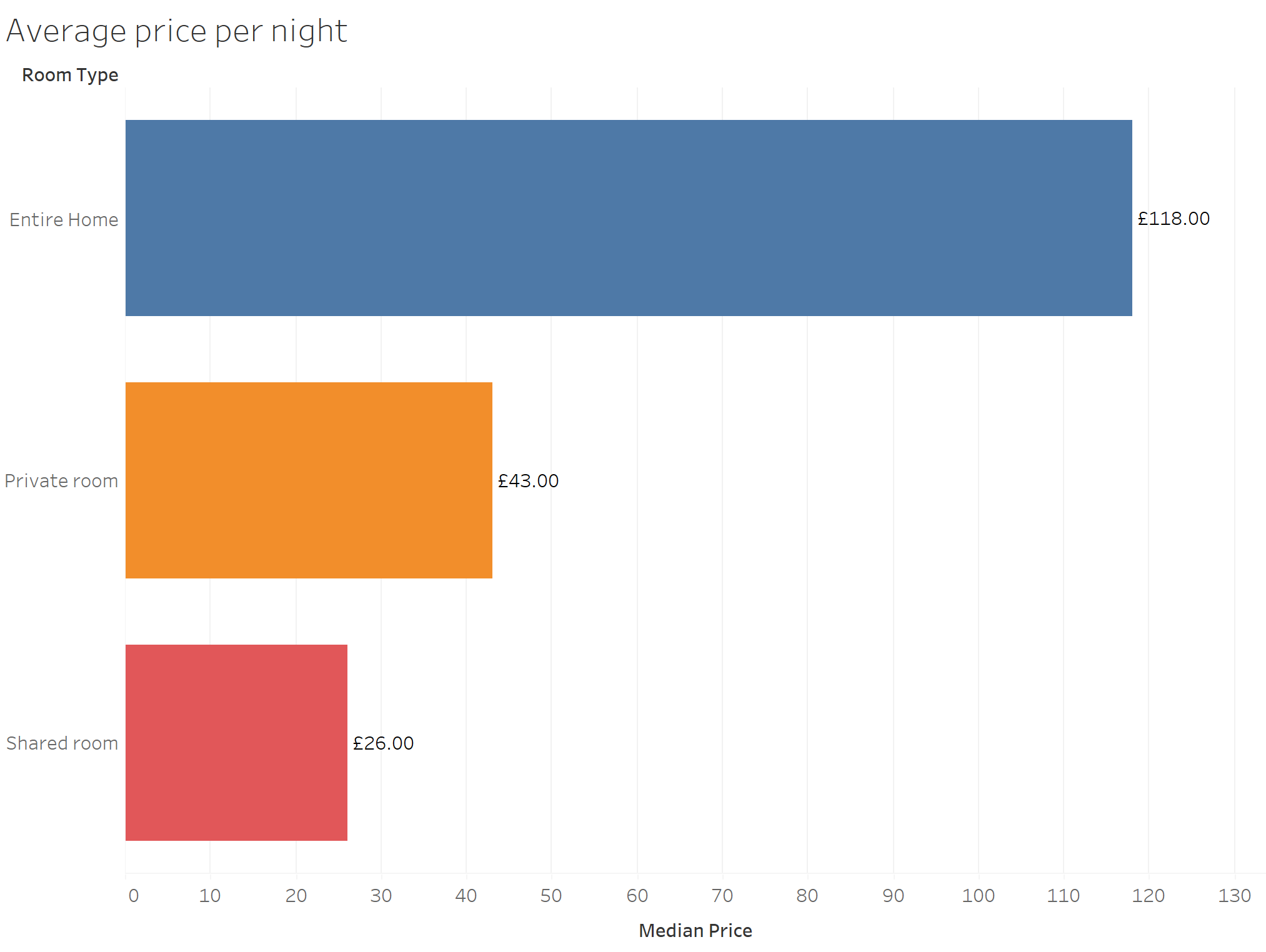
Take the following dataset for example. Here we have data representing the average price per night of a range of AirBnb listings in London. We have three categories of listings; "entire homes", "private room" or "shared room". When all the data is aggregated, we can see that the average price per night is highest for "entire homes" compared to the other listing types. What this chart does not show, however, is what the spread of this data looks like.
For examples, are all the listings roughly around the median of £118? Or do the listings vary from low prices per night to high prices per night. This information could be useful to someone deciding how to price their listing, this cannot be determined by just looking at the average.
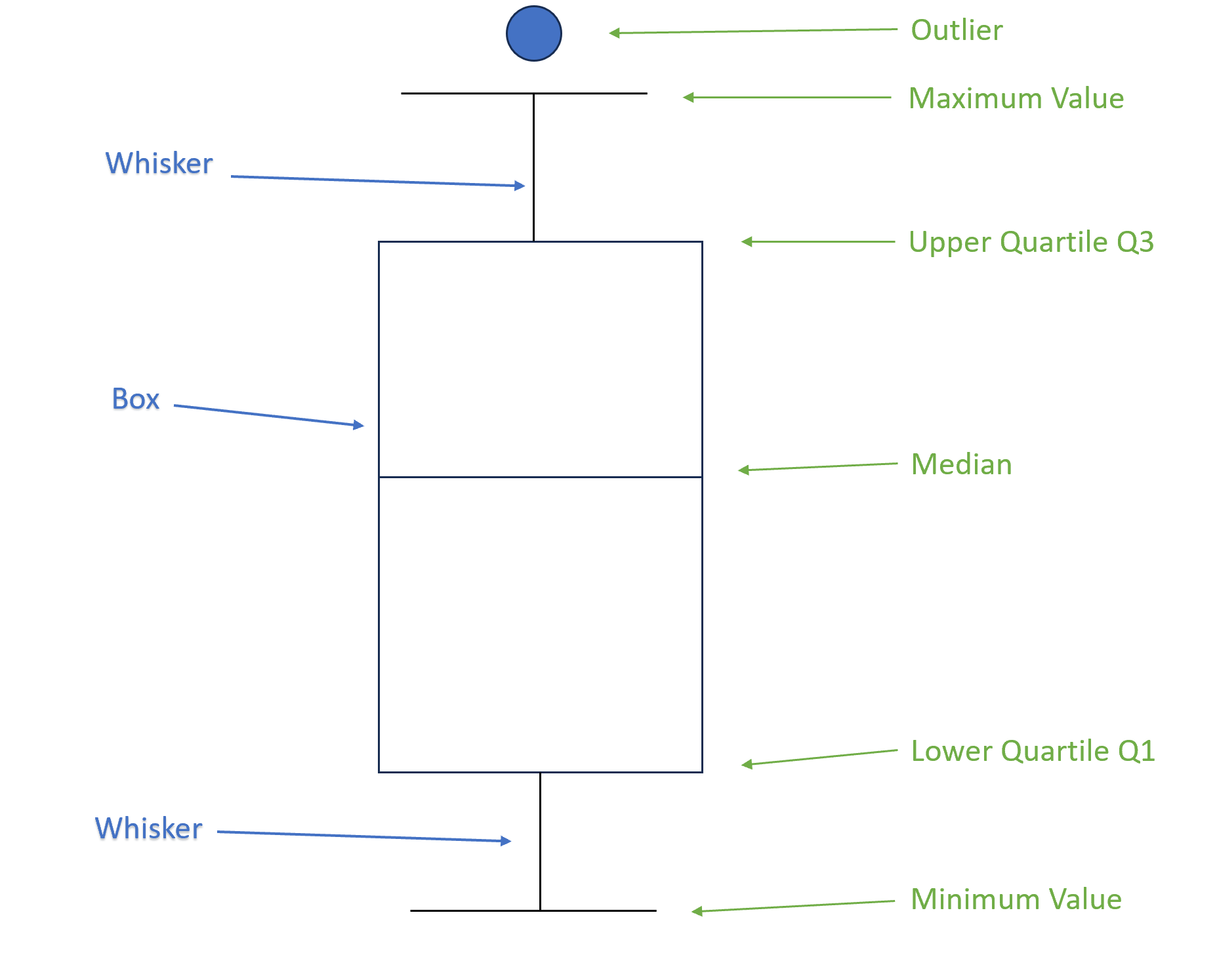
On a boxplot we have several main points of interest. The boxplot divides the data into parts of four, called quartiles. The size of these quartiles will not be in equal sizes and will vary depending on the spread or distribution of the data.
- Interquartile Range (IQR) - This is the “box” area which represents the middle 50% of the data. Each end of the box represents the lower quartile and the upper quartile.
- Lower Quartile (Q1) - This represents the bottom 25% of the data, up to the minimum value.
- Upper Quartile (Q3) - This represents the top 25% of the data, up to the maximum value.
- Median value - The middle of all data points. This is the line that splits the box in two. Depending on the spread of the data, the median value will not always be in the middle of the "box".
- Minimum data value - This is the lowest value in the range that is within 1.5 x IQR below the lower quartile value.
- Maximum data value - This is the highest value in the range that is within 1.5 x IQR below the upper quartile value.
- Whiskers - These are lines that extend from the box to the minimum and maximum values within a certain range. They represent the spread or variability of the data in a graphical form.
- Outliers - These are any data points that fall outside of the minimum and maximum values are
Using these points of interest we can gather additional information about our dataset, allowing us to gather greater insight.
Some things to observe are:
What to look out for on a boxplot?
The size of the box.
A large box or IQR indicates that the central point of our data spreads out further. Whereas, a smaller box shows that the middle values are closer together.
The length of the whiskers
If one whisker is longer than the other, it may suggest asymmetry or skewness in the data distribution. This could mean more data is found above or below the mean.
Outliers
The size of the distance of the outlier from the minimum or maximum values may help you decided which outliers to investigate. For example, the further the outlier from the maximum or minimum value the more significant the outlier.
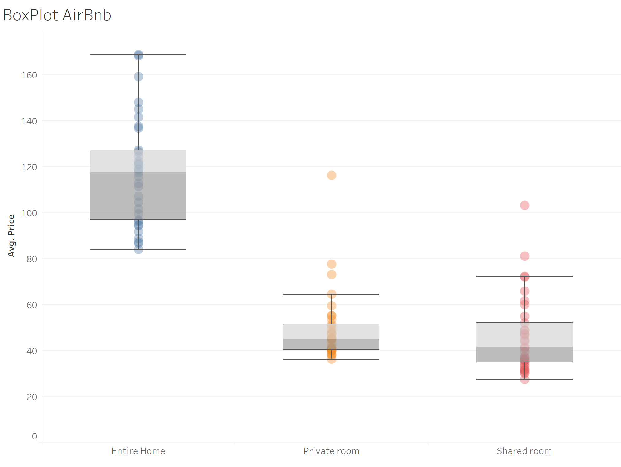
Our Airbnb boxplot
When looking at the same Airbnb data represented as a boxplot, we can see the median value is still the greatest for "Entire ome" listings at £118, followed by "Private rooms" and "Shared Rooms".
What we can also observe is that the box on the box plot for "Entire homes" is larger than the other listings. This is the IQR and tells us that price per night varies much more than the other two room types.
In terms of whiskers, we can see that whisker above each box is larger than the whisker below for all three room types. What this tells us is that owners are more commonly pricing their listing above the median.
Finally, our "Entire home" box plot has no outliers versus the other listings. So while we have some owners posting their listings higher than the median, their pricing strategy remains consistent with the remainder of the listings. For private rooms and shared rooms on the other hand, we have several outliers, therefore the price of these listings is not consistent with the remainder of the dataset. It could be that these listings are of very high quality and the price per night is justified, however without more context this cannot be determined. What this chart does how however is the outliers in context the remainder of the data.
In conclusion, boxplots are invaluable tools in data analysis for their ability to provide a concise and insightful visual summary of the distribution of a dataset. They offer a clear representation of key statistical measures such as quartiles, the median, and potential outliers, facilitating a quick understanding of central tendencies and variability. The simplicity of a boxplot makes it particularly useful for comparing multiple datasets, identifying patterns, and detecting potential anomalies. By presenting the data in a visually intuitive manner, boxplots enhance the interpretability of complex datasets and aid in making informed decisions. Whether exploring the spread of Airbnb prices, analyzing financial data, or investigating scientific observations, the versatility and efficiency of boxplots make them an indispensable tool for researchers, analysts, and decision-makers in diverse fields of study.