


Final week of training at The Data School involves the famous Dashboard Week.
5 topics, 5 dashboards, 5 days.
Day 1 was all about accessibility.
Brief: Redesign a dashboard that is accessible to keyboard-only user
The plan for the day:
- Recap the Tableau keyboard accessibility guidance/help
- Find blogs and Tableau Public dashboards for research
- Download and interrogate the dashboard, identifying features to keep and remove
- Sketch and plan the new design
- Build and test new features
- Present
Research
After doing some research, these are the features that were suggested to include in the dashboard.
Keyboard Accessibility Guidance document
As many end users of Tableau dashboards may be unfamiliar with Tableau. Point them to an info button that gives the user an easy way to get to this content. The recommendation here is to place an Image Object on the dashboard with a Target URL that points to the help page.
Improve Keyboard Navigation
Tableau has a default order in which a keyboard user can move around the page using the Tab button which is generally, left to right and from top to bottom. Unfortunately there is not much guidance around this on layout of containers. So I am going to assume that contains stacked vertically, provide a consistent order. This becomes more complicated when wanting to use a different layout. I will test this out and see what works following my sketch.
Keep information out of tooltips
Keyboard only users are unable to use tooltips to click and hover to gather more information. Therefore it's important to extract any additional information from these tooltips, which may require additional charts. This may include adding mark labels back onto the chart to improve readability.
Pointing to accessibility options
"Show data" is an option that allows users to open up the crosstab of the selected chart. Since charts chart areas in Tableau can neither be read with a Screen Reader nor selected using keyboard controls, it might be that visual representations of our data is unsuitable for in-depth analysis. The "Show Data" feature enables users to gather further information about their data.
Review and sketching
Once we had gathered our recommendations, we annotated the dashboard with our changes. As the dashboard is for internal use only, we have redacted the main information from the view.
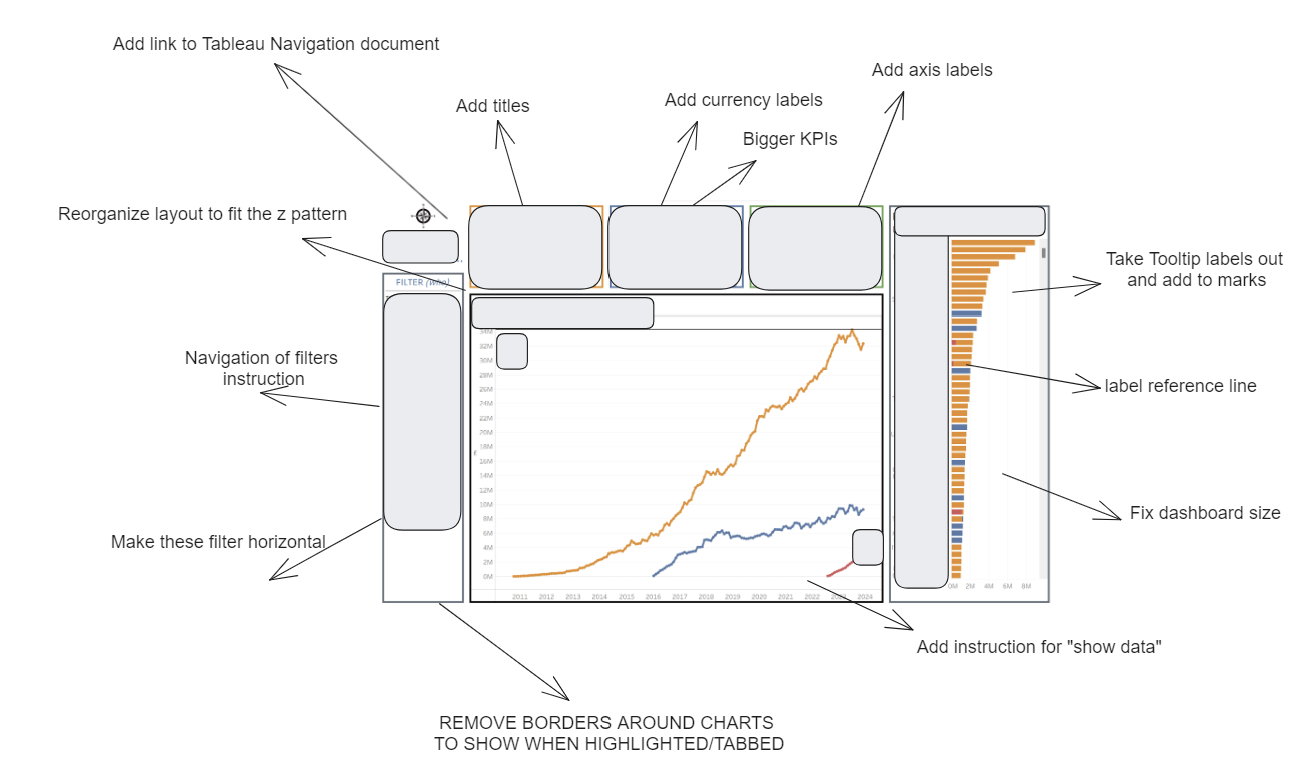
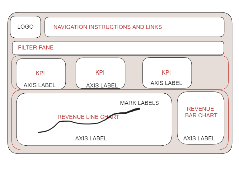
Next, we created a high level sketch of the intended rebuild.
Final Dashboard
Again, because this dashboard was for internal use, we are unable to show the final dashboard.
Reflections
Overall this topic has been very interesting to learn about and will make me think more carefully about how I design a viz but also gather requirements from clients regarding accessibility use.
Unfortunately, content around this subject is sparse online. Tableau public is lacking examples of vizes tailored to accessible use and there is little to no content online in regards to blog posts or videos aimed at educating the community around these subjects. These are both areas of opportunity for Tableau. Finally I would add that the Keyboard guidance document is helpful, but may not be accesible to all users. We decided to add a link to this webpage within our final design, however, it may be a good idea to generate a video tutorial, walking users through how to use keyboard shortcuts rather than reading a document. This is something that could be added at a Company level, but this would also be great to see from Tableau.
Day 1 of dashboard week - complete...