Having just completed my first week at The Data School I thought now would be a good time to reflect on the journey of creating my initial application dashboard.
I first learnt of The Data School during a data science careers day while I was at university. In particular, a demonstration about data visualisation really caught my eye, and when I asked the presenter how I could gain those skills myself she straight away pointed me to The Data School. Later that day, I went home to research this “Data School” that I’d been told about, and I was immediately sold. Four months of training hugely valuable skills, the chance to gain experience across four different placements -all while getting paid- count me in!
I was, therefore, very excited to start my application. Before I began I made sure to look at previous applications for inspiration. Having never used Tableau before I was concerned that I would not be able to match the quality of the previous applicants, however, the tools and blogs provided by The Information Lab helped me pick up the skills I needed quickly.
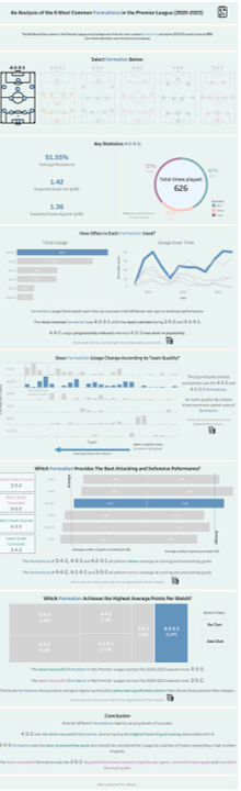
I decided to make my dashboard about football as this is a topic I am hugely passionate about. In particular, I find the tactical side of football very interesting and decided to build my dashboard about the success of different formations in the Premier League.
I searched for a dataset that I could use by browsing through Kaggle. Once I had loaded the file into Tableau and familiarised myself with the dataset, I created a rough plan of how I wanted the dashboard to turn out. This plan continually changed throughout the Viz-making process as I spent more time with the data and discovered new trends I wanted to display. After several iterations, I eventually got to the stage where I was happy with my dashboard and submitted my application.
A couple of weeks later I received feedback on my work. One example was that my dashboard used a range of contrasting colours which affected the visual aesthetic of my Viz. I tried to act on the suggested feedback one by one, and each time, I noticed a significant improvement in my dashboard. My final dashboard can be seen below.
The whole process taught me so much about Tableau and data visualisation principles. I am now very excited to continue this learning journey and will be posting updates on what I have learnt in future Data School blogs. In the future, I would like to expand my dashboard by including other leagues in my analysis to see if the success of formations changes within different environments.