I recently created a Tableau dashboard where the colour of each graph dynamically updated based on a value selected by the user (https://public.tableau.com/app/profile/dan.booth/viz/PremierLeague2425-TeamProfileComparison/GoalkeeperDashboard).
A data school coach has since tasked me with recreating this logic in PowerBi.
Here are the steps for how this can be done:
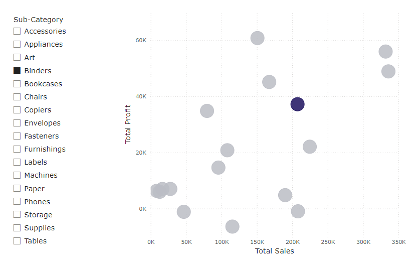
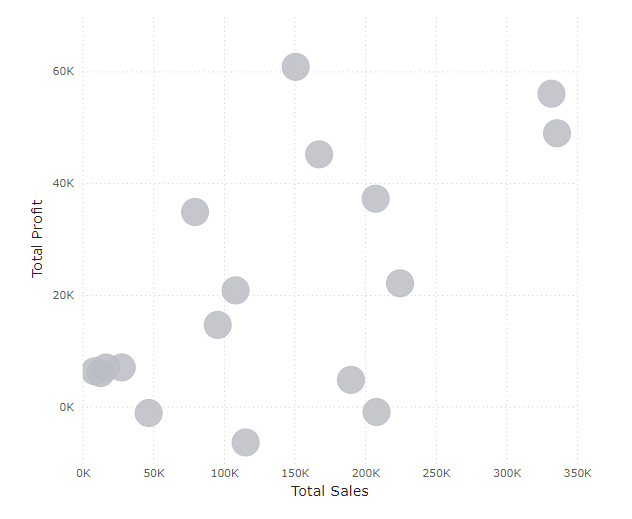
1) Create a graph of your choice: in this case I have made a scatter plot where each dot represents a different subcategory.
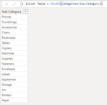
2) Create a new table that lists the values you want your user to be able to select from. I wanted a user to be able to select from subcategories listed in my pre-existing Categories table.

(Using a new table means there will be no relation to the existing graph and, therefore, no unwanted filter actions will occur).
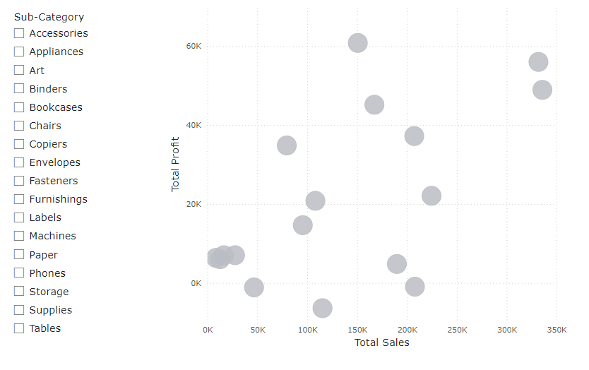
3) Add a slicer to your worksheet and use the newly created column as the field to populate this with. Your selectable options should now be visible.
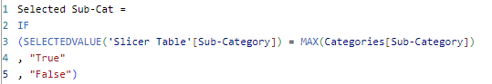
4) Create a new measure that detects which value is selected. In this case I have made an IF statement that returns True or False based on whether an object is selected.
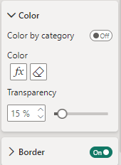
5) Click on your graph and in the format pane select the fx button that sits just below Color.
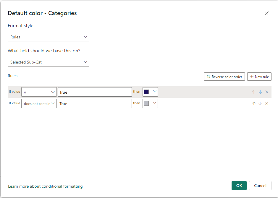
6) Format the colour pop-up window in the same way as below and select two colours of your choice.
7) Congratulations, your graph should now dynamically change colour based on the selection of the user.