Dashboard week has officially started! One remarkable thing about the Data School is that the first day of dashboard week also includes a lesson on accessibility design. I was very excited to learn about how we can make our dashboards more inclusive because I think it’s important for information to be accessible to as many people as possible. Here are some key takeaways from my lesson in accessibility dashboard design:
- Ensure the dashboard is accessible for mouse and keyboard users
- Reduce cognitive load by being consistent with color and the layout
- Prioritize the most important content
- Make sure to provide text alternatives for non-text content
- Utilize titles! Screen readers will read titles out loud so make sure the title provides enough content for the listener
- Ensure elements in your charts are easy to read and understand
- The dashboard should be easy to navigate with or without a mouse
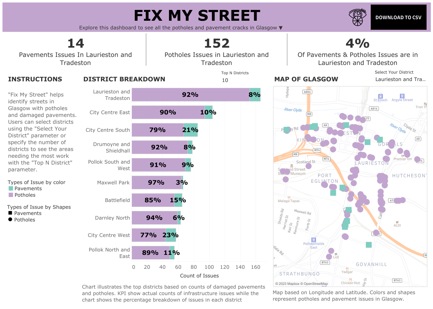
After our lesson, my cohort and I were tasked with building a dashboard with these accessibility design principles in mind. I began by looking at the dataset and brainstorming ideas I could make for a dashboard. The dataset we received was from ‘Fix My Street’, a UK map-based website created to alert local authorities on infrastructure issues such as broken street lamps, and potholes. This particular dataset had the name of the districts in Glasgow, category, datazone, latitude, and longitude. Right away, I knew I could make a map of all the districts with potholes and damaged pavements/footpaths (category). The data was immaculate so there was no need to clean the dataset. Although I had created 2 bar graphs with a Top N parameter for potholes and pavements, I decided to only keep a stacked bar that showed the percentage of potholes and pavement by district name and sorted by the highest count of infrastructure issues. The number of incidents with potholes and damaged pavement ranged from district to district but all districts had significantly more damaged pavements than potholes. I thought this was a more important insight to highlight. The KPIs I created for this dashboard are dynamic and change with the district selected through a parameter. Unlike my stacked bar chart, the KPI includes the actual count of potholes and pavements as well as the total percentage of all the districts for both these infrastructure issues.
My dashboard, “Fix My Street” utilizes many accessible dashboard design guidelines. I implemented my KPIs in the title card so the screen reader can read out the KPI. My dashboard font is Verdana, which is a recommended font for accessibility. I included an option to download my dashboard next to the title of my dashboard so users can use a more suitable format if using a Tableau dashboard was not practical. My colors are colorblind-friendly and obtained through a website called https://colorbrewer2.org/. While I usually include an information button, I think hovering over a button is not an easy option for everybody so I wrote the instructions out on the left panel. I double-encoded elements in my map so potholes and damaged pavement were represented by shapes and colors. I didn’t include tooltips for this dashboard because screen readers can’t read tooltips. I also ensured my fonts were above 12 and higher for easy readability. Here’s my dashboard for dashboard week 1: