Welcome to the second installment of “Why’s it look like that?” a mini-series on the hidden visual cues in Tableau. Click here to read the first installment on the conditional formatting filter.
Here’s a not-so-secret: I’m terrible at formatting.
Fonts are not my friend. I can tell when a viz looks bad due to the choice and sizing of fonts, reference lines, grid lines, etc., but I have a really hard time making the right choices myself. This means I spend a lot of time picking formatting, deleting it, and starting over. With the maze of formatting tools that Tableau provides, it’s easy to get lost and forget what I’ve changed and what I’ve left the same. I don’t know about you, but I just can’t tell if a heading is showing up in Tableau Bold or Tableau Semi-bold. Tableau Light? Tableau Book? Give me a break. Yet those little inconsistencies in formatting can take a heavy toll when it comes to the overall look of your viz.
Last week, I learned of a little visual cue that Tableau sneaks into its formatting pane that has made all of this a whole lot easier. Actually, there’s a couple depending on where you are in the formatting process. Let’s start at the beginning
Format workbook
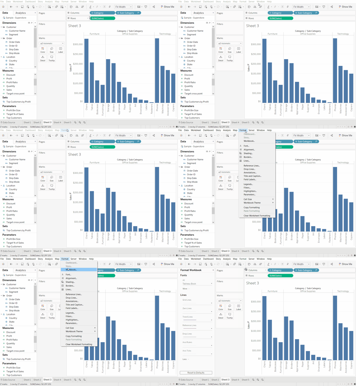
For a long time, I spent hours messing around with formatting on a sheet by sheet basis. Grid lines? No, thank you. Tick lines? Um, hard pass. I’d get one sheet looking right only to move on to the next one and repeat the whole process. Now, I start at the top, literally. In the drop-down menus at the top of the Tableau window, there’s an option to “Format>Workbook…”. This brings up a special formatting pane that lets you make changes to fonts and lines for your entire workbook.

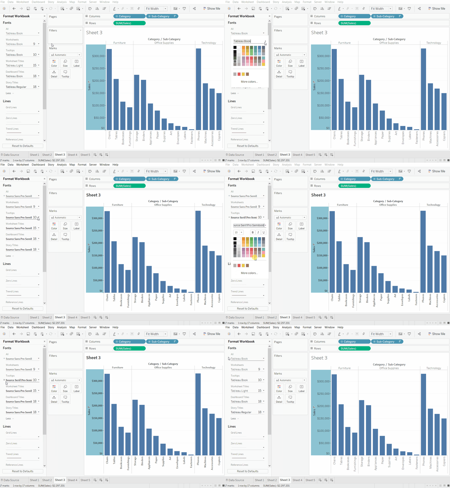
The discovery of this option has streamlined my crusade against chart junk. Test any of the formatting options and see the changes born through the entire workbook. You’ll also notice that Tableau places a little dot next to the formatting you’ve changed. This is a subtle reminder that this formatting option has been changed from the defaults. It’s also a godsend if you, like me, tend to change a bunch of settings, realize you’ve made a horrible mistake, and want to go back. You can undo formatting option by option by hovering over that little circle and clicking the “x”.


If you want to take the whole shebang back to basics, you can click “Reset to Defaults” at the bottom.
Format sheet
Alright, that’s a nifty trick for the whole dashboard, but what about formatting on a sheet by sheet level? Maybe just one of your sheets needs to be in Wingdings font. Well, for that you can always right-click anywhere on your sheet and click “Format…”. This brings up a formatting pane that looks a little different from the overall formatting pane.

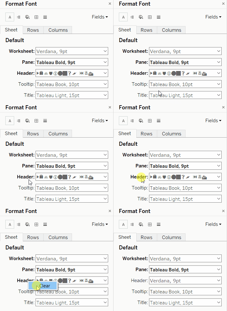
Note that there are a lot more options here. How to keep track of what’s been changed? There’s no handy little circle to clue you in this time. However, there is a different way to know what’s been altered. Bold words next to the formatting drop-downs mean that they’ve been changed from the default. If you made any changes on the “Format workbook” pane, then the bold text will indicate departures you’ve made from the formatting you indicated there.
Similarly to the format workbook pane, there’s a button to “Clear” your formatting. This takes all of the formatting options on the tab back to the default you set in the “Format workbook” pane or to the Tableau defaults if you haven’t set any overall workbook formats. It doesn’t change formats on any other tab. But what about that handy circle and “x” trick? It’s here too! Just in a different form. Right-click on any of the bold text titles to bring up a menu to clear the formatting for that option.

There you have it! Any more visual cues you use to navigate around Tableau? Leave a comment! Stay tuned for more in the “Why’s it look like that” series coming soon.
