


Going into the second week at the Data School, I was keen to continue learning and come to terms with all the new aspects I was still yet to discover. This blog will give a run down of content covered, along with my own personal insight and escapades.
Building the foundation
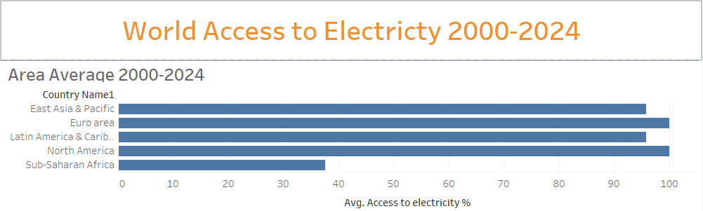
The week began with learning the foundations within Tableau Desktop. Content covered learning all the Mark Types as well as chart types such as bar, line, scatterplot and maps. The second part focused on visual elements and context, and how each of these contribute to communicating visualisations to a user. Monday ended with our first Makeover Monday session, which definitely had plenty of learnings for my personally. The task was to update the below visualisation of Access to electricity Map in Tableau. However, I made crucial errors.
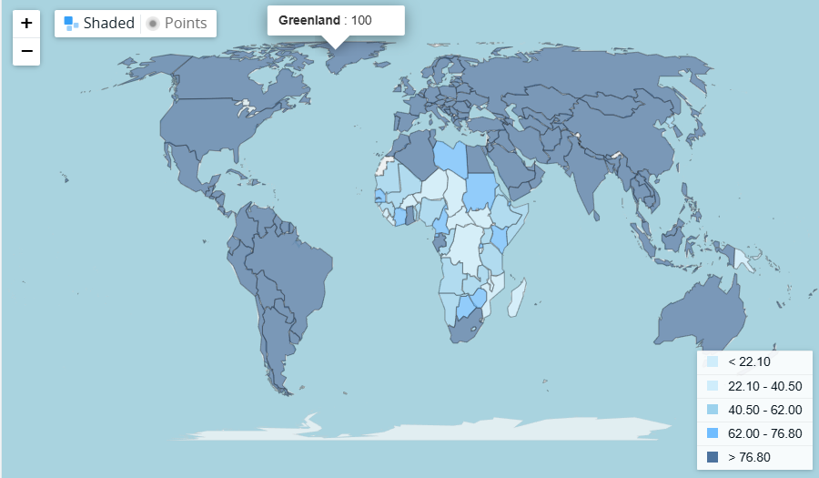
Unfortunately, I struggled badly while trying to clean the data to leave only the country specific figures to create a map from. Ironically, not listening to my own takeaway from last week I did not at any point think to ask anyone for help. To no one's surprise, the below is the best I could come up with.
Safe to say an utter failure. However, I know it will definitely remain in my memory for a long time as a reminder to never sit an struggle, and rather ask for help (which I thankfully did as the week went on).
Tuesday and Wednesday continued learning in Tableau Desktop, covering all of the menu's in the top ribbon such as Data, Analysis and Map discussing the functions and options within these menu's, followed by filtering options. Content then progressed to dashboard design & interactivity, which involved learning about the fundamentals of design such as colour, consistency and communication through the dashboard. The valuable technique of containerising a dashboard correctly was shown, which will definitely help to solve some of the issues I had building my dashboard for the applications.
Thursday covered the differences between descriptive, exploratory and explanatory analysis in consulting in conjunction with the strengths, and when to use and not to use each approach. This flowed wonderfully into Project Management 102, learning about user and user stories; how to create a narrative for client when it comes to creating solutions as part of a project.
This culminated in the Friday Client Project, where we were tasked with creating user stories for a prospective client, then using our knowledge of charts and dashboards to create suggestions suitable to fulfill the task of the client.
Highlights & Learnings
This week we had our photoshoot for our DS 53 cohort, and as someone who is not a fan of pictures, picture days or any variation of it. But with many laughs, unserious poses and coaxing the pictures were taken, eventually...
The Friday Social's after work are definitely an enjoyable way to start the weekend, especially after the long day of Client Projects. It's good to reflect on the week and share laughs before heading off, and are becoming part of my favourite aspects of the Information Lab.
The technical concepts will definitely require extra practice, as there is such a wide variety of tools to make use of. Making a passion project into an opportunity to practice and make use of new techniques learnt during training will definitely be key. There are a few ideas brewing, hopefully at some point I can blog about them!
Upcoming...
It appears this Week 3 has PowerBI and PowerQuery, Stats and more Client Projects ahead!