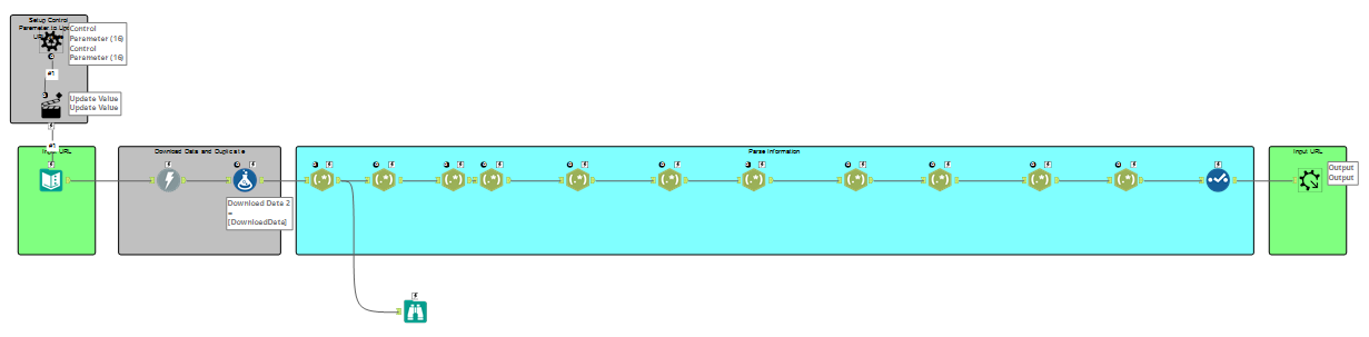
For our second day of dashboard week we had the unique task of web scraping the Bundesliga website for data on different teams performance in the last 20 years. As a result a lot of the time we used today was just using Alteryx to download and scrape the data I needed with RegEx. Moreover, because we were looking for data in multiple years and seasons it was necessary to use a batch macro to extract data from different years as the URL of the Bundesliga website changed depending on the selected season.
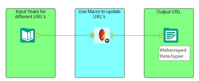
Once I had built the macro I needed only to insert it into a 3 tool workflow that allowed me to update the URL’s with the years I was interested in, giving me a great deal of data from 2000-2023.
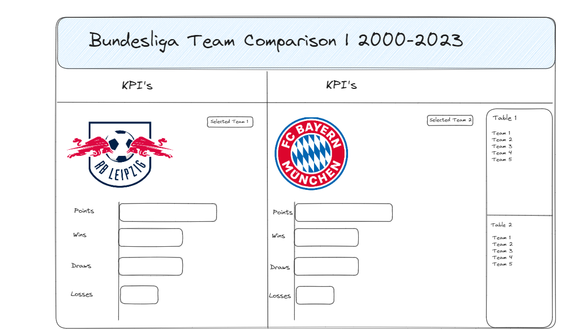
With the data I had extracted I wanted to answer the question of not only how teams were performing but how can I compare teams in a given season to one another and what teams perform similarly to the ones I selected? How also did the teams I were interested in compare to the year or season before? To this end I created a quick sketch of how I envisioned my dashboard. What I wanted to use the table for was a set action that would highlight the team a user selected then showing the nearest 4 teams in terms of performance.