Introduction
Title are an important part of any dashboard. They can have stylistic, contextual and descriptive importance for what you are presenting, which may make it worth your time working on improving them. Here’s a look into my thoughts on the topic and how I acted on this on the demonstration dashboard.
There are many kinds of common titles that you will come across on dashboards, from big main “dashboard titles” to chart and pane titles. Each of these can also have sub-titles, or other information/ symbols included adding to their use and value.
Dashboard titles
In the goal dashboard, I have used titles in a few different formats and styles, and I will try to explain the reasons behind my choices.
Things to consider:
- The text
- Perhaps the most important consideration is what text you actually include. This is the message you give the user of your dashboard and can confuse or simplify the rest of the visualisation.
- Font(s)
- This may sound trivial, but the font choice you make can be important. Whether it follows a company branding, suits a theme or topic or adds value in an artistic sense, it’s worth finding what is most appropriate to use. Need something to stand out? Use a bold font. Talking about medieval times? Use a gothic font. Talking about Polos? Use a Polo image for each ‘o’. Publishing to Tableau Public? Check out this list of supported fonts
- Text colour(s)
- Use of text colour can vary for titles. Perhaps you have a title and a sub-title and want to draw peoples eyes to the main title first, then perhaps using a colour that stands out better for the main title is the best choice. Whether this is a dark, light or vibrant colour largely depends on the background colour of your title and the colours used in the rest of the visualistation. Perhaps you have are intending the viz to represent a company; in which case you may want to use a company colour or one which goes with their logo. You can also use colour, much like with the fonts, to add to the context of your viz in an artistic way. It can also be useful to vary colour across a title, perhaps a more prominent colour for what is most important and then changing it to something lesser for the less important stuff. Another use of colour is for a legend which we will cover below.
- Background colour
- If your font and background are the same colour, then no one will be able to read it. You’ll likely need contrast to stand out and draw eyes to where you want them. It’s usually safe to choose a light background for dark text and vice versa.
- Sizing
- Probably big. You likely want people to see it and we look at big text. You probably also also want it on one line, but this may vary down to personal preference. You can also make use of varying the size as you go to once again direct the users eyes where you want them. Dashboard titles are probably going to be the biggest, followed by chart and pane titles.
- Dynamic text?
- Titles can be made in a way that adapts to the data or how the user is interacting with the viz. I will show an example of doing this later on and it can be a great way to add context and clarity to what you are showing.
- Legend?
- Sometimes it can be good to incorporate a legend into a title itself. See the image below

So what did I do?


Here I use a large (22pt) font and all caps to draw the eye to the main title of the viz. I want users to look there first. I’m keeping font choices simple as this is intending to be a business style viz. On the right I made use for a smaller font, dropping the bold, changing to lower case, a ‘|’ to create a divide and a less prominent colour against my white background. This part of the title adds context, but does not necessarily need to be viewed first.


Next I used smaller fonts (15 & 12pt) in a similar fashion to the main title for three of the charts. I keep a consistent theme and use try to be as clear as possible in a short space. The extra info that is lighter adds more context into how the charts are broken up and how values are calculated, without cluttering anything up too much.
KPI BANS
Most of what I’m about to mention comes from training with Andy Kriebel.
This title is jargon for those three charts on the left showing some ‘key performance indicators’ (KPIs i.e. measures of how well something is) using some ‘big ass numbers’ (BANS). Alongside these numbers are small ‘sparkline’ charts to show a trend and add further context to the numbers.
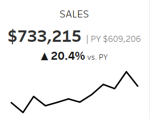
I learnt how to make these from Andy Kriebel and he has a tutorial on them here. Essentially they are line charts with titles showing the KPIs.
Notice here how the big number stands out more than the title. In this case I believe this to be the most important part for the chart and where I want peoples eyes to go. Then in almost descending size order and saturation is where I want people to look after, for more information on what these numbers mean and why they are important.
KPI construction
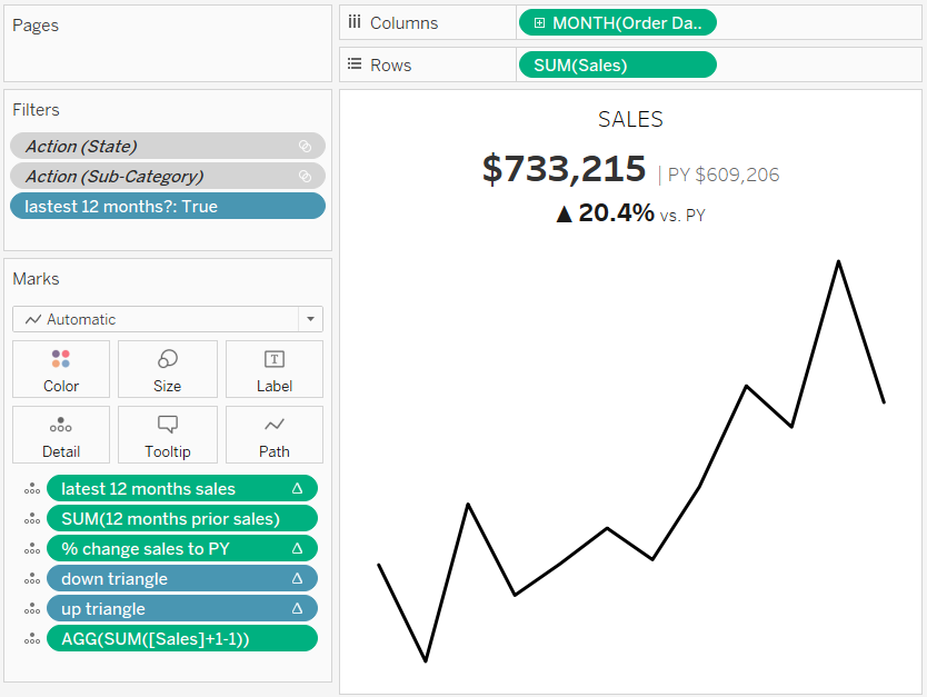
Before you start shouting at your monitor about what all these pills on the marks shelf are, or what these gray filters are, let’s break it down as it is not as bad as it looks.
Step 1: Creating line chart
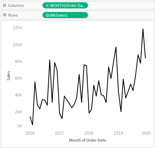
The first step is to create the line chart, which you can do by placing the order date (from the sample superstore dataset mentioned in the first blog) and setting it to continuous months. I’d recommend doing this by right click dragging the order date onto the columns shelf as shown here. Then add sales to the rows shelf. You can hide the headers by clicking on them and deselecting ‘show headers’.
Step 2: Creating calculations
To get the sales for the last twelve months, you can use three calculation. One to sum the sales in the view, one to find the latest month in the dataset and one to filter out anything other than the last twelve months from this latest month.


Now we can place this calcualtion on the filters check to keep only dates that are within the latest 12 months (i.e. the calculation = True)
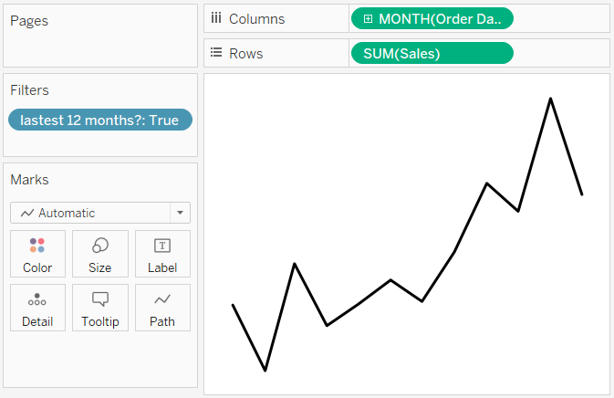
One of the BANs to make is the total sales in the last 12 months and we can do this with a window sum as below:

We also want the 12 months sales prior to the latest 12 months (i.e. 12 to 24 months ago) and we can do this with a new calculation to check if the date is in this period and then summing the sales if so.


Then finally, to get the % change from the previous 12 months (PY) to the latest 12 months, I used the following calculation

Step 3: Adding the calculations to the details shelf.
To get these numbers into the titles they need to be included in the view. One way to do this is to add the calculation to each mark, by putting the calculation on the details on the marks card. The first three pills on the marks card are the calculations from above, with the latter three being small things we will quickly go over.
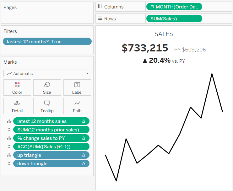

This weird looking sum of sales is essentially just another copy of the sum(sales) value that I can format separately to the one in the view. +1 and then -1 doesn’t change the value so it’s still the sum of sales.
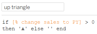
You may have noticed the use of a little triangle for the KPI to show a positive or negative change. These calculations work by returning an up triangle if the value is positive or a down arrow if it is negative. The reason here that the up and down calculations are separated is due to formatting each differently as you will see shortly.
Step 4: Actually using all these calculations

Once again to looks like a mess, but all that is happening is adding our calculations in and formatting how we want them to look. Big bold numbers, red for negative change and a variety of other factors as discussed earlier.
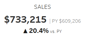
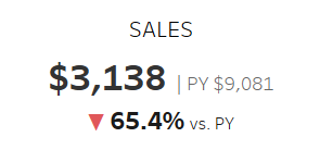
Finished KPI BANs w/ Sparkline
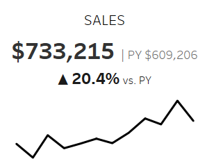
Now we have covered the steps that go into making one of these, I hope that shines some light on any areas you were unsure about. Now that sales was down, I then repeated this for profit and then the average sales per customer, which I won’t go into in any detail as they are very similar. Personally I prefer to use a plus or minus instead of the triangles and this is what I did for the others, but the steps are the same if you wanted to colour the symbols too.
Conclusion
I hope my thoughts on how to use titling effectively was interesting to you and the demonstrations of how these thoughts affected my actions with the demonstration workbook helped.
We are one step closer in this series to completing this dashboard and there are many exciting tips coming up! Next stop will be making the main charts.
What do you think of the sizing, text, colours (shades of grey count!), context and fonts used here? Do you think these considerations were meaningful, useful, too grey? Please let me know what you think over twitter @chris_vizes
Once again, shoutout to Andy Kriebel for all the tips and help making the charts with BAN KPI titles.
