What are all these blogs about one dashboard? Check out the introduction blog here.
Introduction
Hex maps are a mapping technique that many people have covered, but there a couple different techniques for making one. They each have their own characteristics and pros/cons. Let’s talk about them and give one a go.
Here’s a hex-map if you haven’t seen one before, it’s a map of US states tiled into hexagons. (Spoilers: we’ll make this one later)

Let’s take a step back from just wanting to make a cool looking map for one second.
Why create a hex-map?
A conventional map break down areas into smaller regions. In the case of a world map, it’s probably the surface of the earth split up by countries, but it could be a country into regions, Europe into EU and non-EU. In these cases, the geographic shape of these regions are portrayed (think the squiggly edges of Greece) and the size of the shape is proportional to the area of that sub-area. France is bigger than Belgium and so it usually takes up more space on a map of Europe.

This can work well if the area of the country and the shape of it are important. But this is not always the case. Maybe you want to see which parts of the UK voted to leave the EU in 2016.
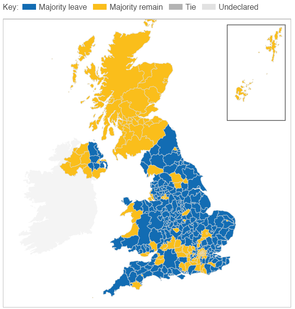
Using a conventional map, with the area broken down by each voting region, at first glance it looks like 1/3 or so has a majority remain outcome and this largely comes from Scottish votes. But, this is not the case. The area represented by remain winning areas is about 1/3 of the UK, but not 1/3 of the population. The referendum result is not proportional to area of each region and so this map can be misleading. Most of the remain support came from England.
You can instead represent the result using a map that does not place as much importance on accurate geographical importance and rather on what matters; how each area voted.
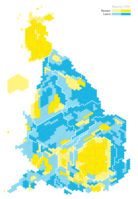
https://www.theguardian.com/politics/ng-interactive/2016/jun/23/eu-referendum-live-results-and-analysis
This hex-map allows easier interpretations of what the overall outcome was as the number of votes for or against is proportional to the area shown in the map. Scotland has a comparable population to Greater London, hence they are both represented by a similar number of tiles. In the conventional map, the area of Scotland is far greater than London’s, which makes it looks like it has a far greater voting power, but it doesn’t. It’s a similar story of much of the countryside of the UK compared to it’s cities.
I’m not saying that hex-maps are the answer to all your mapping needs, nor are they the perfect choice for the map above. You start to lose the ability to make geographic comparisons with these maps because, well, they are not geographically accurate. Where is my region? Hmm it’s moved and I now can’t find it. That’s an issue.
Make your choice on how to map and try weigh up whether it is the best choice. Consider something unconventional, but don’t forget about the most basic forms.
Why hexagons?
Tessellation. Closest tessellating shape to a circle. Why is a circle good? It’s borders are all equidistant from it’s center. Why’s that good? It’s a more accurate way of representing where the data is. Is that it? Nope, but it’s late in the day and I want to go to bed.
But don’t listen to me, listen to a cartographer (about the shapes, not the bed bit).
Here’s a good blog for more discussion and some great points on the subject
How to create a hex-map
Two ways (that I know of):
- Download a table that has a coordinate of each state defining where each hexagon should go and then join your state-based data to it, showing a hexagon shape at each of the coordinates.
- Download a shapefile with made of hexagon polygons for each state and join your state-based data to it.
1. Shape and coordinates
This may feel like the simpler option to those who haven’t used a shape file before as it’s essentially a scatterplot of hexagons, but it requires a similar amount of work and can be harder to format with flush tessellation.
You can find a great demonstration of how to do this here:
https://www.tableau.com/about/blog/2017/1/viz-whiz-hex-tile-maps-64713
2. Shape file
I personally prefer to use a shape file is possible and I’ll walk you through how to do so.
First of all, you’ll need the shape file and you can get it here (from a blog by Joshua Milligan).
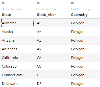
The shape file (the file with a ‘.shp’ at the end) has two fields about the name of the state that you can join to in Tableau and then another field called ‘Geometry’. This is the field that contains the ‘shape’ that makes it a shape file. Each state has it’s own Polygon, which in our case is a hexagon with a position.
We can then join this polygon/ hexagon onto each of our rows based on what state is in this row.

Now you can add ‘Geometry’ to your worksheet (by double clicking it) and you have some hexagons placed over Cameroon. Why Cameroon? The shape file has an associated geographic relationship with it’s polygons and it just so happens the creator of the file put the hexagons over Africa. Ignore this, we can washout the map in the background .
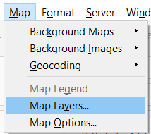
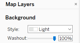
Tableau will default to ‘collecting’ all the hexagons together, because it currently doesn’t understand how to use each one.

To get each state as it’s own mark we can add ‘State’ to detail on the marks card.
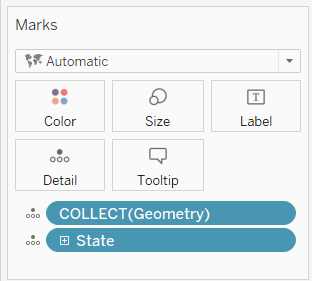
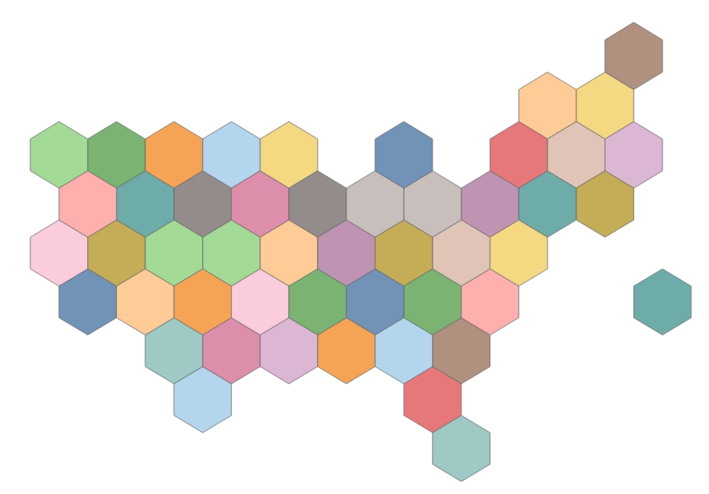
By putting ‘state’ also on colour we can see that each state is it’s own mark now and we are now ready to use it however we wish.
So how did you use one?
I wanted to show the profit of each state and so I placed sum(profit) onto colour, but I also wanted to make it clear which state was which (as we lose some of the geographic accuracy with this map type), so I also added the state abbreviation to label.
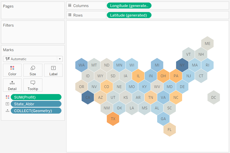
And there we have it. A hex-map showing the profit of each state.
If you’ve looked at the demonstration dashboard for this blog series on Tableau Public you may have noticed there is more interactivity on the map that I have not covered here. The techniques to do so ( parameters, parameter actions and conditions statements) are more advanced and so I have left them out of this blog, but I intend to cover this at a later date.
Conclusion
Hex-maps can be a great tool in your data visualization tool-belt. They can allow you to represent geographic data in a format that places less focus on geographic area and position, giving each sub-region an equal area on the map. The position of these sub-regions can also be modified, getting around situations with widely distributed geographic areas (like Alaska on a US state map). Spend some time thinking about the most appropriate choice of map for your visualizations and consider using some hexagons.
What do you think? Have I missed reasons that could affect whether hex-maps are a good choice or not? Do you have any great examples of why they should an shouldn’t be used? Let me know in the comments or via twitter @chris_vizes
