What’s all this about? Check out the introduction blog here.
Floats, integers, currencies and percentages all have a default number format of putting a negative sign in front of negative numbers and leaving positive numbers sign-less. However, sometimes you may want to have +24 rather than just 24. Perhaps the number represents an increase and it is clearer to have the sign of positivity.
Here are some ways to do it:
String calculations
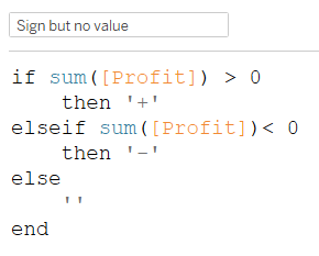
The ole’ reliable, clunky, but dynamic string calculations. Simply create a calculated field that checks whether the number is positive, returning a ‘+’ if so, and if it is negative return nothing (i.e. “”).

Then add to this the string of your number. However, you need to watch out how your number formatting is set up that you show the correct number of decimals/ significant figures.

Formatting signs differently
Credit to Andy Kriebel for showing me this one.
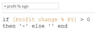
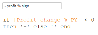
If you want to format the + and the – differently then you’ll need to disable the number formatting (more info). Then create two separate calculations, one checking if the number is positive and returning a ‘+’ and the same but for negativity and ‘-‘. Then wherever you are using these strings you can add them both and set their colours differently. It may seem like both signs will show, but a number can only be positive or negative at one time and your conditional statements return nothing if the other is true. It’s either + or -.


The result


Built in custom formatting
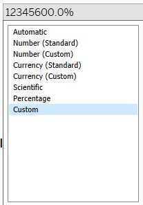
Tableau allows a ‘custom formatting’ in the number format window alongside the automatic options. Here you can split up how to treat positive, zero and negative values on formatting. This can be the most efficient option, compared to string calculations, and probably more familiar to excel users.

What goes in the formatting box?

This is where we define the formatting and how to treat positive, negative and zero values differently.
As demonstrated in the following images, we can split up the box into two regions using a ‘;’. This makes it so all positive and zero values are formatted with the first part (before the semi-colon) and then negative numbers are formatted with the second part.

If you want to treat positive, negative and zero values all differently, you can do so by using three parts, the last of which will define zero values.

The syntax for how you format is not something I’m entirely comfortable with yet, but here are some examples of basic usage.
For more advise on the topic, go here to Tableau, but they pretty much just refer you to Microsoft here. Be aware that the advice is for excel and not Tableau, the latter of which in this case having less functionality.
Examples
- Formatting positives and negatives:
- 0;0 turns
- -8 to 8
- +10 to 10
- +0;-0 turns
- -8 to -8
- +10 to +10
- +0.0;-0.0
- -8 to -8.0
- +10 to +10.0
- +$0.0;-£0.0
- -8 to -£8.0
- +10 to +$10.0
- 000;000.0
- -8 to 008.0
- +10 to 010
- 0;0 turns
- Formatting positives, zeros and negatives
- 0;0;0 turns
- -8 to 8
- +10 to 10
- 0 to 0
- +0;-0;0 turns
- -8 to -8
- +10 to +10
- 0 to 0
- +0.0;-0.0;0.0
- -8 to -8.0
- +10 to +10.0
- 0 to 0.0
- +$0.0;-£0.0;abc0
- -8 to -£8.0
- +10 to +$10.0
- 0 to abc0
- 000;000.0;000000
- -8 to 008.0
- +10 to 010
- 0 to 000000
- 0;0;0 turns
But what’s this got to do with the dashboard you’re blogging about?
I have used the built in custom formatting and string calculations in the dashboard to ensure the numbers display how I want them to.

+0.0%;-0.0%

“$”#,##0.00;-“$”#,##0.00

“$”#,##0,.0K;-“$”#,##0,.0K


I used a string calculation here because I wanted the (+X% of State) part of this tooltip to only show based on when a certain parameter was selected (choosing a state to compare to where ‘reset’ is the default position.) So first of all the string was only created if a parameter was a certain value. Then a ‘+’ sign was added if the number was positive. I also wanted it to have a negative sign but the number was already formatted so that it came with a negative sign when negative. Next the actual number to show was brought in and rounded to the degree of accuracy I wanted, converting it to a integer to get rid of silly floating point errors and then to a string so it can be combined with the other strings. Then it was converted to a percentage by multiplying by 100 (as Tableau stored percentages as decimals), a % sign added to the end and finally the state name. So this one was a little more than just number formatting, but I hope it gives you an idea of what you can do with creating dynamic strings like this.
// only show if a state is selected (i.e. param is 'Reset')
if [state focus] != 'Reset' then
'('
// add  + sign if positive
+ if [profit or profit compared to selected state] > 0 then '+' else ''end

// change number to string and round
+ str(int(round([profit or profit compared to selected state],2)

// convert from decimal to %
* 100))

//add the % sign
+ '% of '

// add the state name
+ str([state focus])

+ ')'
end
Conclusion
Number formatting is cool and fun. The built-in custom formatting is fairly powerful and easy to use (especially the auto options). String calcs are more powerful but also more clunky.
