


Introduction
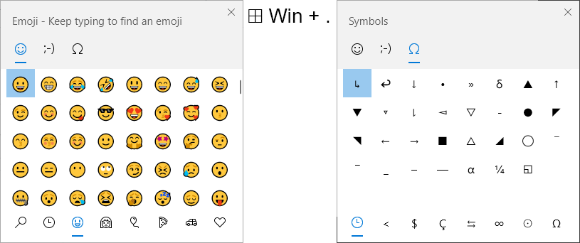
If you’ve ever read one of my blogs or met me, I’ve probably told you about the magic that is the shortcut ⊞ Win + . It opens up a window that allows the user to find and search for symbols, Emojis and Kaomojis.
It’s shortcut magic.
(Sorry Mac users, this one is not for you, but I believe you can used Ctrl+Cmd+Space for a similar experience)
Now I don’t expect you to walk away from this blog adding emojis left, right and center of your dashboards, but I believe that using symbols effectively can have a huge positive impact on your designs. I want to show you the ones that I use the most and give some examples to help cement you in camp symbol.
The symbols ╰(*°▽°*)╯
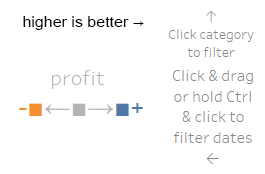
Arrows
→ ← ↖ ↗ ↑ ↙ ↘ ↓ ↕ ↥ ↧ ↴ ↰ ↱ ↵ ↲ ↳ ↪ ↩ ⇄ ⇒ ⇾ ⇱
Probably the easiest to describe, arrows are great for pointing at things and showing a direction of something. Maybe you’re annotating your dashboard and pointing at what you are referencing. Maybe you are trying to make it clearer how a user interacts with a dashboard. Maybe you are creating an axis and wanting to show direction.
A couple examples:
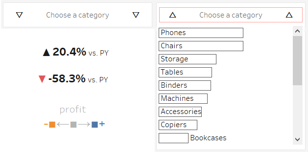
Shapes
▥■▣▦□▤▧▨▬▭▱▰◀◁▶▩▮▯▲△◄◅►◊▪▫▴▵◂◃▸◗◖●◌◈◇◆▷▻▼▽○◍◓◐◑◔◕◒◎◉▿▾▹◙◤◥◩◲◳◪◢◣◚◛◯◧◨◻◫◱◶◵◸◹◬◰◷◴◺◿◼◽◾◭◮
From acting as an arrow, demonstrating a colour in a legend, indicating a dropdown exists or even showing which bars are which, shapes are the bread of the characters world. Coming in a wide variety of forms, well loved and tasty.
Examples:
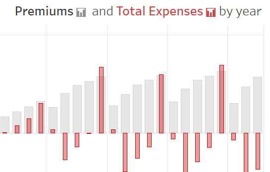
Emojis (hear me out)
📈📉📊💹✏✒🖌📌📍🗑✂⏱⏳🍆🚩
Emojis can help humanize parts of your dashboards and also can make for interesting legends. The pens can be good for showing something it editable/ a text input. The pins can… something to do with maps? I’m not sure about this one but they look nice. Flags can, oh so very literally, be used to flag up a value that needs attention. You can add the bin emoji to a dashboard you don’t like or add a timer to highlight a time factor or even a loading screen. Emojis can be useful!
Check out this example of using Emojis:
How about a little Greek
δ η β ε θ λ γ ζ ι μ ν π τ Ξ ρ υ Σ
You can find a variety of symbols from other languages in this menu too, which may be useful to you.
Conclusion
Symbols can be very useful to humanize a dashboard, add information and instruction on how to use it and make it clearer what you mean. I think it’s always worth keeping a variety of shapes and symbols under your tool belt.
I hope you enjoyed the examples here, but did I miss something? Let me know! Comment here or find me on twitter. Thanks for reading!