


The second day of dashboard required us to web-scrape data from cheese.com and to build a dashboard with the data.
Step 1. Web-Scraping
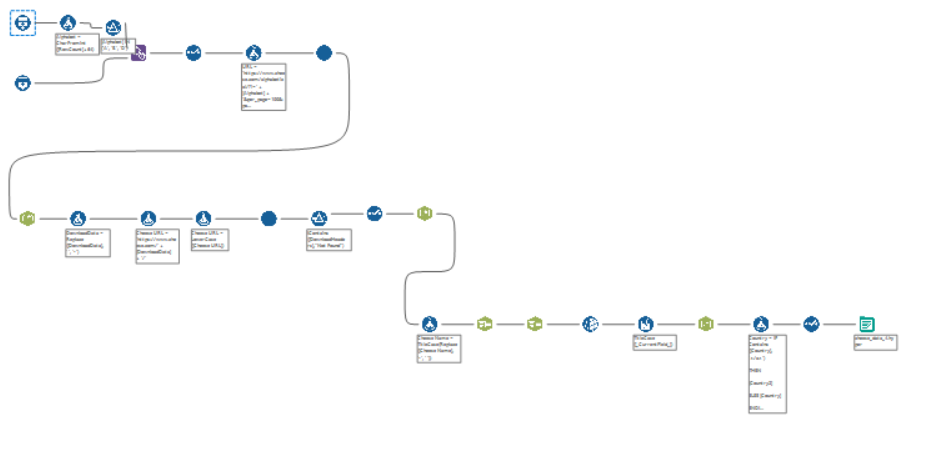
I used Alteryx to web-scrape. At first, I attempted to web-scrape all the cheese in the website, but quickly realized that this would take too long. So I re-scoped and decided to focus on cheese that started with three randomly selected letters.
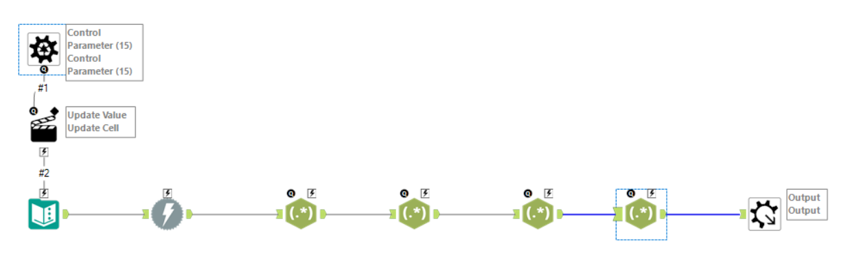
I used two batch macros to scrape the data. The first batch scraped the top 100 cheese results of the first two pages of each alphabet.
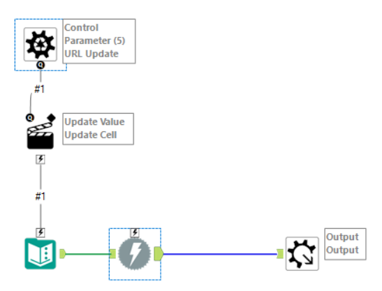
The second batch then scraped the names of the cheese. The batch also included some regex to parse and tokenize the data.
Putting it all together, my final Alteryx workflow looked like this.
The data was outputted into Tableau for visualization.
Step 2. Tableau Visualization
I decided to make an interactive, app-style visualization to allow the user to identify the best cheese for them based on aroma and flavor.
I achieved using a combination of set and parameter actions.
The first step was to create a set action allowing the user to select flavors of their choosing. The 'flavor set' was then used in a calculated field to return aromas associated with the selected flavors.

Then, I used another calculation to return a list of cheese that pertained to both the flavor and aroma sets.

I then counted the number of cheese in both sets by country to create a bar graph showing the countries that produce cheese of the selected flavor-aroma combination.
Next, I used a URL action to allow the user to select on a cheese and go to that cheese's website for more information.
Finally, I implemented several dynamic zone visibility actions to dynamically change the display of the dashboard based on where the user was in the query.
My final dashboard can be found here: https://public.tableau.com/app/profile/charles.yi/viz/DashboardWeek2_CheeseProfilebyFlavorandAroma/Dashboard1?publish=yes