


When creating a dashboard for accessibility you need to consider various people with various disabilities. This is why I tried to take more of a universal design approach where Universal design is the idea that you design for everyone.
This meant trying to make it accessible to people with colour blindness as well as people that rely on keyboard functionality to scroll through a dashboard, or people who rely on a narrator using windows+ctrl+enter to activate.
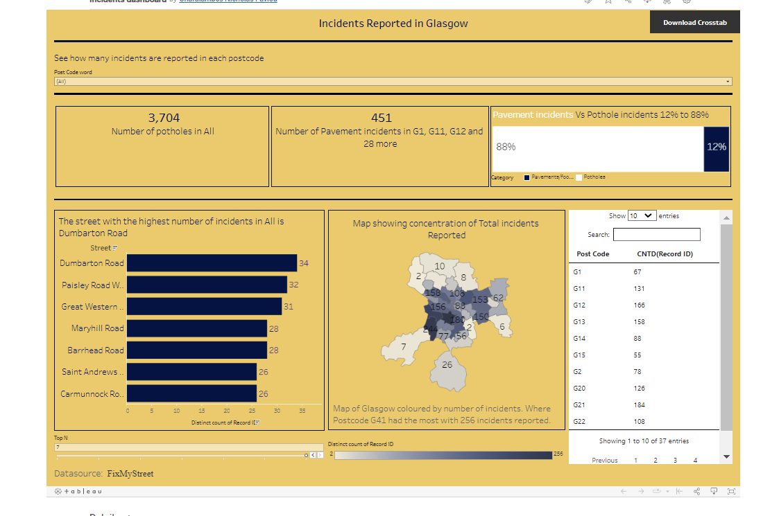
This dashboard was designed to be able to be readable by screen reader as well as accessible by keyboard. To do this all KPI's had to be inserted into the title as the screen reader cannot read anything in the view of a worksheet. I then also used colour that was easy to read based on contrast using Coolers
I also tried to incorporate more captions and information to make it more accessible.