


Today is the first day of Dashboard Week for DSNY Cohort 7!
Dashboard Week serves as a capstone for training here at The Data School NY. Each morning, we arrive to find a convo post outlining the assignment for the day. By 3pm, we need to be ready to present, with a completed dashboard, an Excalidraw documenting our thought process, and a blog about the work we did that day.
Our assignment today was to make an interactive, exploratory dashboard using the College Scorecard data from the U.S. Department of Education.
Upon download, the data immediately overwhelmed me. Loading a few files into Alteryx was slow, and each time I clicked on a tool, it took minutes to load and the application often came up as "not responding." With so much time spent waiting for tools to load, exploring the data was cumbersome and it was hard to retain a train of thought from one view to another.
Why was the data so slow to load? This dataset was incredible WIDE, with over 3k fields. Wide data takes much longer to load since each field contains metadata that must be parsed by Alteryx.
I kept poking around on the DOE College Scorecard website while Alteryx took its time loading my tools. I found their Data Glossary page, which was easier to understand than the other documentation. This page explained different categories of data and then listed the relevant fields in the dataset. After exploring what's available, I decided to scope to focus on field of study. Putting myself in the mindset of a high school student about to apply for college, I came up with the following questions to try to answer:
- What should I study?
- What fields of study earn the most?
- How much will cost me?
- How much debt will I accrue?
- How does this change depending where I go to school?
- Where should I study?
- Can I get in to my school of choice?
- How will the cost vary?
- What are the success rates at the different schools I'm looking at, for my chosen field of study?
A lot of these questions can be answered from the Most-Recent-Cohorts-Field-of-Study file, so my plan was to start there, grab the relevant fields, and then add in fields from other files as needed.
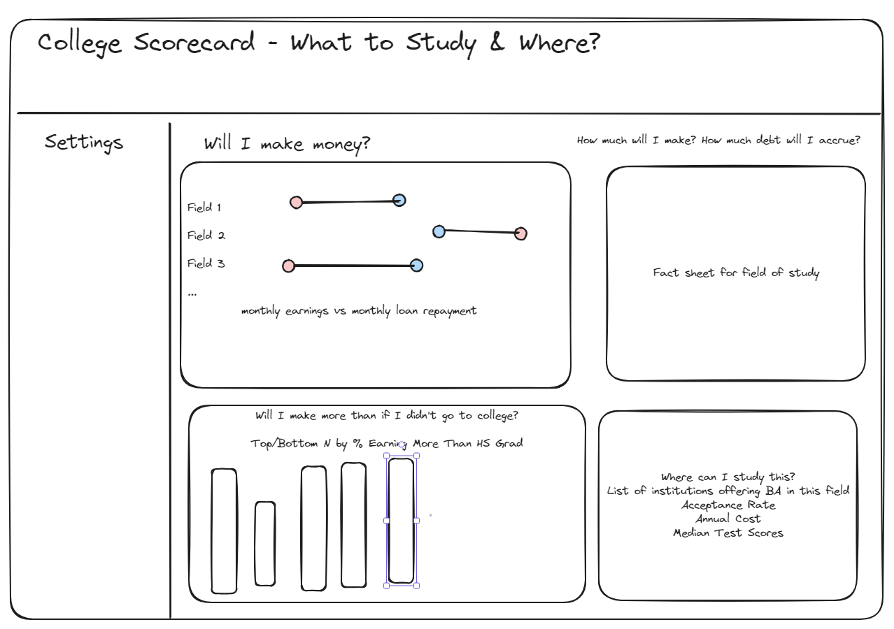
My original vision was to have a dashboard that focuses on field of study and then has drill-down functionality to look at different institutions. With some understanding of the dataset and an initial vision, it was time to move to Excalidraw and sketch out a dashboard.
With my vision in mind, I started narrowing down the dataset in Alteryx. I decided to only work with the Fields of Study dataset, given the time restrictions. I quickly realized this meant I wouldn't be able to get everything I wanted onto the dashboard. I ended up with a summary table of fields of study joined to a table about those fields at institutions offering those fields. With about an hour and a half left, I finally opened Tableau.
I started off by making my main chart, the barbell chart comparing monthly earnings to monthly loan repayment for each field of study, and added in a dynamic sort-by parameter to allow users to sort by gross or net earnings or loan repayment. I realized I don't have to data for my bottom bar chart, so I got to work making the fact sheet for field of study and list of institutions offering degrees in the field.
You can see my completed dashboard here: https://public.tableau.com/app/profile/cecily.santiago/viz/FieldofStudyWorkbook/Dashboard1