The application process is basically a way to show that you are a self starter and can learn tableau on your own. As the saying goes, "You only know what you know." This means that there will be a lot that you don't know. This is where the Data School comes in. They will teach stretch you. We have only been enrolled for 2 weeks now and we have learnt a lot in a short period of time.
The Data school will make you uncomfortable and take you out of your element to then bring you back to being comfortable with everything you are learning.
This week we learnt about Parameters and Sets. Two areas in tableau that comes up in interviews - 'What is the difference between Sets and Parameters?'. It's one thing to know how to describe the difference, but its another thing to understand why and when to use them.
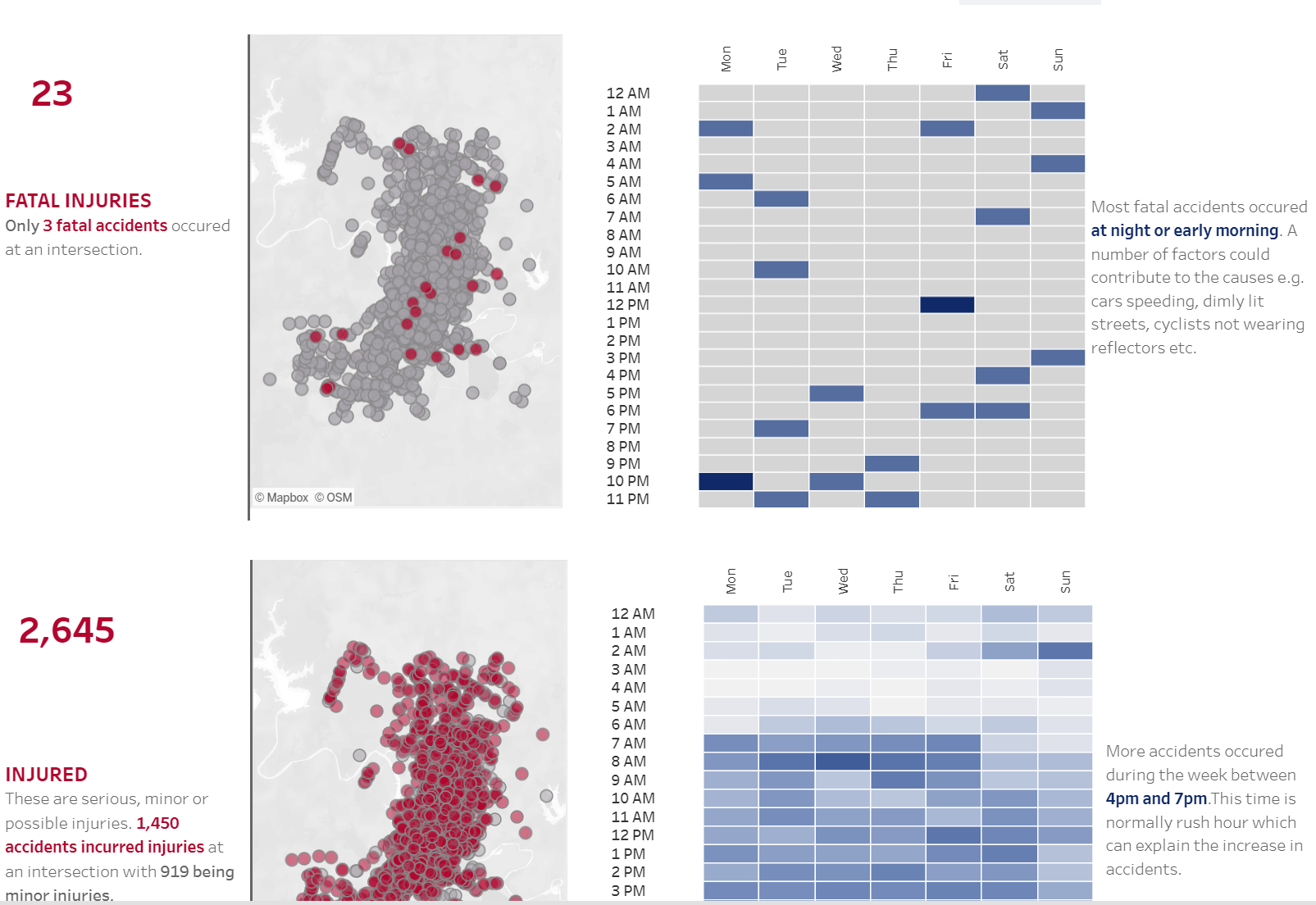
We were tasked to recreate our final application visual using the skills we were taught this week. The feedback from my final interview is that I needed to combine my maps.

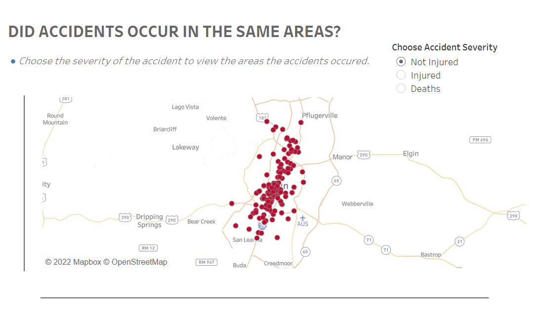
From the knowledge I gained this week, I combined two areas into one. I created three different sets for the different Crash Severity - Not Injured, Injured and Deaths. Next, I created parameters in order to view different maps and be able to switch between them.

Combining sets and parameters not only saved space on my dashboard, but it also made the visual clearer and more interactive.
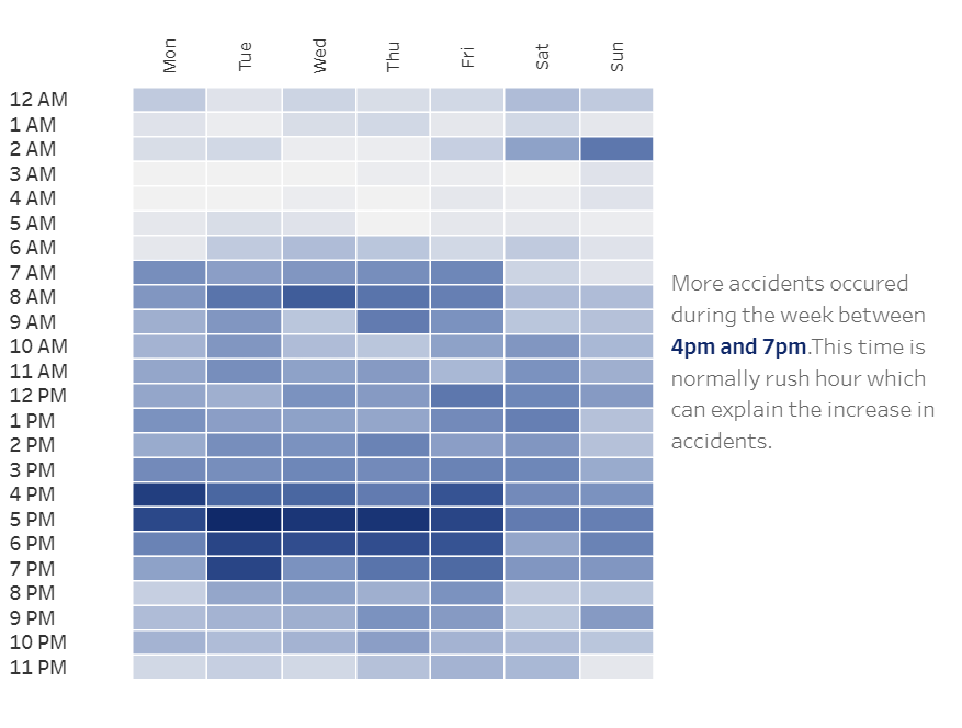
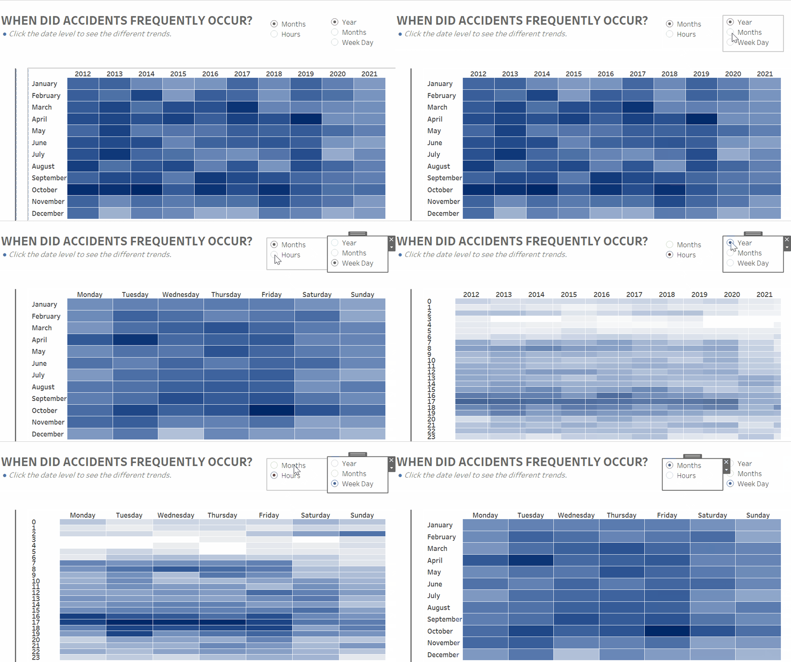
The other chart I changed was the heat map. The new version is a dynamic heat map. I used a parameter for this change. A question were asked in class by Andy Kriebal was; 'Why do we use parameters?'. The answer was; 'to give the user power to make choices depending on what they want to see and analyze. We create the parameters that contain the options.'


I am still improving this chart as I would like to link the map to the heat map so that the heat map will show the trend for the different crash severity. For example, if you choose to view the Deaths map, the heat map should change to show the trend when deaths occurred to see which time frames are popular.
I will keep updating my dashboard as I continue to learn and improve.
