Sheet swapping is useful when you want to switch between sheets with different chart types. Its also a fancy and effective way to save space on your dashboard!
In this mini tutorial, we will use Sample Superstore for our data source. We will create a line chart, bar chart and a map.
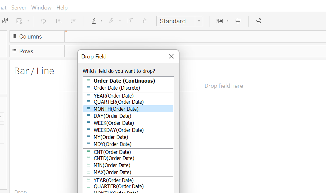
- Click new sheet. Right-Click and drag Order Date to the columns. A pop-up window will appear as shown below. Click MONTH(Order Date). Click OK.
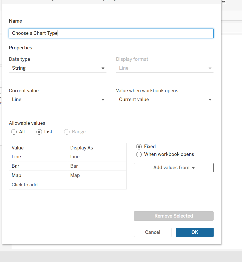
2. Create a Parameter. Name it- 'Choose a Chart Type'.
Fill in the following:
Data Type = String.
Allowable values = List.
Values = Line, Bar, Map. Display As column will be the same as your values.
Click OK.
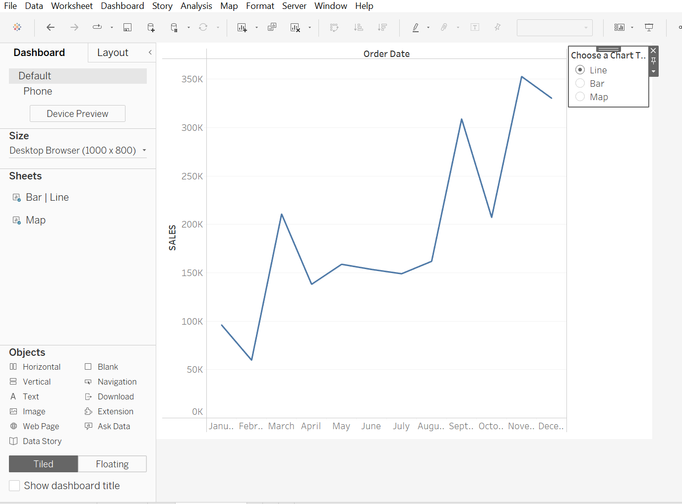
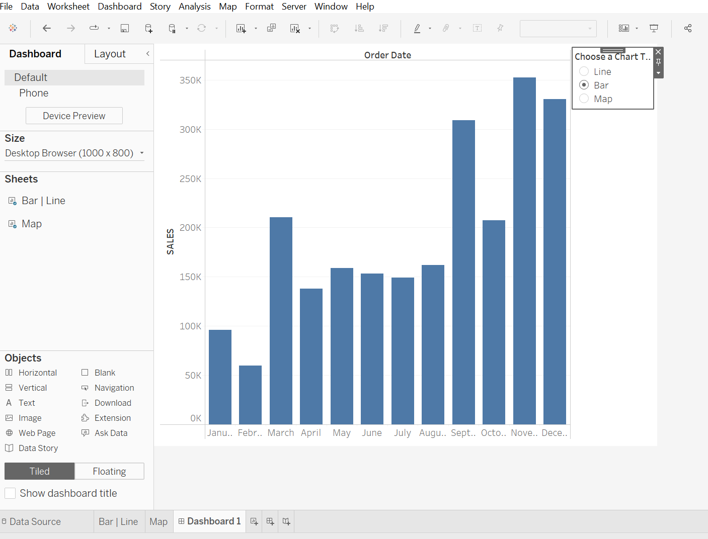
Right click the 'Choose a Chart Type' Parameter and click on Show Parameter. Your Values will show on the right of the sheet.
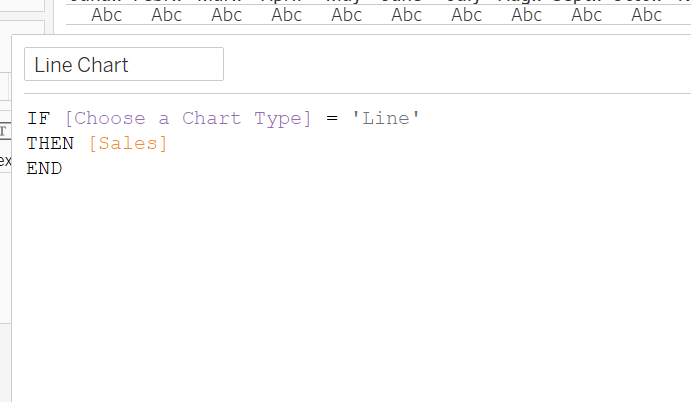
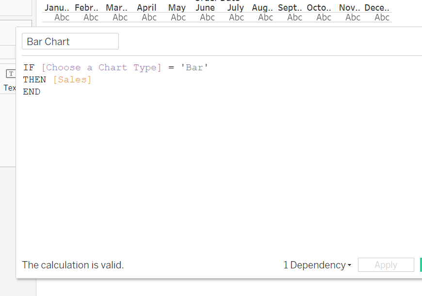
3. Create a Calculated Field - Label it as Line Chart.
Write an IF statement like the one below for 'Line' which will be your Line Graph. Duplicate it and edit the calculated field by changing 'Line' to 'Bar'. Change your label to reflect bar so you know which calculated field is which.
4. Drag your Line chart to rows and bar chart on the right Y-Axis to create a dual chart. Remove header for Bar Chart on the axis. Change the Line Chart Axis to SALES.
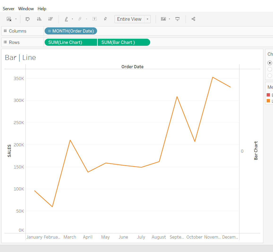
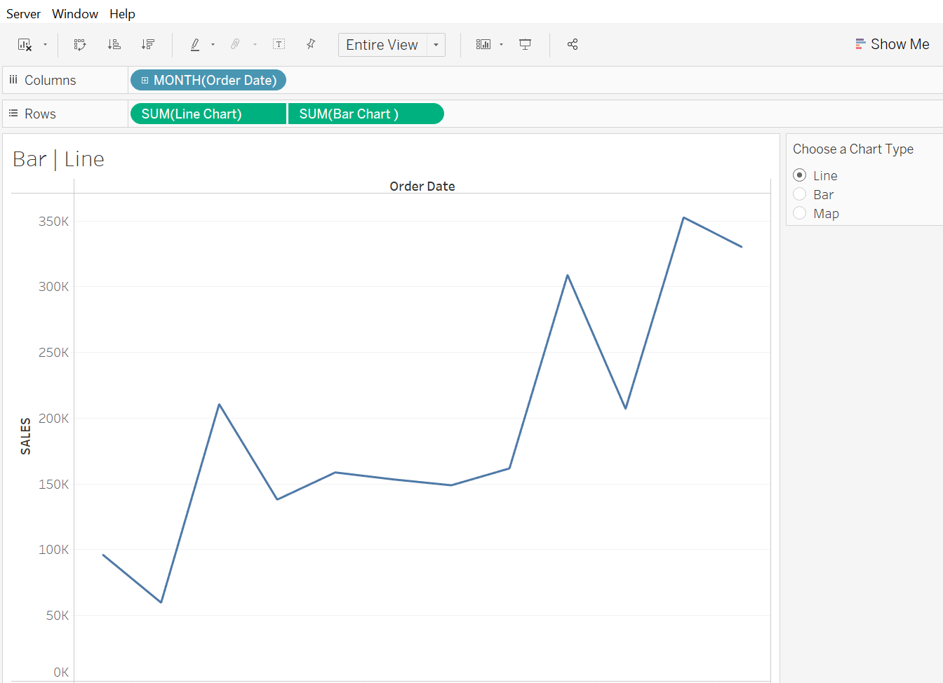
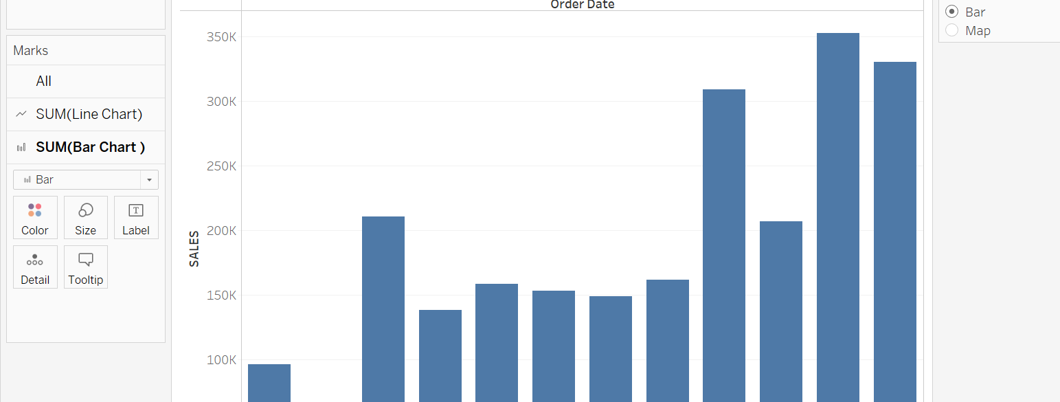
5. Make sure the Bar Chart in the marks card is changed to bar to reflect a bar chart.
Now its time to create the map sheet.
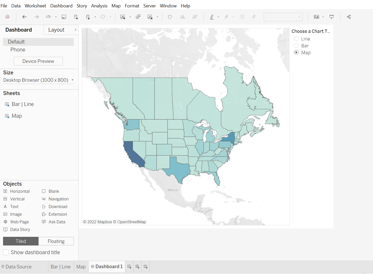
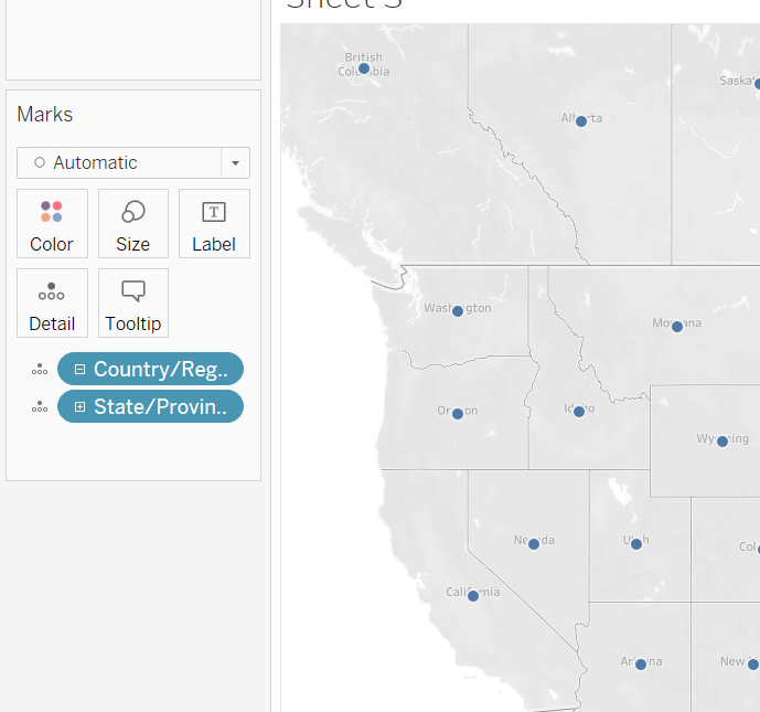
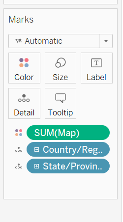
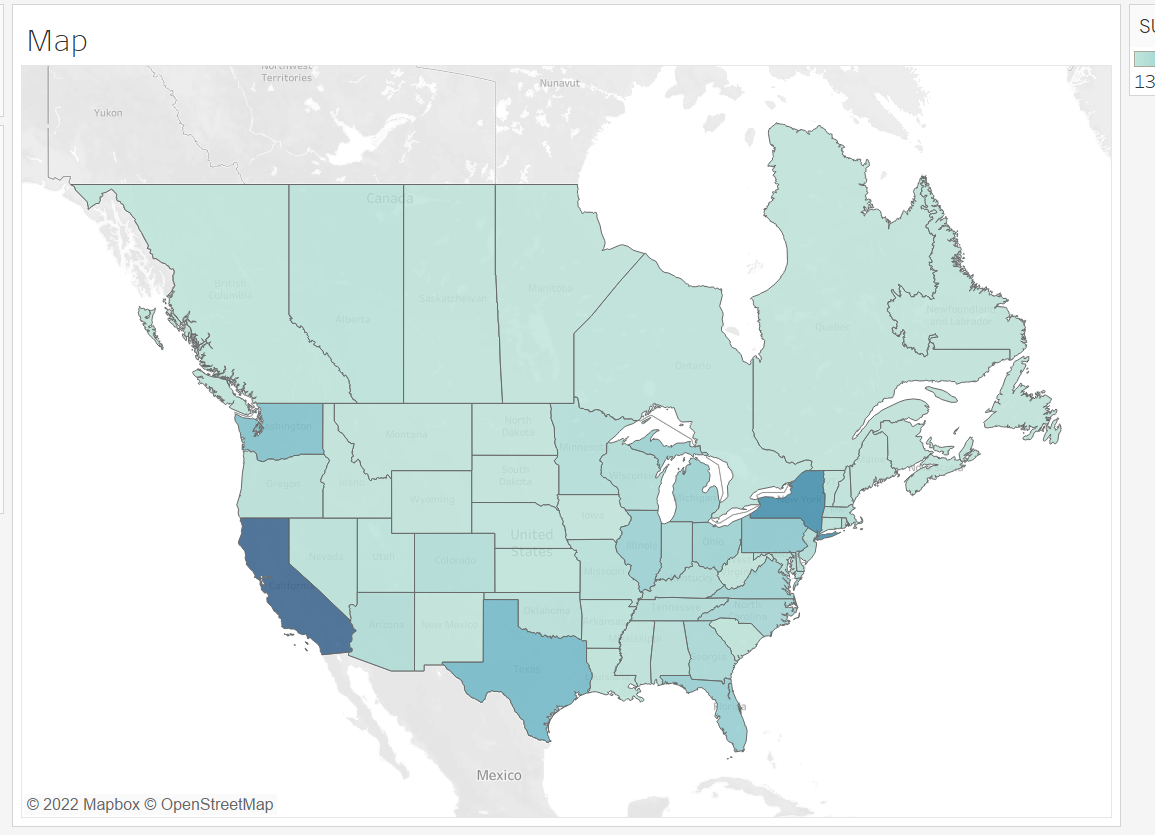
6. Click on new sheet and drag and drop state/province into Detail on the marks card. Your map will be generated with dots on the states.
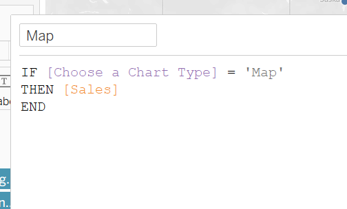
7. We need to link the Map value in our parameter in order for it to be possible to be used. Create a calculated field and name it. Use the syntax in the screen grab below. Click ok.
8. Drag and drop the calculated field into Colour in the marks card.
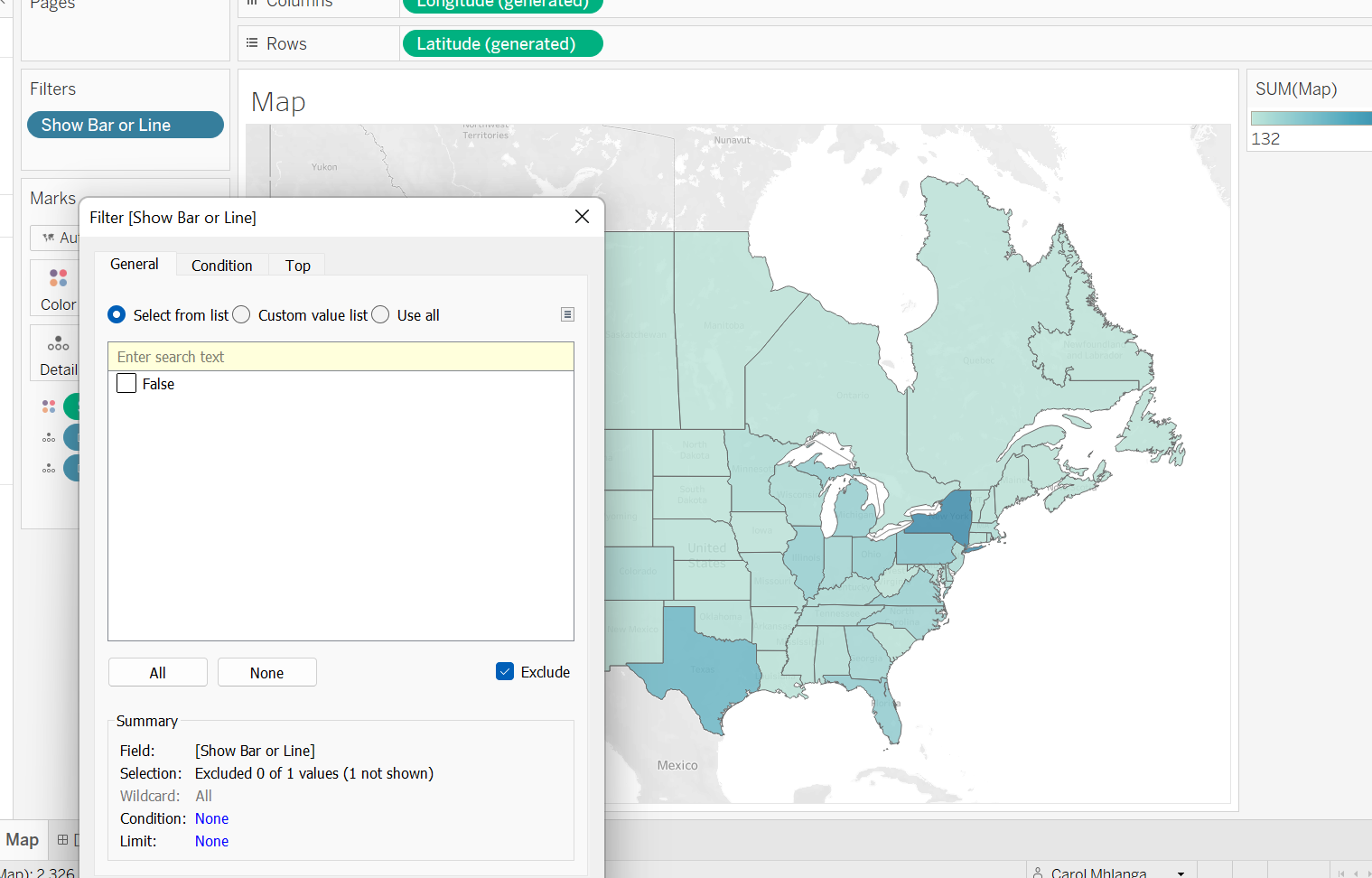
We can now check if our map is linked with the Line/Bar chart sheet through our parameter. Go back to the Line/Bar sheet, choose Map. The sheet should be blank. Go in the Map sheet and you'll see that the Map chart has a gradient colour for sales.
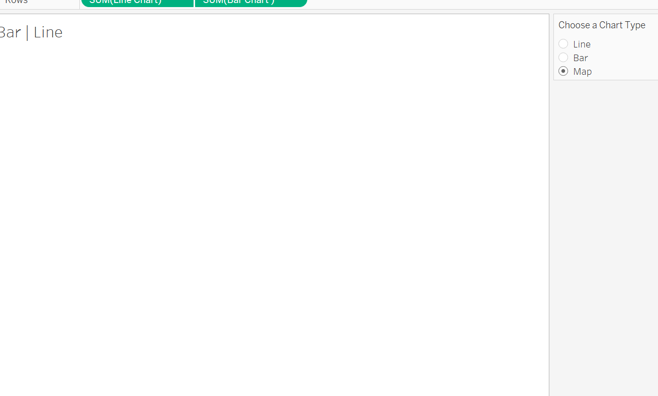
If you click the Line chart or Car chart, the correct chart will show up but the Map sheet will be blank. This is because a parameter can only show one value at a time. So it can only show a bar chart, line chart or map from the parameter we created and linked in the calculated fields for use.
9. Create a calculated field with the syntax in the screen grab below. We use our parameter in this calculation so that we can toggle between the charts.

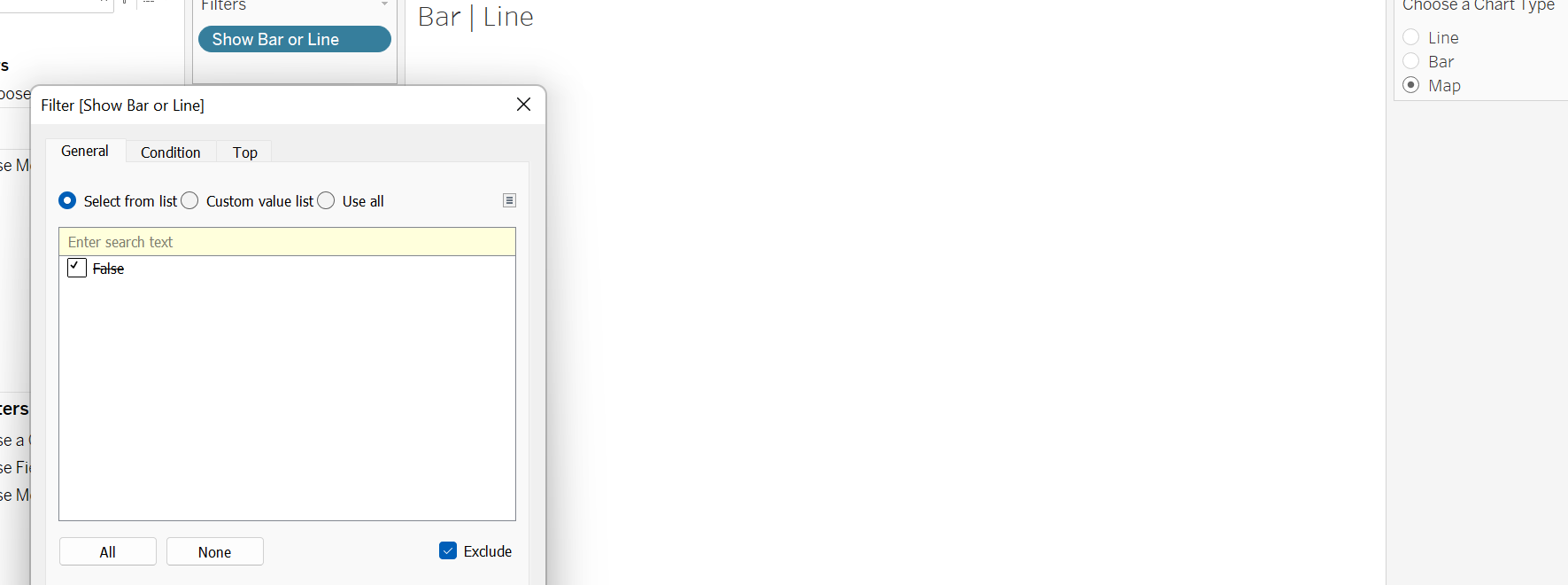
10. Drag the new calculated field into filter and click exclude in the pop-up window.
You want to make sure that when you select on bar, the filtered calculated field pop up window says an unchecked True value and you click exclude at the bottom.
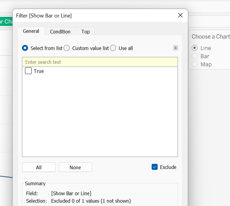
Repeat for Bar. When selected, the True box is unticked and the exclude is ticked.
When you click on map, the window should be blank. There should be a ticked False box and exclude is ticked as well. When you go to the map sheet and click on the filter field, the box should be an unticked true and the exclude should be ticked like the other sheet. This will ensure that our sheets will swap.
11. To pull it together, click a new dashboard. Drag and drop a vertical container into the dashboard. Drag and drop the Bar/Line chart sheet into the container. Drag and drop the Map sheet into the same container. Remove headings. Now you are able to use the filter to switch between sheets.