


Today, Dashboard Week has started! The way everyone puts it, it might not be a fun one…
Data Download and Preparation
Andy has posted our challenge for today just over 10 minutes before 9 and apparently it should be a relatively “easy” one. The topic: agencies using drones in the US. This data has to be exported from Google Maps. That’s where the first problem kicks in… We’ve never exported from Google Maps!
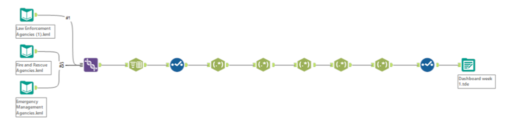
After just under an hour of trial and error, we had to ask Andy for some help. The file was easily downloaded from Google Maps into a KML file but when trying to load it into Alteryx or Tableau, all the columns were blank. Turns out we needed to select a different file type when importing it into Alteryx, this being xml.
Once that is done, the Alteryx flow was a doable one, only really needing to use Regex to extract the relevant information that was all in one single column. The data did not seem to show much at first, only States and Counties but nothing more, not a lot of depth to it. I needed to create a dashboard that makes sense of the data with what seemed very little so once outputted and loaded onto Tableau, I started planning.
Planning and Dashboard Making!
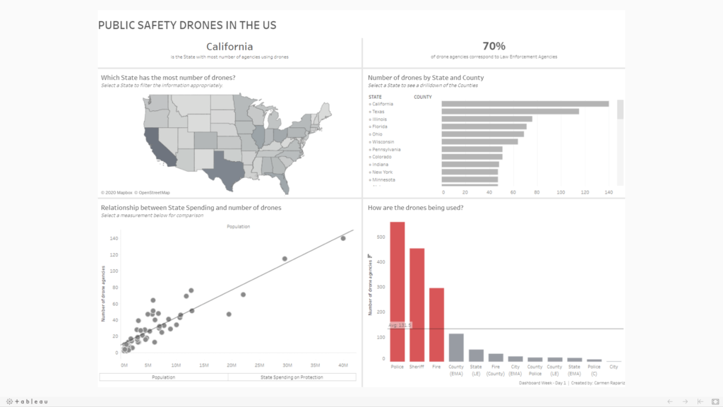
For the planning part of the dashboard I decided to follow Andy’s advice which is: look at the ‘when’, ‘where’, ‘what’, ‘how’ and ‘why’. In this case I didn’t have a ‘when’ so I jumped straight to the next step, the ‘where’ This was what most of the information seemed to be showing so there was quite a lot to work with there. First… a typical map. Surely if you have location data, you need to show some sort of map, so that’s done! Formatting will come in later.
That will answer the ‘where’ for now. The rest of the questions seemed trickier to answer. Each row of the dataset was showing the agencies that owned (not only used but actually owned) a drone. That was essentially the ‘what’ but to show it, I decided to merge it was the ‘how’. How were those drones being used? This would be answer by splitting the data by agencies to see what agency was using more drones.
And lastly, why? Why are those States using more drones? To answer this I decided to add more data, a data set about population and another one about how much each State spends in protection, since the data is about public safety drones. Once these datasets are added, I checked the relationship between the ownership of drones and those two measures by using a scatter plot with a parameter action to be able to change the measure on the x axis.
As a result, the final result of my first day of Dashboard week was…
Excited to see what Andy has prepared for our Day 2 of Dashboard Week tomorrow!
Link to the Viz on my Tableau Public:
https://public.tableau.com/views/Dashboardweek-Day1/DashboardWeek-Day1