


Scatterplots are a great way to visualise data and identify trends and relationships between variables easily. It also allows us to identify anomalies and inconsistencies more easily.
Drawing a regression line (line of best fit) allows us to view the correlations between two variables (ie the impact of smoking and drinking on life expectancy). This allows us to identify strong or weak relationships which in turn can influence future decisions within a business.
For this example, we are going to analyse if an increase in productivity causes a decrease in quality. For this example, we are going to use video game data for Nintendo that contains dates, games released by Nintendo and critics' reviews (Scores) on those titles.

Choosing and adding our variables
The first thing we need to do is identify our variables and our nominal value. If we want to analyse the impact of workload on quality over time then we will need to include: the number of titles released that year (workload/variable 1), meta score (quality/variable 2 ) and year (our measure of time and our nominal value).
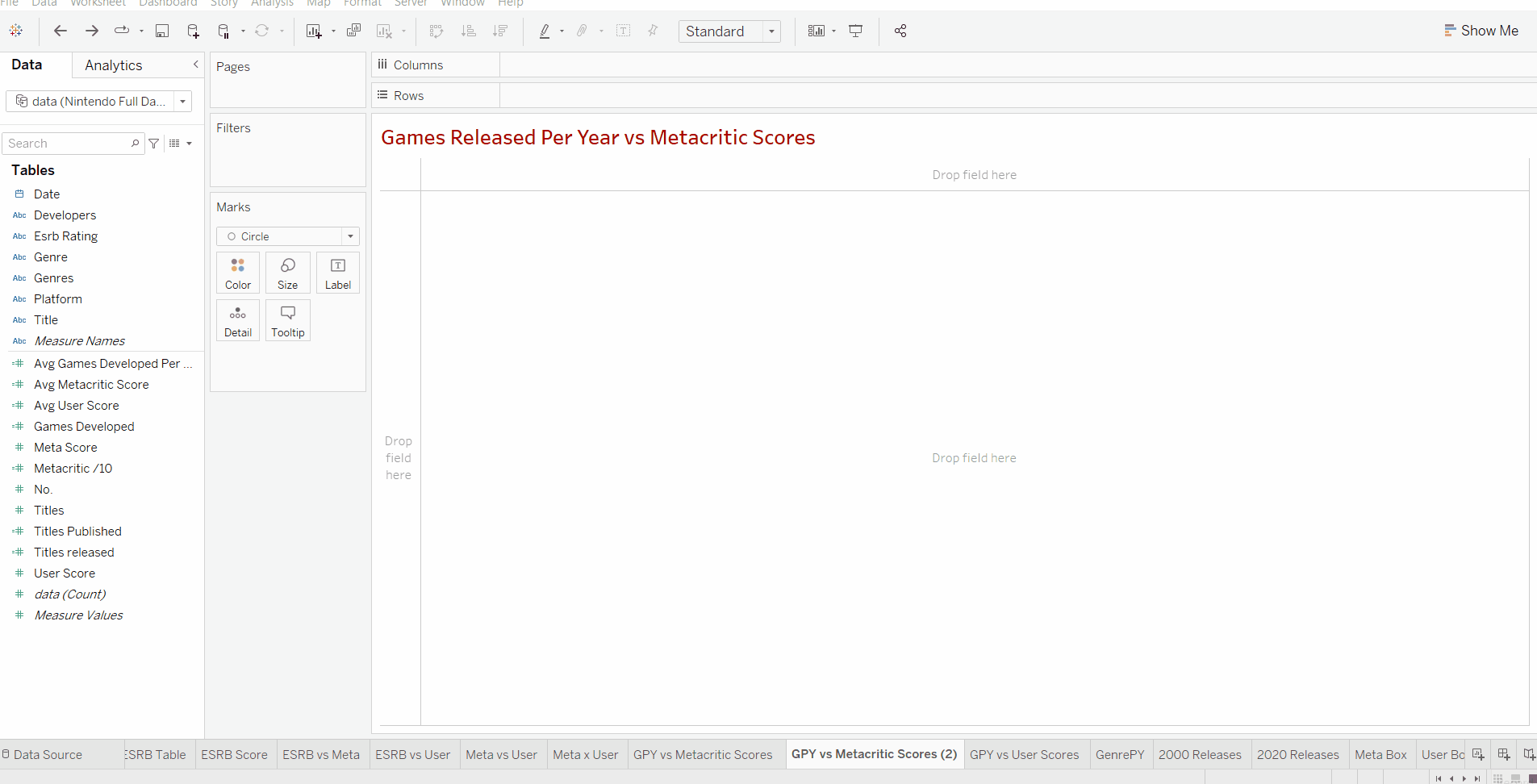
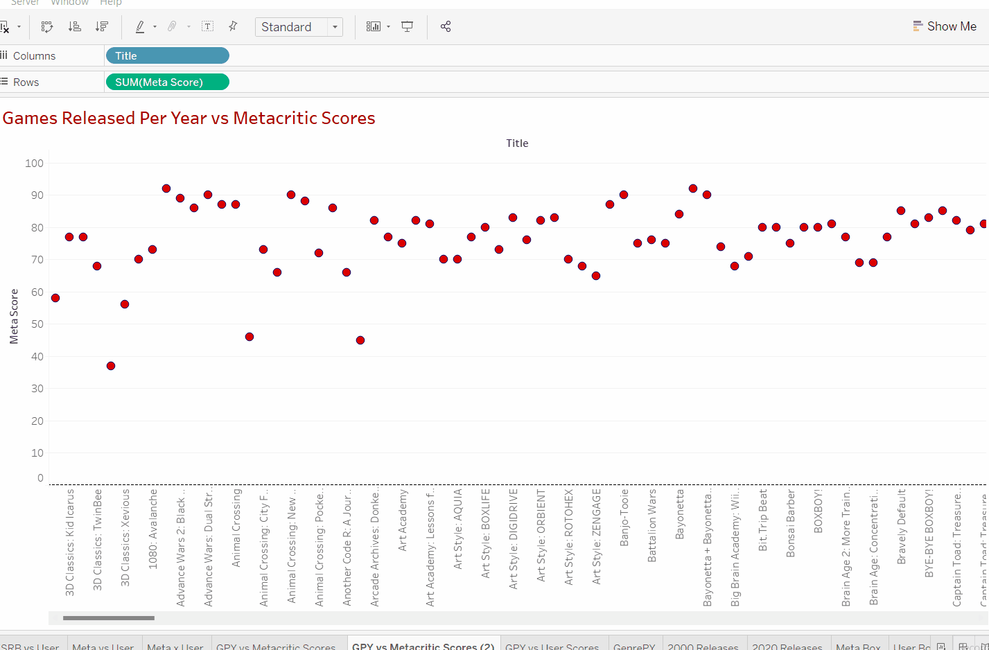
We can see that inserting our title data and scores creates a graph showing a circle for every single title released in our dataset.
If we look closely at our inserted values we can see that our title data is discrete data due to it being shown as a string (game title name). In order to carry out our desired scatterplot and linear regression, we need both our variables to be quantitative data (numbers). Additionally just adding the title names doesn't give us an idea of how many titles have been released in that particular dataset.
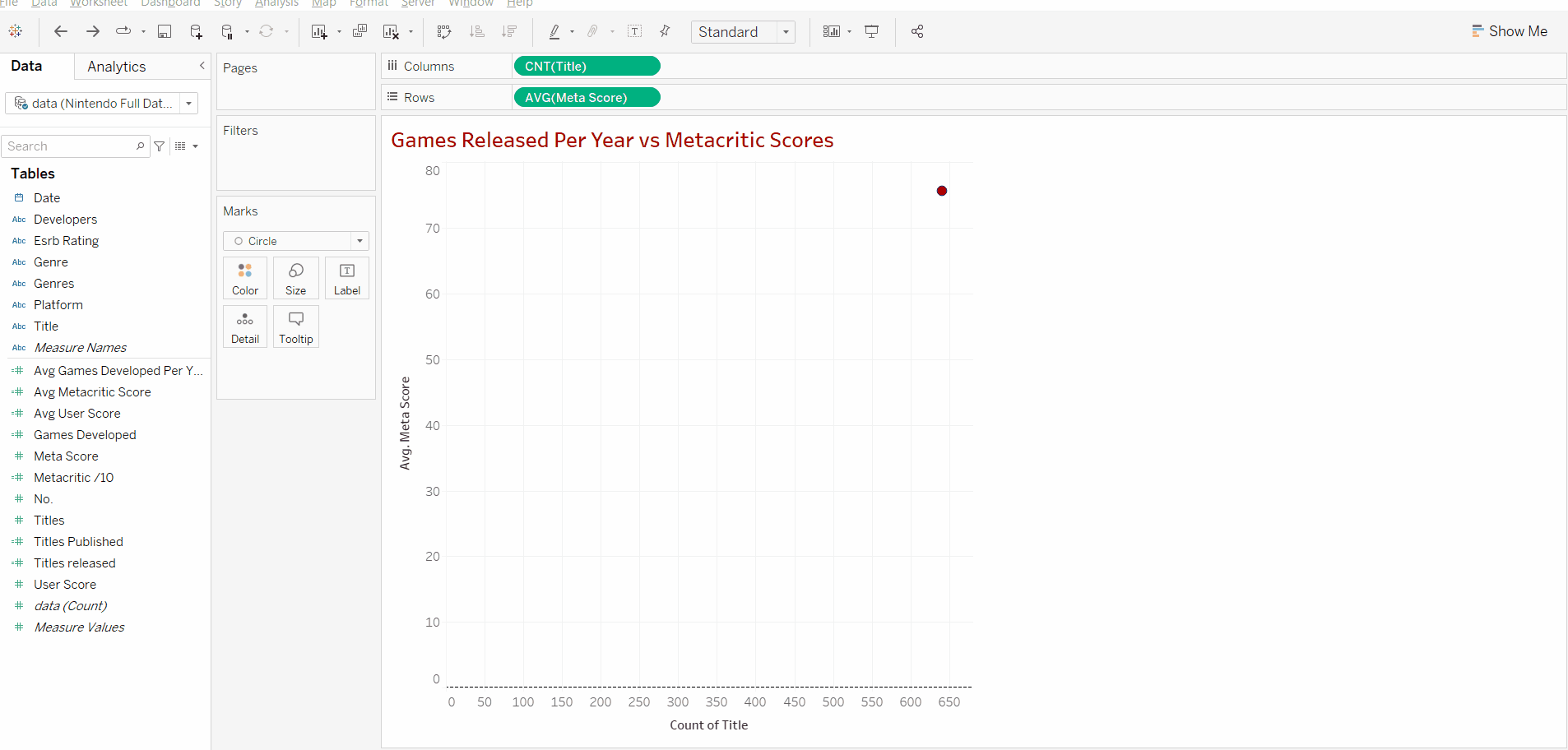
Luckily we can transform the title data into quantitative data by adding a simple measure, "count". This can be done by clicking on the arrow on our Title "pill". Adding a count measure means tableau will count every individual title in the dataset and provide a total number for the number of games that have been counted.
Now we can see that the data set has a total of around 640 titles in the data set. We do not use count distinct as we want to count every title released. In this case, Nintendo might have released the same game twice on different consoles. However due to the fact that reviews may differ by console then we want to make sure it's still counted in.
Now we find a new problem, our scores have changed from 0-100 all the way to 48,000. This is because if we look at our row data we can see that tableau defaults to summing the meta scores. This can just be changed by clicking on the arrow on the pill and switching from the sum to average. This way when we add the years in we can see the average score in that year in relationship to "x" number of releases.

We can see that our y-axis now falls into our range of 0-100. Currently, there's only one data point as the graph is only showing the average score across all the 640+ titles.
Adding our nominal value
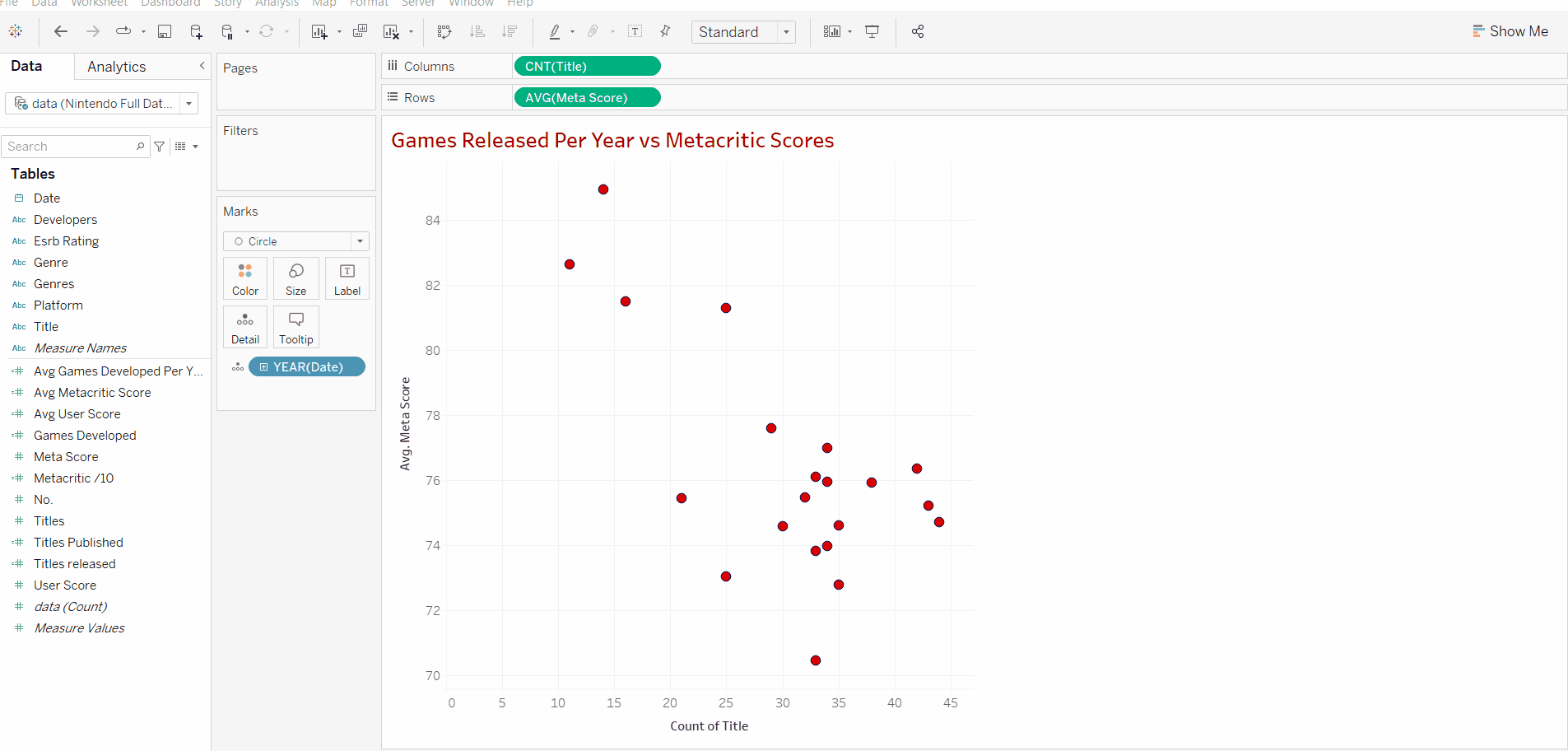
Now that we have our 2 variables we can add our discrete measure. In this case, we are using the year of release. Adding this will create a data point for each year that's in our data set, this data point will include the number of titles released that year alongside the average score for that year's titles.
After we add the date we can right-click the y axis and uncheck "include zero" as all our data points are over 70 and we don't need the whole range to analyse our data in this case.

Applying Linear Regression
Now that we have all the data we need, we can introduce linear regression and use it to analyse our results. The Trend Line tool allows us to introduce a trend line (duh).
A trend line is a straight line on a scatter plot that best defines the trend shown in the plotted points. It also illustrates the correlation, either positive, negative or none between the plotted variables.
In order to add a trend line on Tableau, we can navigate to the analytics tab next to the data tab and drag and drop the trend line model into our chart
Now that we have added the trend line we can identify the correlation. Below I have added an image displaying the type of correlations that we can expect to have. Its good to note that whilst they may vary in degree, the correlation will fall into one of these categories.
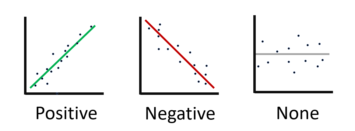
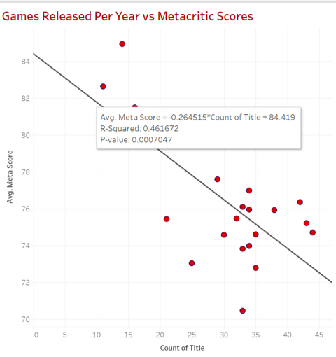
Now that we know what types of correlation exist we can look at our results and see that there is a negative correlation between the number of games produced in a year and the reviews that they receive.
Analysing the correlation
Hovering over the line will display information about the correlation and introduce us to the 3 values that we can base our analysis off.
-
Avg. Meta Score - This is the linear regression formula. Whilst it's not important to know, it's nice to know how we got our result. Simply put, the equation is y = a + bx. Where y is the dependent variable (critic score), a is the error estimate, b is how much we expect y to change in relation to x (regression coefficient). Finally, x is the independent variable (count of title).
-
R-Squared: This shows how well the data fits the regression model. The value ranges from 0-1 where 0 means no correlation at all and 1 means 100% correlation. Anything over 0.7 can be interpreted as having a strong correlation. In general computed data, an R-squared value of 0.461672 would be classified as a slight level of correlation. However as this is human opinion (reviews), it is unpredictable behavioural data. This value is harder to predict thus a value of 0.46 is of great importance in explaining the relationship between the two variables and shows a fairly strong correlation.
-
P-value: The p-value shows the probability that our results and the observed difference could have occurred randomly/by chance. A p-value ≤ 0.05 is significant. It indicates strong evidence against the null hypothesis, as there is less than a 5% probability the results are random.
With this data and information, we can conclude that an increase in game production will lead to a decrease in review scores and the quality of Nintendo published games.
Using a scatterplot and regression is a great way to find and show the relationship between two variables and can give an insight into the behaviour between our data and can lead to new ideas and options in customising a business, process, operation, etc.