Let’s say your client wants you to build a chart that shows which products have exceeded the company’s sales target. However, since the sales target is subject to change over time, they would also want the flexibility to adjust the target if needed.
Would you know which chart to build?
In this blog, I will discuss how to create a conditional formatting parameter on Power BI. This type of visualization is helpful for highlighting which values have met, fallen, or exceeded a target.
Start of Tutorial
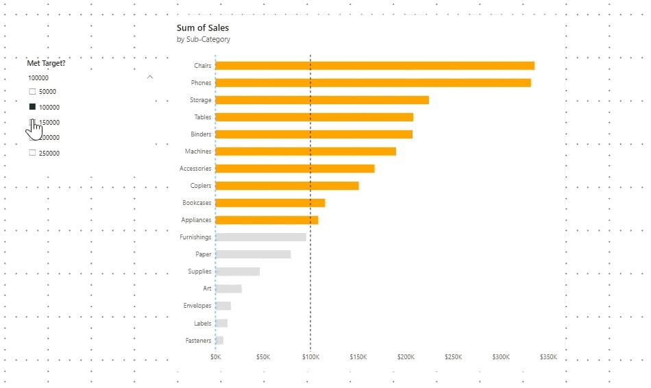
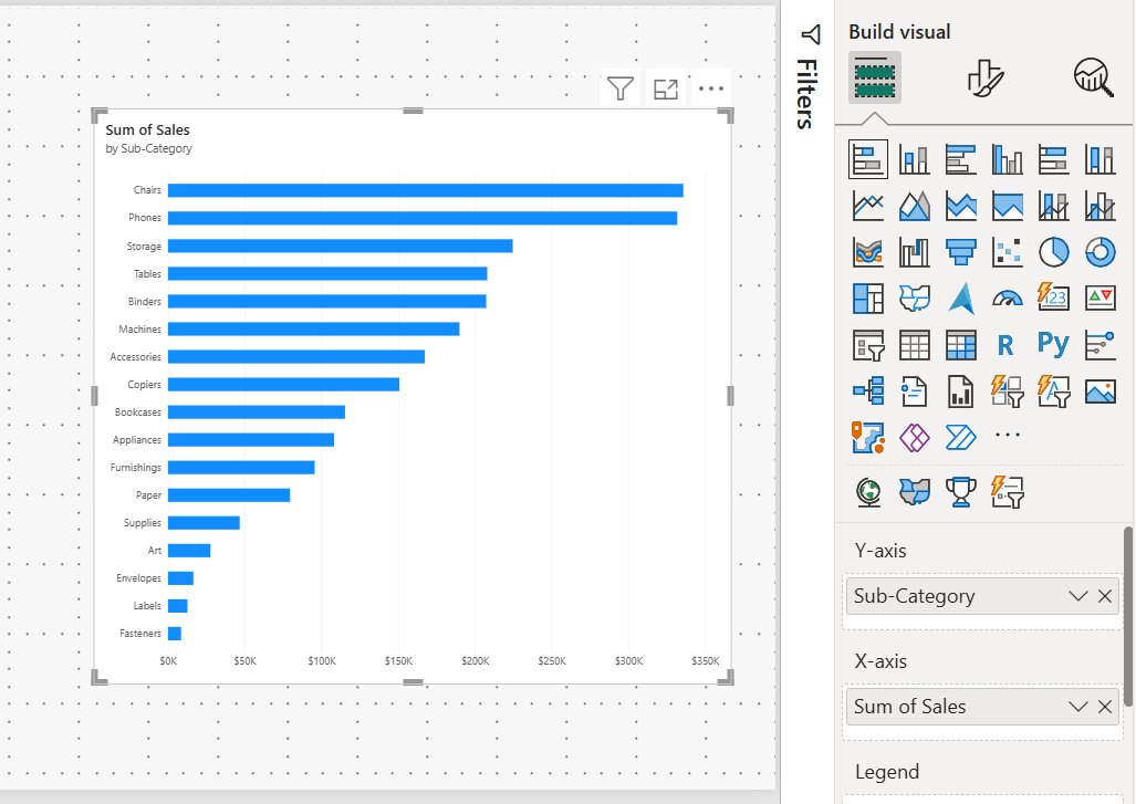
For this example, I am creating a stacked bar chart using Tableau’s Superstore dataset to compare Sum of Sales by sub-category.
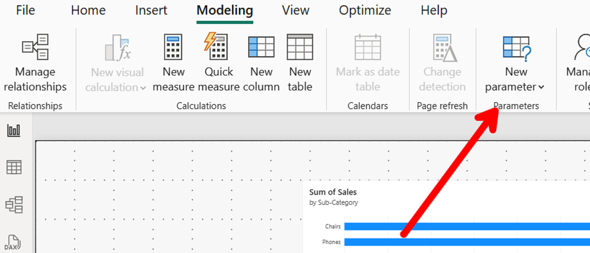
To begin, we will be creating a parameter by navigating to the Power BI ribbon, selecting Modeling, then clicking on New Parameter.
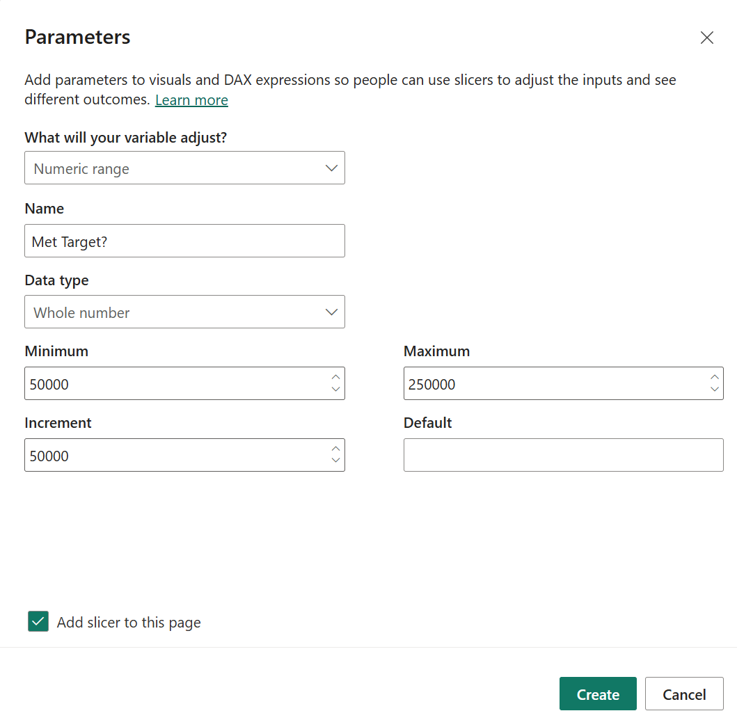
For this parameter we will select a Numeric range. A Numeric range allows you to set a target range that your end user can adjust. In this example, I set my target range from 50,000 to 250,000 with an increment of 50,000. Make sure to have “Add slicer to this page” tick boxed.
Once your parameter has been created, a slicer will be added on your report page. For the next step we will be setting a conditional x-axis constant line.
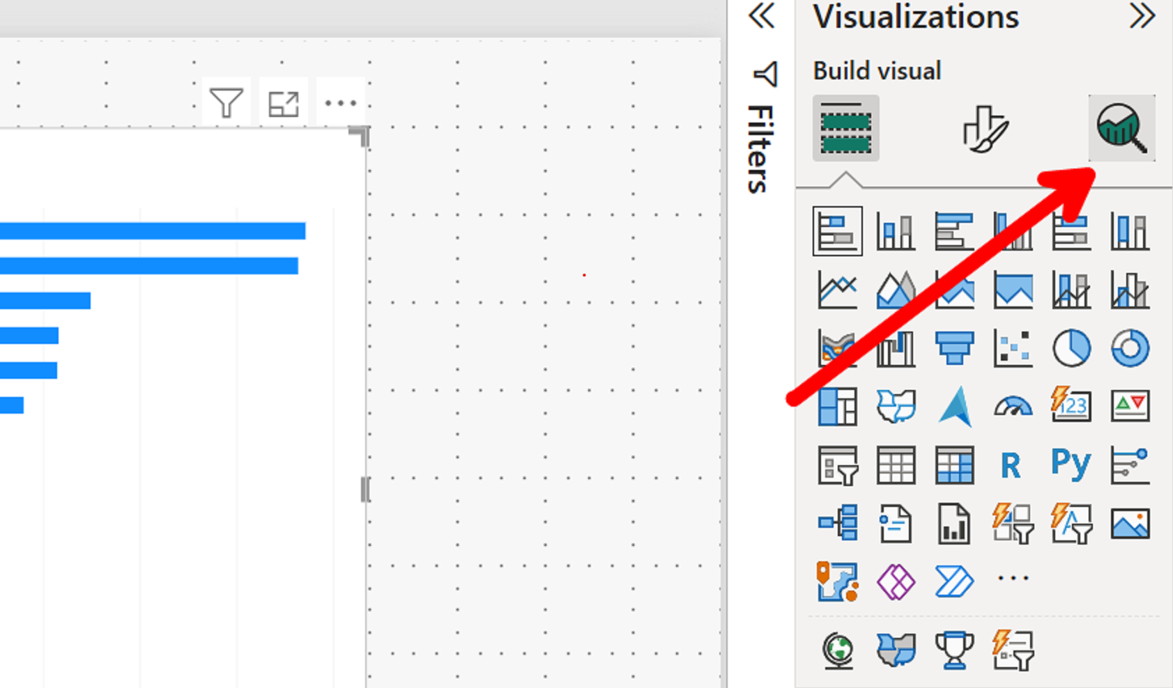
Select your chart and click on the “Add further analysis to your visual” button (the magnifying glass icon) in the Visualizations pane.
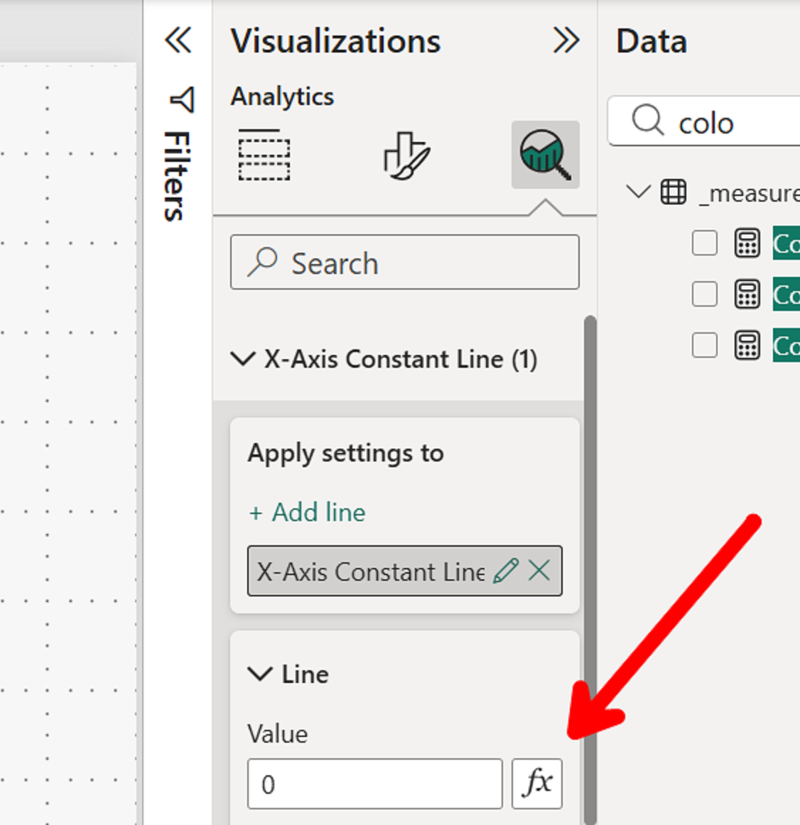
Click on “fx” and set the Field Value under Format Style to the parameter value. This action will link the x- axis reference line to your parameter. For example, if you set your parameter slicer to 100,000, the x-axis reference line would move to that value.
Next, we need to tell Power BI which values to highlight based on whether they have exceeded or fallen behind our parameter. This can be done by creating the following measure:
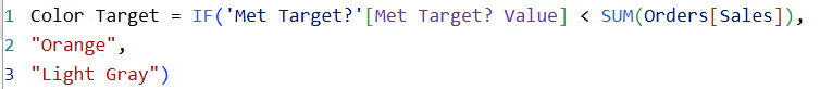
If the Sum of Sales of a sub-product exceeds the target value set by our parameter, which is linked to our reference line, the sub-product bar will be highlighted. If the Sum of Sales falls below the parameter value, the bars will remain a neutral color.
We will now use this measure to conditionally color format our bars.
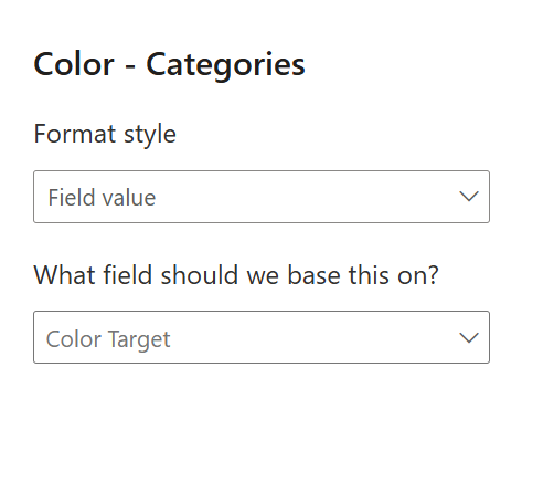
In the “Format your visualization" section of the Visualizations pane (the paintbrush icon), scroll down to Bars, then Color, and click on Conditional Formatting (fx).
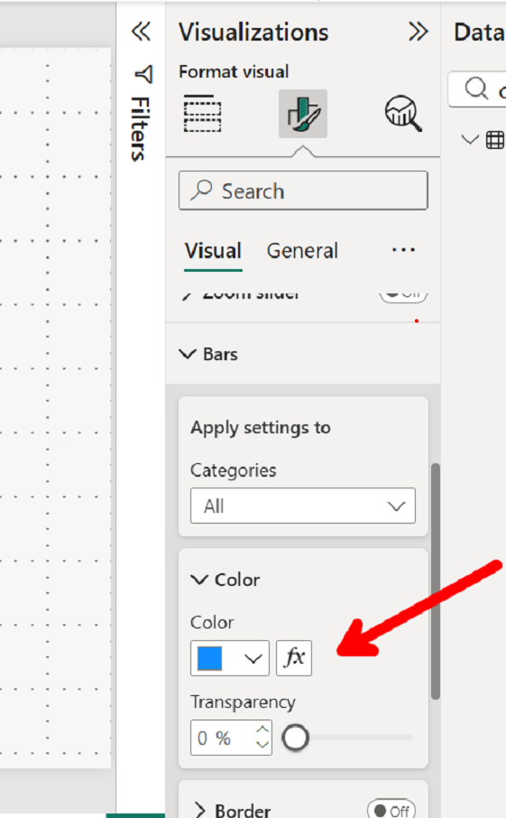
Set Format style to Field value and select the new measure created. This will allow the bars to change color based on the conditions set in our measure.
Once completed, you should have a chart that highlights each sub-category based on whether it has exceeded the target set by your parameter.