


Day 1 of dashboard week was about the US College Scorecards. This data provides information about all the institutions, colleges, and universities in the United States along with information about the students demographic and family income. The data contained more than 3000 potential fields to use making it extremely difficult to include every field into a single dashboard. Each row represents an institution.
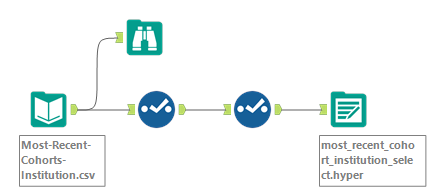
To get a sense of what fields are in this data, I uploaded the ‘Most Recent Cohorts Institutions.csv’ into Alteryx.
Although some of the fields are self explanatory through the field names, there were many fields with names that are not as easily interpreted:
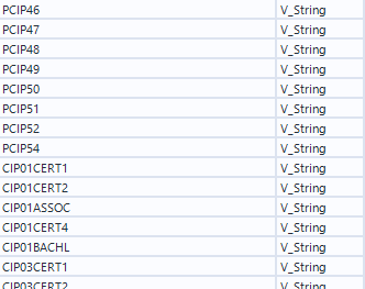
Hence, I went back to find the data dictionary from the website and scrolled through the fields to select only the columns that I was interested in. I then outputted the file as a hyper file to input into Tableau. In the meantime, I made a draft of what I wanted my dashboard to look like using the fields I selected.
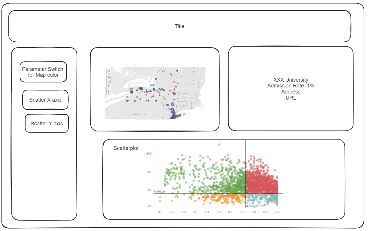
At the end of the project time, my dashboard changed slightly.
Given the limited time, I was not able to format every detail to the ideal method but colors and text layouts are something I would like to work on given more time.
You can view my dashboard here.
Photo by Matt Ragland on Unsplash