DS30 had a [re-]introduction to Statistics this week, to get everyone comfortable and up to speed with descriptive and inferential stats...
When we are looking at complex data, we will often need a good understanding of distribution, and box plots are a helpful visual tool for seeing this (as well as for identifying significant outliers!).
If we compare a box plot to the bell-curve of a normally distributed dataset, we can quickly see where the Median value falls in the data, as well as the Interquartile Range, the Upper and Lower Quartiles (Q3 and Q1).
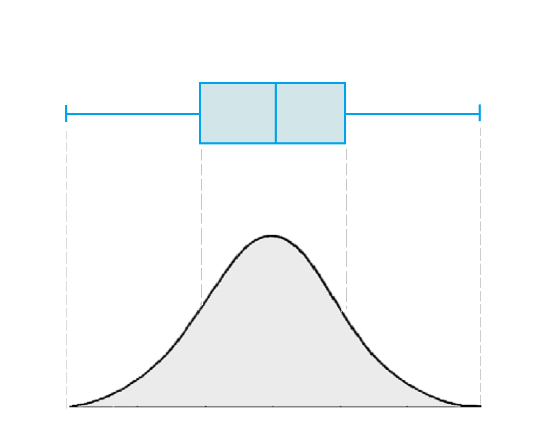
The far ends of the ‘whiskers’ in our chart are calculated as follows:
- The lower whisker is the Q1 value – 1.5 x the Interquartile Range
- The upper whisker is the Q3 value + 1.5 x the Interquartile Range
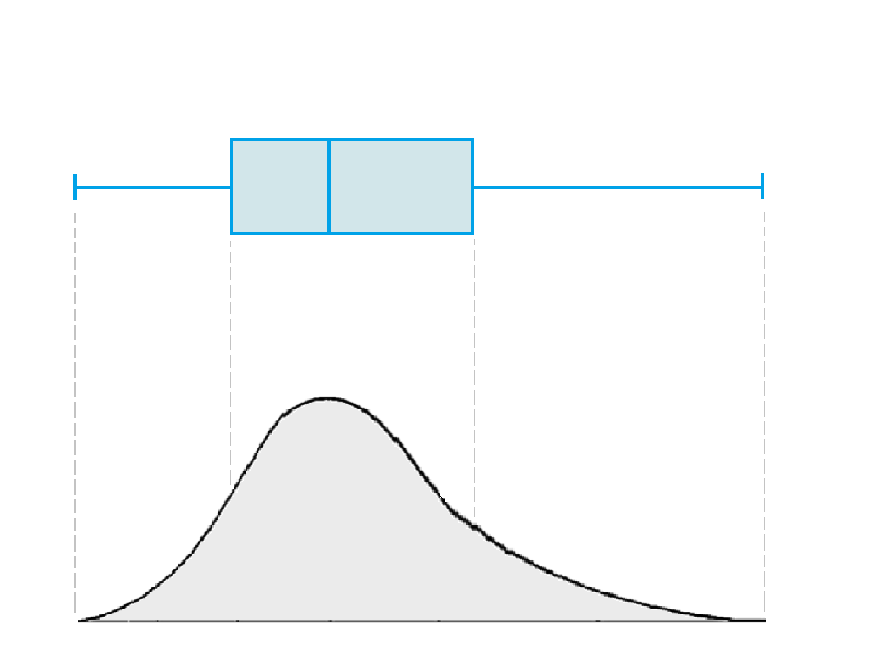
Any values that fall beyond these whiskers should be considered outliers; if data is not perfectly normally distributed, the quartiles will vary more in size:
Easy mode: basic box and whisker plots
In Tableau, the tool for making Box Plots is in the Analytics pane. We can build one out using Superstore data.
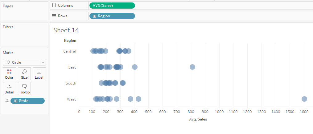
To begin with, we will need to build a dot plot that visualizes average sales by State, broken out into our four Regions. Drag ‘State’ onto the detail card, Region into columns, and Average of Sales onto rows:
To add a box plot, simply drag this from the Analytics pane onto the ‘Cell’ view:
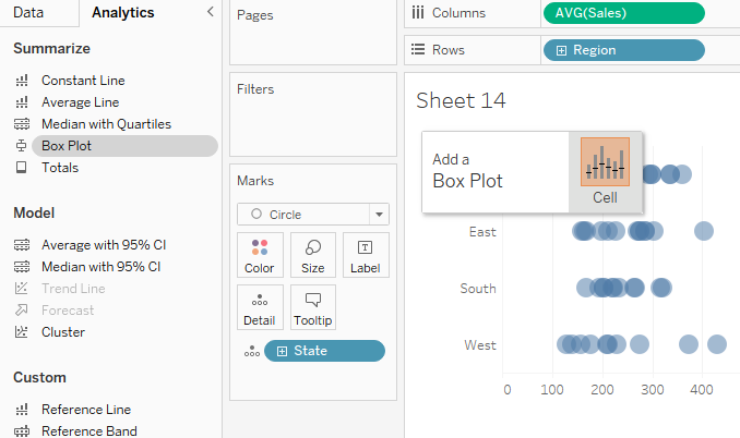
Right click and select ‘Edit’ to view details about how this is currently configured, e.g. how far the whiskers are set to extend, and whether the values within the box plots should be shown or not. This could be useful for highlighting only the values that should be considered outliers.

You can also add some formatting at this stage, to get everything looking neat and presentable.
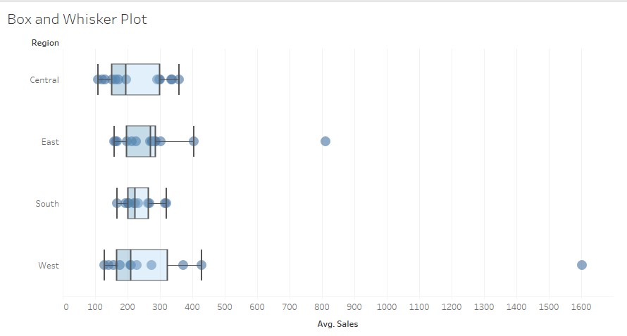
Hard mode: add a Sort
Now that we have a nicely presented Box and Whisker Plot, we might want to see at a glance which Region has the highest Median value.
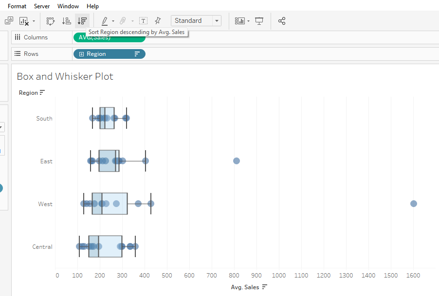
However, when you hit the Sort buttons in the toolbar, we can see that Tableau automatically organizes a sort using the Sales Average values in the view:
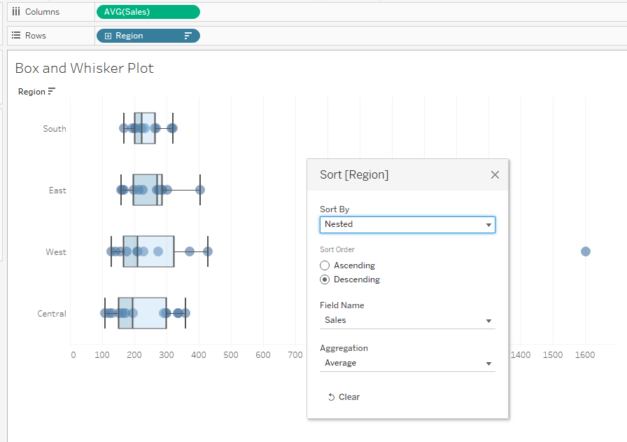
To order the Sort by Median value, we will need to create a new calculated field:
WINDOW_MEDIAN(AVG([Sales]))
This will act as a Table Calculation.
Add the new calculated field to the Rows shelf, and right click to edit the Table Calc.
We want to be sure that the window average is being calculated along State, and by Region, so ensure that in our Table Calc we have ticked ‘State’ and not ‘Region’ under ‘Specific Dimensions’.
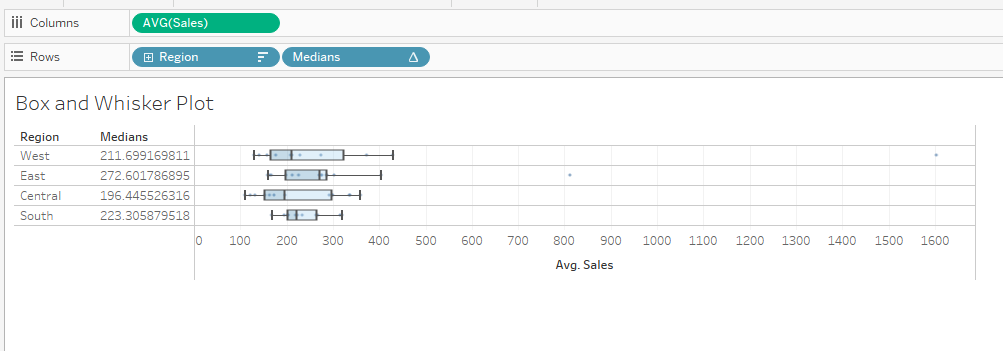
Finally, we can drag our Table Calc value to the very left of the Rows shelf to ensure that it is being used to order our Sort.
To finish tidying up, right click on the Median values column and hide the Header.
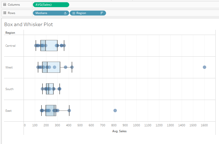
We now have a Box and Whisker Plot that is sorted by Median value, smallest to largest.
BONUS - If we want to sort in the other direction, i.e. largest to smallest, we can double click the pill and add a ‘minus’; this will force the Median values to become negative, so that what was the largest value will be read by Tableau as the smallest.
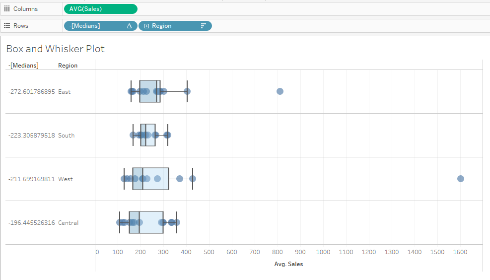
Keep an eye on the colour of the pills on your Rows shelf: we need to make sure the 'Medians' calculated field is discrete, and not continuous.
