


Our second task of dashboard week was to build two templates: one for a Tableau dashboard and the other for Power BI. The idea behind this challenge is that, as data analysts, we should be able to create flexible and clean templates that save us time when we are working on a client project.
Data
We were given two datasets that we should use to build sample plots and populate our templates, demonstrating to our users the possibilities with those dashboards. The first dataset was the famous Superstore sample dataset and the second was about HR data. We were free to choose which dataset we would use with a particular tool, but we needed to use both datasets.
The Tableau Template
Below you can check out how my Tableau template looks. In the upper portion of the dashboard, there is a placeholder for a logo, followed by title, subtitle and filters area. Finally, the upper section includes an information button to explain how to use the template.
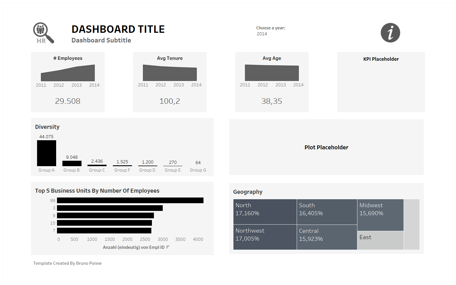
The next section includes KPIs that show numbers and time trend lines. Finally, there are 4 areas for bigger plots. The template was built using only containers and tiled elements.
The Power BI Dashboard
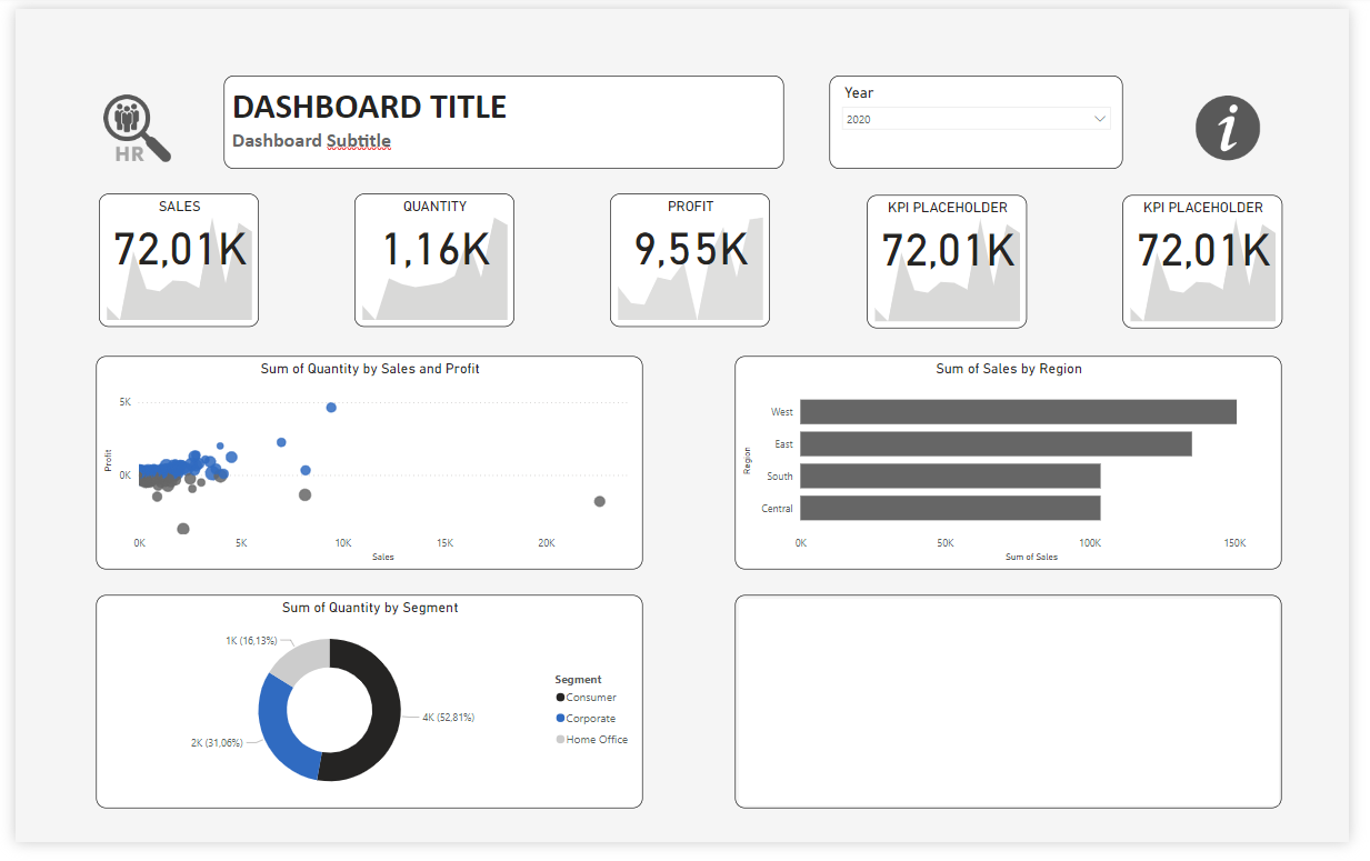
The template in Power BI follows the same structure and layout as the Tableau dashboard. One main difference is that all elements are floating in Power BI. I also chose to use rounded corners in Power BI because it is really easy to implement and adds a cleaner look.
My Impressions About The Task
- Building a template/dashboard in Tableau takes more time compared to Power BI;
- In Tableau, one good practice to work better with containers is to rename containers and elements with meaningful names that can help you arrange all the parts of your dashboard through the dashboard hierarchy, as shown in the picture below;
- Another small trick that I learnt about layout in Tableau is that you can distribute elements evenly inside a container by clicking the down arrow of it and selecting this option;
- One step that I have not yet done is to write instructions for the users of my template;
- One piece of feedback I received is that I should be more attentive to the space between elements and their sizes. Some elements were too far apart, and others looked too big and could have been built in a more compact way.
This is all for today. I am curious about topics of our next three days and looking forward to further learning!