


Data tables can be structured quite differently across organizations, teams, and users. For analytics, it's important that data is structured in a clean, tabular format, with each column representing a different field and each row having a clear meaning (e.g., one product for one order). One of the many responsibilities of a data analytics consultant is transforming data to make it ready for use in analytics tools. In this blog I'll explain my process for transforming data on Covid-19 variants and vaccines (source) to the long, narrow data format we love using in Tableau.
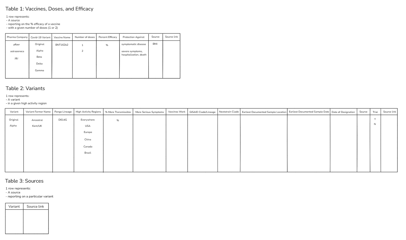
I started with a sketch to identify the 3 tables I'd want to split this data into. Instead of using all fields in one long table, it can be helpful to separate your data into different tables for distinct analyses; this helps you to be more intentional with your analysis and makes your data more performant. In my sketch I specify what each row represents to support the data discovery process:
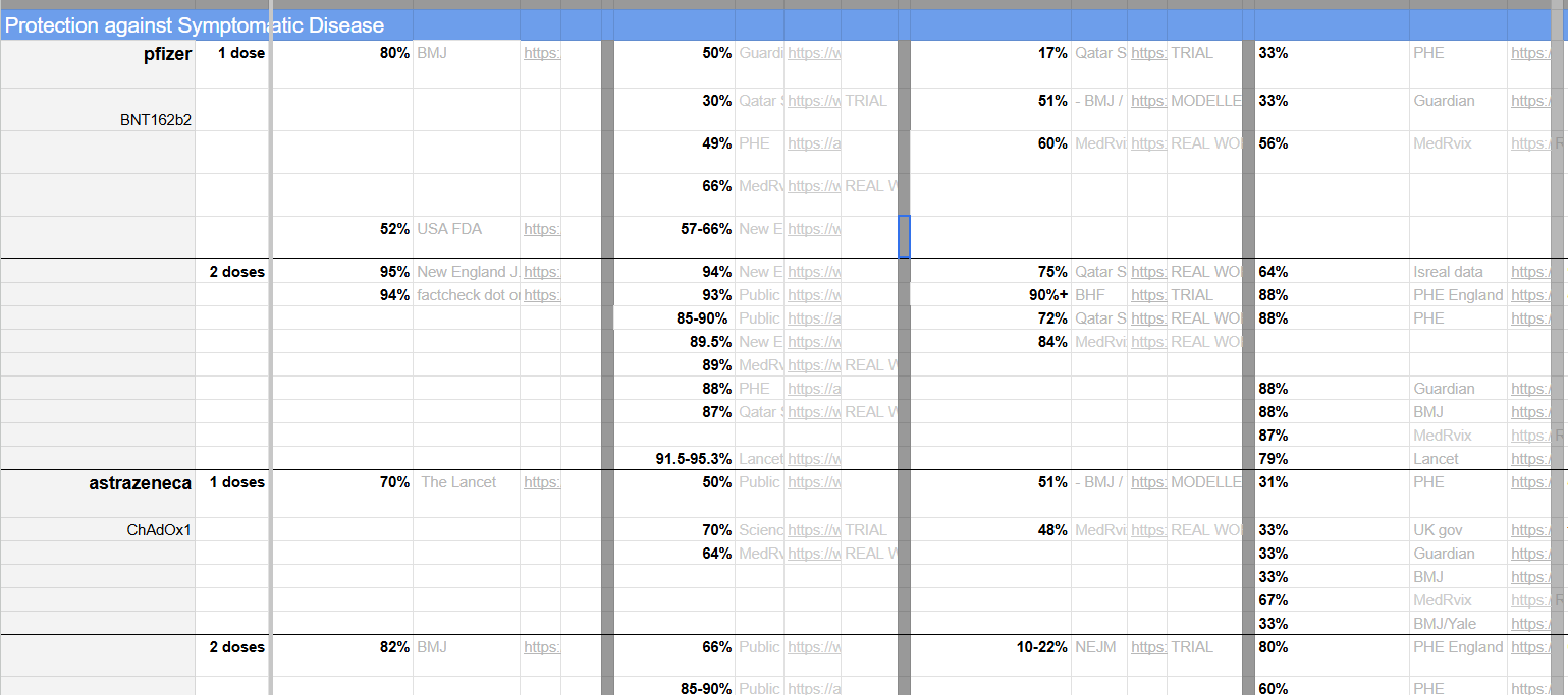
To keep this blog concise, I'll simply walk through my process for extracting fields in table 2, which come from this part of the original data:
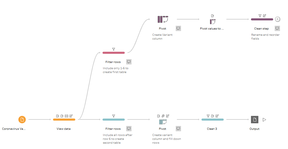
I started by adding a row number, which would allow me to filter the data by the specific rows I'd want and essentially help me split this large table into smaller tables. I then filtered the table to only include rows after row 6 and merged fields so that the percentages in the table above would be consolidated into one field. Lastly, I performed a columns-to-rows pivot to create a field for Variant Name and removed nulls where possible.
The next steps would involve performing a more comprehensive clean of the original table, but this quick process allowed me to produce a few in a short timeframe! See the final product on my Tableau Public.