


Firstly what is a box plot?
- A boxplot is a graph that gives you a good indication of how the values in the data are spread out.
- It is split up into: the minimum, the first quartile, median, the third quartile and the maximum
When to use a Box Plot:
- Finding out more information the the central tendency
- Allows you to see how the values in the data are spread out
- Shows shape of distribution (skewed, variance)
- Useful for individual variables or variables in groups
- Useful for identify outliers
So here's how to make a box plot:
(scroll down to find data set)
1. Drag 'Casualty Class' onto columns
2. Drag 'No__of_Casualties' onto rows
3. Drop 'Borough' onto details
4. Change the shape to 'circle' and reduce the size

4. Select 'Analytics' then under the 'Custom' section select 'box plot' on top of 'cell' then click 'OK'
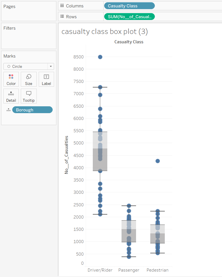
5. Drop 'Casualty Class' onto 'Color'
6. To add extra details onto your points feel free to change the opacity and add a border to each point under the color section

7. Finished! Here is your completed box plot graph!
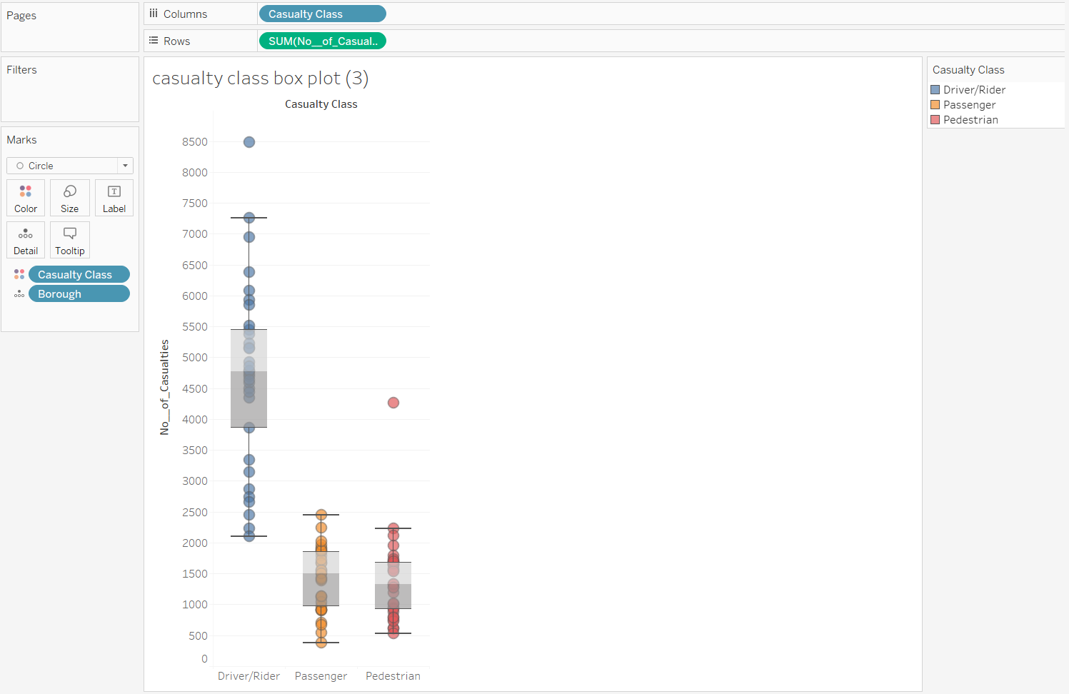
I can certainly see how beneficial using box plots are and will be using them more often in the future!