Today’s task was to use data from the United States Drought Monitor API, in particular the comprehensive statistics. Raw figures of square mileage affected by drought, as well as the percentage of area affected by drought were available at different spatial levels of aggregation, like county and state.
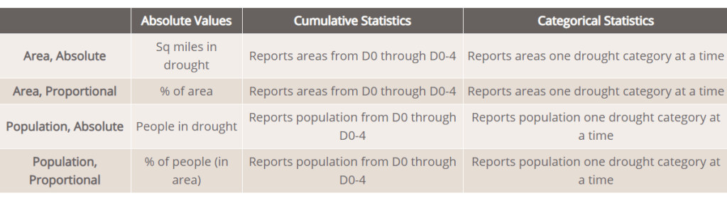
The drought severity is categorised from D0-D4 (abnormally dry, moderately dry, severe drought, extreme drought and exceptional drought).
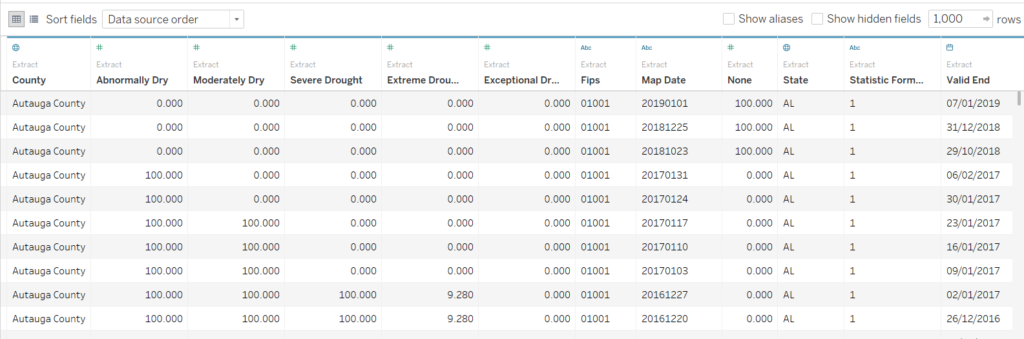
I went for the percentage of area affected at the county level. In Alteryx, the API calls had to be made for each county separately, which were determined by FIPS codes. Making all of the calls at once was creating a massive temporary file (~40gb). I chickened out before it finished downloading and made a macro to download each county one at a time, clean and organise the table, and cross-tab it, to avoid generating a huge number of rows. The data ended up looking like this:
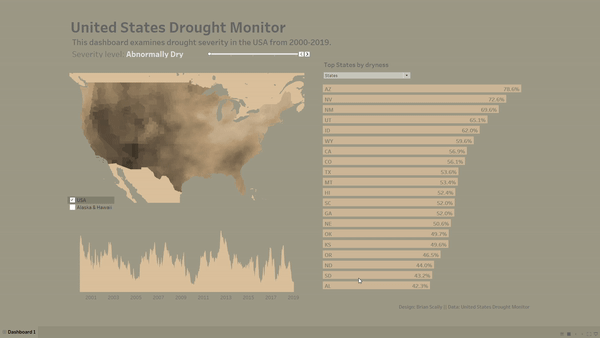
I made a quite exploratory dashboard that enables the user to look at peaks of drought over time. The filled map at the county level looked really nice in the end, especially on a Mapbox Western map. I made the overall dashboard look pretty barren – my attempt at trying to fit with the theme.