


It’s day four and the final day of Dashboard Week at the Data School New York! In case you aren’t familiar, Dashboard Week takes place during our final week of training here at Data School. During this week Data Schoolers are tasked with creating and presenting a dashboard each day using a data set provided by our coach. Additionally, this data is often accompanied by specific tasks or instructions for us to address in our dashboard design.
Here is the link to my final viz
Day 4 Focus
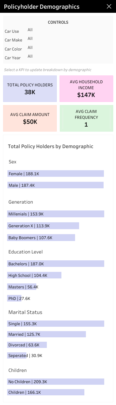
Today's task focused on a type of dashboard rather than a specific data set. Our coach asked us to build a mobile dashboard using a data set we used in week five of training. For me, that meant using a mock data set containing demographic information about customers of a car insurance company.
Wireframing
Because I used this data in the past I skipped the data exploration and preparation step and moved straight into wireframing. I kept the same user story from my previous project, a Marketing Manager looking to learn more about their customer's demographics. Because this project called for a mobile dashboard I opted to stick with simple charts and limited interactivity.

Dashboard Design
When it came time to build the dashboard, I chose not to use Tableau's phone layout view. This is because it would essentially require me to create and format two separate dashboards, one in the default view and another in the phone view. Instead, I formatted the default view to fit on a mobile screen ( width of 375 pixels). In terms of interactivity, I made it so that the user could update their view by clicking on a KPI card to prevent the view from getting cluttered. I also incorporated a menu button that when clicked would populate the control panel. Finally, I assigned a color to each KPI that would serve as a visual cue on the demographic breakdown bar charts. The bars change color depending on which KPI the user selects.
Lessons Learned
- Mobile dashboards are a bit cumbersome to format. If this had been a dashboard for a client, I would have built it out in the phone layout view so that users could view the dashboard on any device.
- Because of space limitations, mobile dashboards have to be a lot more simple than their desktop counterparts. This means being strategic about chart selection and only including essential information.