


It’s day three of Dashboard Week at the Data School New York! In case you aren’t familiar, Dashboard Week takes place during our final week of training here at Data School. During this week Data Schoolers are tasked with creating and presenting a dashboard each day using a data set provided by our coach. Additionally, this data is often accompanied by specific tasks or instructions for us to address in our dashboard design.
Here is the link to my final viz
Day 3 Topic
Today’s topic was cheese! Our task was to build a dashboard that can be used as a search tool using data obtained by web scraping cheese.com. Although, as a vegan, I'm not a huge cheese fan, I do love a good web scrape.
Data Exploration and Preparation
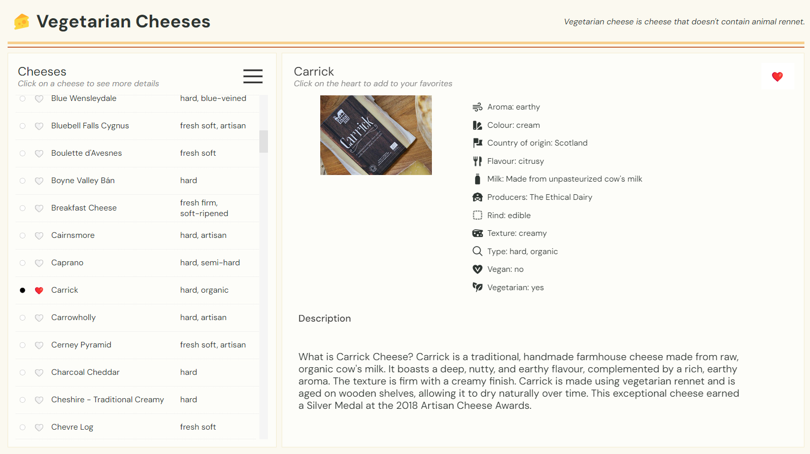
I spent a couple of hours in the morning scraping my data using Alteryx. For this task, I chose to focus on vegetarian cheeses which helped to keep my web scrape manageable. I started by scraping the name and URLs of every cheese on each page of the vegetarian section of cheese.com. This left me with about ~589 different cheeses. I then used the URLs I gathered to scrape data from each cheese's wiki page. From these pages, I extracted a description and list of attributes for each cheese. Finally, I used Alteryx's Blob Output tool to download pictures for each of the cheeses in my data set. Sadly, most just had a stock photo.
Wireframing
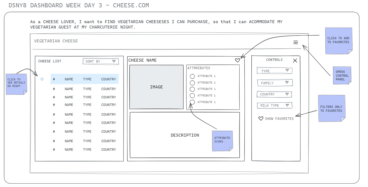
Unlike yesterday, I had time to identify my user story and build a wireframe. My user today is someone trying to find suitable cheese options for their vegetarian guests coming over for wine and cheese. With this user in mind, I planned to build a dashboard allowing users to search for cheeses based on different attributes. The user could then favorite the cheeses they are interested in purchasing and if needed only display those options on the dashboard.
Dashboard Design
My dashboard design was very similar to the golf dashboard from day one. For my charts, I chose to have a list of cheeses on the left which would be used to select the product to display on the right. This time around I chose to do a peek-a-boo control panel to allow more space for the content on the right. Additionally, I utilized emojis as UI elements in my design (who doesn't love a fun emoji?). For colors, I generated a cheese-inspired color pallet on Coolors (super cheesy, I know!).
Lessons Learned
- Tableau Public kept giving me a [] for my heart emojis which was super frustrating. At first, I thought it was an issue with the emoji but then I realized it was capping out after 500 rows. I knew this was the case for images but had no clue it was the same emojis.
- Web scraping is fun but often unreliable. If the pages you're scraping are structured inconsistently it becomes a pain to get the data you need for multiple items. I learned this the hard way when trying to find a way to scrape Pokemon evolution data for a personal project (I gave up😭).
- I thought all cheese was vegetarian so I was surprised to learn that the rind is sometimes made with animal products!