Zdravka Bratuhtcheva

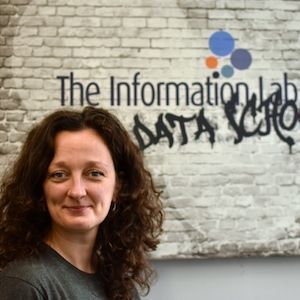
Zdravka (Zizi) attained an MBA degree from the University of Surrey and BAs in both International Relations and Business Logistics from Bulgaria’s Academy of Economics, a leading economics and business school.

She has extensive experience in marketing, operations, HR, strategy and business administration, within the food production, e-commerce and hospitality industries.

While running her own e-commerce business, she realised the importance of well organised, timely data and in-depth analytics, in making informed decisions about operational efficiencies and business profitability.  This created her passion for data.

In her spare time, Zdravka enjoys the London food and culture scene, keeping fit and reading.

Blog Posts

Avatar
Mon 04 Jul 2022 | Zdravka Bratuhtcheva
Dashboard week - day 5
I started with data exploration and creating a user story. Here are my notes of the user story: Then I went on to explore the data further. I discovered that there are some entries where the age is null and more importantly, there where duplicates in the data
Avatar
Thu 30 Jun 2022 | Zdravka Bratuhtcheva
Dashboard week - day 4
Today was day 4 our the final week of training at The Data School, known as The Dashboard Week. We were asked to put together a KPI dashboard with exceptional design. The dataset we had to analyse included data for the rental properties in San Francisco, USA from 1998 to 2018
Avatar
Wed 29 Jun 2022 | Zdravka Bratuhtcheva
Dashboard week - day 3
For today's challenge we had to build a Dashboard catering for people with special needs. Glasgow City Council are trying to make their city’s data more accessible to residents, and have given us a sample of road repair data from FixMyStreet to show what we can do
Avatar
Tue 28 Jun 2022 | Zdravka Bratuhtcheva
5 things I learned about Accessibility today
Today was the second day of the last week of training at The Data School. We learned how to make dashboards friendly to audiences with different needs. For my project I had to redesign a dashboard to make it easy for someone with Dyscalculia to read. So the one of things I learned was today was: 1
Avatar
Tue 21 Jun 2022 | Zdravka Bratuhtcheva
A color legend for each value
How to use separate colour legend for each separate value. This blog is inspired by another Workout Wednesday and this time I will show you how to format a table so that each meausre has a separate color legend. As always, I use the old favourite Sample superstore
Avatar
Tue 21 Jun 2022 | Zdravka Bratuhtcheva
'Show-me-free' highlight table
In this blog I will show you how to make a highlight table without using the show me shortcut. I use the Sample Superstore data set. Lets begin. Step 1. Drag and drop a dimesion (Region) on the column shelf. Step 2. Drag and drop another dimension (Category) category on the rows shelf. Step 3
Avatar
Tue 21 Jun 2022 | Zdravka Bratuhtcheva
How to make a Hex Map
In this blog I will show you how to make a Hex Map. Hex map are a great way to visualise data when the actual location is not that relevant, or when there are some outliers, like Alaska and Hawaii in the USA for example or when the size of the locations do not matter
Avatar
Sat 18 Jun 2022 | Zdravka Bratuhtcheva
Custom shape color palettes in Tableau
Its 2022 and it's all about the looks, isn't it? I got inspired by the WOW2022 week 23 challenge from Lorna Brown. There Lorna shows an interesting way to show a colour legend on the dashboard. In this blog I have shown how Lorna did it and I have expanded to show a few more shapes
Avatar
Sat 18 Jun 2022 | Zdravka Bratuhtcheva
How to add a red alert dot
In this blog I will show you how to add a red dot in the begging of a horizontal bar chart. I will use a bar chart I created for my previous blog. For this example I will indicate what orders it took above the average days to ship
Avatar
Sat 18 Jun 2022 | Zdravka Bratuhtcheva
Parameter controlled sorting
Step 1: Create a sort by parameter
Avatar
Tue 14 Jun 2022 | Zdravka Bratuhtcheva
Alteryx Server
User Roles and Permissions User roles are defined in Server Admin interface by the server administrators, also called Curators. User roles what each user can do on the server and how they can use the assets on the Server
Avatar
Tue 07 Jun 2022 | Zdravka Bratuhtcheva
How to hide the Sort Controls from view
This is going to be my shortest blog for something I find very valuable - hiding the sort control toggle from the view. I learned about this option form Convo and I when I needed it I had to go back and scroll through a very long feed to find it. I thought I had remembered it
Avatar
Tue 07 Jun 2022 | Zdravka Bratuhtcheva
CP (current period) vs PP (previous period) KPI’s
How to calculate current period compared to the one before. This blog will provide step-by-step instructions on how to create Current period vs Previous period KPI. Step 1 : First I start by creating the needed parameters and calculated fields
Avatar
Tue 10 May 2022 | Zdravka Bratuhtcheva
Stats 101 - Weighted Average
Most of us know what an average is. Simply add all values and devide by the number of values. Its pretty simple until it is not. Lets look at the following example: I need 100 apples, 100 pears and 100 oranges. I go to shop one and they have only 70 of each
Avatar
Wed 27 Apr 2022 | Zdravka Bratuhtcheva
Double layer drill down
The purpose of this blog is to show how to make a double drill down bar chart. I will use the usual Superstore dataset
Avatar
Wed 27 Apr 2022 | Zdravka Bratuhtcheva
Highlight chart selection
in 6 steps using parameters This blog will illustrate how to highlight chart selection by using a parameter and how to remove the black line outside the selected part of the chart
Avatar
Tue 26 Apr 2022 | Zdravka Bratuhtcheva
Tableau order of operations - overview
The order in which Tableau executes varios actions is called Order of Operations. In this context operations are all filtering actions, sets, parameter actions, LOD actions, table calculations, total, MIN and MAX functions, trend lines, reference lines etc
Avatar
Fri 15 Apr 2022 | Zdravka Bratuhtcheva
KPI's & a Chart in one sheet
How to build a single worksheep KPI with a chart. The main benefit of this is that it allows us to use less sheets on out dashboards, it saves time formating and the sheets look uniform. First we need to create 4 calculated fields
Avatar
Mon 21 Mar 2022 | Zdravka Bratuhtcheva
Titles under values
How to get the title in capital leters under the number or measure values over measure name? In Tableau, I have seen the measure names under the measure values many times and I was very stuck as to how to achieve that view
Powered by The Information Lab
1st Floor, 25 Watling Street, London, EC4M 9BR
Subscribe
to our Newsletter
Get the lastest news about The Data School and application tips
Subscribe now
© 2025 The Information Lab