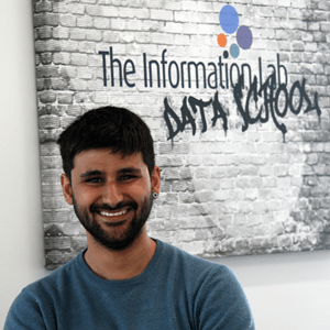
Niccolo Cirone

Niccolo Cirone

Niccolo’s data driven journey started in Italy, attempting to translate the breath-taking Italian cultural heritage into figures. His challenge consisted in starting, from scratch, the BI activities of a firm producing art exhibitions worldwide: It was ‘sink or swim’, and he fell in love swimming through data!

His hybrid educational background combines Philosophy with Management, and involved an exciting period of study in China. He is passionate about good ideas that impact people’s life, and in 2012 he has been selected by the World Economic Forum to be one of the first Global Shapers of the Rome Hub. His curiosity found its natural habitat in the Data School.

Blog Posts

Avatar
Sat 19 Sep 2015 | Niccolo Cirone
Learn Connect Enjoy: A week on Tableau Community!
[http://community.tableau.com/community/forums]Click on the image to go to Tableau Forum! Learn – Connect – Enjoy is the slogan of the Tableau Community, and I find it really appropriate
Avatar
Fri 28 Aug 2015 | Niccolo Cirone
The Urban Century: Exploring the Impact of "Slumification" on Development Goals.
DashboardWeek is approaching its end here at the Data School, and I genuinely admit that it was a fun, interesting and intense experience. On Thursday, we spent the day working on the United Nation dataset ofMillennium Development Goals Indicators [http://mdgs.un.org/unsd/mdg/Metadata.aspx]
Avatar
Wed 26 Aug 2015 | Niccolo Cirone
Gun deaths in the US. People beyond numbers.
Today’s Dashboard is about gun deaths in the U.S. between 2012 and 2013, using the dataset from this view [http://data.huffingtonpost.com/2013/03/gun-deaths] from the Huffington Post: “Mapping the dead. Gun Deaths since Sandy Hook”
Avatar
Wed 26 Aug 2015 | Niccolo Cirone
Visualizing the Olympics Games
Avatar
Tue 25 Aug 2015 | Niccolo Cirone
Small Data & “Interesting Things”
It’s Dashboard Week at the Data School, which means that each of us is creating a dashboard per day during the whole week! As a kick-off, we made a fun exercise about visualizing just two numbers in as many ways as possible in 30 mins
Avatar
Fri 21 Aug 2015 | Niccolo Cirone
Tableau Tip Week – Friday: Pop-Up Messages for your Tableau Dashboards!
Designing dashboards is one of your main tasks when you are a Tableau enthusiast. You have your data, and you want your dashboard to tell something interesting, either if it is a business dashboard with KPIs, or a story-telling dashboard about something in the news
Avatar
Thu 20 Aug 2015 | Niccolo Cirone
Tableau Tip Week – Thursday: How to output all your Tableau Server configuration in a text file!
One of the main things of this week at the data school is learning Tableau Server
Avatar
Wed 19 Aug 2015 | Niccolo Cirone
Tableau Tip Week – Wednesday: Dashboard navigation buttons!
The tip of today is inspired by a thought-provoking tweet by our coach and Tableau Zen Master Craig. [https://www.thedataschool.co.uk/content/images/wordpress/2015/08/Craig-on-Twitter.png] I am still not sure about the extent to which I agree with the proposed rule
Avatar
Wed 19 Aug 2015 | Niccolo Cirone
Tableau Tip Week – Tuesday: Determining whether a number is even or odd.
Determining whether a number is even or odd in Tableau could seem a silly task, and indeed the software does not include a build in function for this purpose
Avatar
Mon 17 Aug 2015 | Niccolo Cirone
Tableau Tip Week – Monday: Getting your totals when using Count Distinct!
This week at the data school we are delivering a blog post each day, showing a 2 minute tip
Avatar
Fri 14 Aug 2015 | Niccolo Cirone
Learning Tableau, one puzzle at a time!
This week at the Data School each of us ran a training session about the topic in which we scored the worse at the Qualified Associate Certification Exam. My topic was calculations
Avatar
Wed 12 Aug 2015 | Niccolo Cirone
Woodstock on Tableau: Visualizing the "Three Days that Rocked the World” for the Ironviz competition!
As soon as I saw the Music Competition kicking off on Tableau Public, I realized I wanted to chip in
Avatar
Sun 09 Aug 2015 | Niccolo Cirone
"Is England a Nation on Antidepressants?" - Squeezing Big Data with Exasol, Alteryx and Tableau to answer this question from the BBC.
When Craig [https://www.thedataschool.co.uk/coaches/]told us he would have made his dataset on GP prescriptions available to us to analyze it, I freaked out! It is a 500-million-rows dataset that he scraped out of the internet, containing all the GP prescriptions in England for the last five years
Avatar
Wed 05 Aug 2015 | Niccolo Cirone
Dear diary: My first month in London… visualized!
A few days ago we learnt how to use spatial tools at the Data School: we created polygons from the Alteryx Map Input and from shapefiles, and employed them for answering business questions and building trade areas
Avatar
Sun 26 Jul 2015 | Niccolo Cirone
Presenting my Dashboard on Education Inequality at the Tableau Public Meetup: Challenge accepted!
On Tuesday last week, I had the amazing chance to present one of my projects at the first Tableau Public Summer Meetup [http://www.tableau.com/learn/events/tableau-public-summer-meetup] here in London, together with Pablo [https://www.thedataschool.co
Avatar
Sat 11 Jul 2015 | Niccolo Cirone
#data15 or 'how much one can learn in just two days!'
The last week I attended the #data15 conference in London: what an amazing experience! First, I passed the exam for the certification of Tableau Desktop v 9 Qualified Associate [http://www.tableau.com/support/certification], after only two weeks of extensive use of the product
Avatar
Sun 28 Jun 2015 | Niccolo Cirone
It’s all about the first week!
Wow! After an intense first week in the Data School I feel even thirstier for knowledge than when I landed London last Saturday! My curiosity received an unbelievable amount of inputs, and I now have loads of things I want to explore and deepen
Powered by The Information Lab
1st Floor, 25 Watling Street, London, EC4M 9BR
Subscribe
to our Newsletter
Get the lastest news about The Data School and application tips
Subscribe now
© 2025 The Information Lab