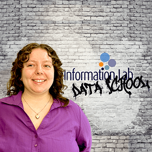
Bethan Donovan

Bethan is a passionate Tableau, Alteryx and PowerBI consultant with a unique background in Physics and a deep interest in algorithms and data visualisation. She holds a Master's in Physics from the University of Bristol and initially worked as a Physics technician in a college. While her degree embedded a love for mathematics, it was her journey into crochet and knitting that sparked her interest in data. Bethan began writing her own algorithms to simplify pattern design and sought out data sources on body measurements to create customizable, inclusive crochet patterns.

Bethan has previous experience with data visualisation in an experimental sense, but through the application process, she discovered a genuine passion for transforming complex data into meaningful insights. Since then, she has honed her skills in Tableau, Alteryx and PowerBI, applying them to a variety of projects to streamline data workflows and create interactive visualizations that help clients make informed, data-driven decisions.

Bethan’s passion for sustainability and plus-size fashion influences her approach to data analysis, as she seeks to make systems and designs more inclusive and accessible. She enjoys blending creativity and technology to solve problems, and hopes in future to combine data visualisation skills and her own custom patterns to push a modern and mathematical perspective to fibre arts.

With a unique blend of technical expertise and creativity, Bethan is excited to continue exploring the potential of data to drive innovation and inclusivity.
Certifications

Blog Posts

Avatar
Thu 30 Jan 2025 | Bethan Donovan
Keyboard navigation in Tableau
For today's dashboard week project, we had to improve accessibility of a given dashboard, for a specific impairment requirement. I was assigned a stakeholder who can only navigate their dashboards via keyboard
Avatar
Tue 28 Jan 2025 | Bethan Donovan
How to use box plots in tableau
Box plots can be an excellent way to visualise the distribution of data points across a selected measure. Box plots allow you to see the median, upper and lower interquartile range (IQR) , and the whiskers extend to 1.5 times the IQR, which allows you to identify any outlying datapoints
Avatar
Wed 15 Jan 2025 | Bethan Donovan
Keeping a tidy DBT project
Starting your first DBT project can feel like a daunting task
Avatar
Mon 13 Jan 2025 | Bethan Donovan
What is DBT?
DBT stands for Data Build Tool. Founded in 2016 it is a tool that allows users to transform raw data into analytics ready datasets within warehouses. It is capable of allowing users to automate pipelines, have detailed version control and integrates with data warehouses such as snowflake
Avatar
Wed 20 Nov 2024 | Bethan Donovan
How to make a difference from selected graph
Today I will be working through how to produce a graph, where when selecting a point for a specific month, the bar chart beneath will show how the other months vary in sales from the selected. Step 1: Open tableau, connect the superstore data set and open up a fresh worksheet
Avatar
Wed 09 Oct 2024 | Bethan Donovan
My first week at the data school
Powered by The Information Lab
1st Floor, 25 Watling Street, London, EC4M 9BR
Subscribe
to our Newsletter
Get the lastest news about The Data School and application tips
Subscribe now
© 2025 The Information Lab