


This blog is going to be a 5 part series sharing my personal experience with Dashboard week. Hopefully the challenges that I’m going to talk through and my mindset and actions in overcoming them is helpful to your your own endeavours, in both data and beyond.
What is Dashboard Week?
Dashboard Week is a week in training where each day our cohort is tasked with creating a dashboard on a designated topic, ready to present at 3:30pm on the same day. We’re given a data source or a website to scrape data from and beyond that it’s up to us to decide what we want to visualise and how.
What did I do?
The first day of Dashboard week had us visualising key performance indicators (KPI’s) related to Baseball. My first stumbling block was trying to parse the huge list of acronyms that is baseball statistics as an individual only familiar to the game at an entirely surface level. It’s a situation very reminiscent of our client projects, we’re often given data full of acronyms that an employee would be familiar of (and some that they’re not!) and we need to quickly get to grips with it to begin preparing data and building charts. With data readily available as the website we were using would export directly to a csv, the biggest hurdle was making a decision on what to do despite remaining fairly lost on baseball jargon. Unfortunately, players from much older seasons didn’t have all the same statistics as the newer seasons so I settled on looking at the longest running pitchers careers and how they did on a few metrics that were present throughout the data.
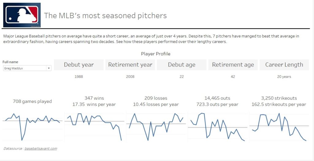
While I got down the main idea to track the decline or lack thereof for Pitchers in incredibly long careers, I felt like the dashboard could do with a little bit more polish. Here’s the final result for Dashboard Week Day 1!