


I’ve just completed my dashboard for week 27 2020 of Makeover Monday, the topic is on self reporting of the presence of symptoms of mental health experienced over the last week. Like usual, my cohort DS20 dove in to the data to see what we could create in the hour we were set to finish make our dashboards.
The task of finding ways to visualise the data is certainly an engaging one but it got me thinking about how data can’t always tell the full story. In fact, when working with data in topics we aren’t familiar with, it is imperative that we are conscious of what our data can tell us, and even more important, what our data categorically cannot.
I studied Psychology at university and my uni spent a great deal of time and energy drilling into our heads that we must consider the limitations of data that we use to make reports, In fact, part of the planning of experiments is working out what our data will not be able to tell us, to prevent us from making unsubstantiated claims or coming to conclusions that our data do not actually support.
In the case of this particular Makeover Monday, we were looking at self reports from an NHS survey in 2014
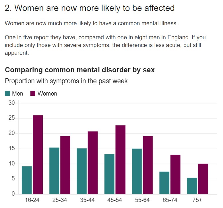
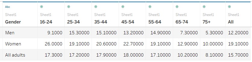
There’s little reason to doubt the veracity of the data itself, the NHS is certainly a reputable source. The question is, what conclusions can be drawn from this for the sake of a dashboard? It appears that women in the 16-24 age bracket are about three times as likely to suffer mental health conditions as men in the same age bracket but is this an accurate conclusion of the data that we actually have? The data is self reported, which invariably means that it will deviate from the actual number. Can we be confident that the difference is negligible enough to conclude that this does accurately reflect reality? Are we sure that the discrepancy in self reporting and accurate numbers is equal across age brackets and gender? The survey was completed in 2014, are we sure that this data is still representative of today to the extent that we can don’t need to specify this in our title? We can have confidence in the numbers presented to us but we must ensure that our numbers back up what we want to say while using them.
This is a particularly challenging issue to overcome because the sheer breadth and depth of topics that people will visualise is far too widespread for one to be fully informed on every single one.
I realise that I’ve asked a lot of questions and given few answers in return because there unfortunately isn’t an all encompassing way to properly report on all kinds of data. The context in which the data is being presented will mostly be what informs your reporting decisions. In the context of a Makeover Monday a good visualisation is invariably the focus and as such this level of consideration may not always be necessary. However, I do hope that this blog post has encouraged you to really consider the limitations of the data you are working with, beyond it’s functionality within Tableau. Engaging with your data in this way can really help in getting to grips with an unfamiliar topic and avoiding the pitfalls associated with trying to visualise something you are not knowledgeable about.