


Every data schooler has gone through the same training process, and DSNY2 is no different. One project we’ve all done is to re-vizit our original application viz.
DSNY Applicants: consider these as tips for your own application visualizations! 😉
Goals:
- To incorporate new data to our visualization, and to specifically the new data prep tools we’ve learned over the past few weeks: Alteryx or Tableau Prep.
- To implement data visualization best practices we’ve been learning
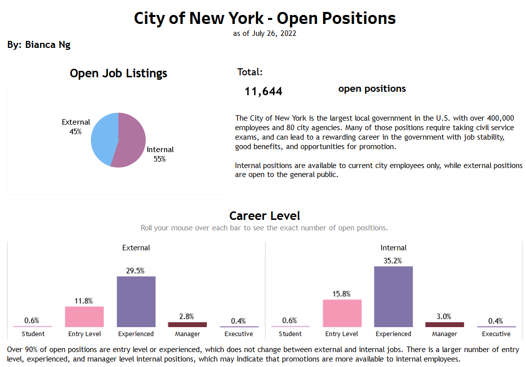
A little preview of my original viz:
Immediately, there were stylistic changes I knew I wanted to make:
- Reduce the number of colors being used; there were twelve (12?!) in my original visualization.
- Reduce the number of text; at the time of building the original visualization, I erred on the side of caution and wanted all insights to be presented in text.
- Utilize tooltips and increase interactivity! Originally I wanted everything in my viz to be presented as a flat image - this time I knew I wanted to put more complexity in it and the ability to mouse over charts.
- Giving everything a bit more space by making my dashboard wider.
Enhancing my viz with ✨data✨:
- I knew this dataset on Open Data NY updates weekly, so the new data I could clean and use was the newest version of this dataset. My original used data from July, and now I had November data to compare to.
- NYC Jobs (updates weekly)
- Due to city government employees being public employees, their salaries are posted also on the NYC Open Data site. I wanted to compare the average salary of current employees to the starting salaries in the jobs dataset.
- Citywide Payroll Data (Fiscal Year)
I’d love to keep working on my enhanced application viz, like giving it some flair and a more inviting intro - but if I’ve learned anything from this project, it’s that vizzes can always be improved!
