


A project I made in week 2 of DSNY heavily relied on parameters to swap charts out. Today, on Bench Day 2, I’ll be incorporating a technique I learned somewhere along the way - measure/dimension swapping within a single calculated field.
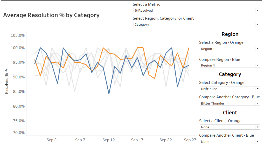
This chart allows you to choose the metric, the detail the lines are broken out by, and then to highlight a maximum of two lines to compare.

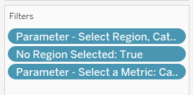
It was a chart swap by each metric, detail, and highlighting option… meaning multiple filters and a long list of charts inside one container.

However, it’s not necessary to do all this because we can have one dimension and one measure that swap out the field being used within it - so it’s all within the same chart and not separate charts.

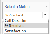
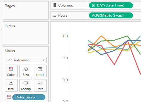
We want to replace the green pill (Call Duration) with a new green pill that will change along with the parameter.
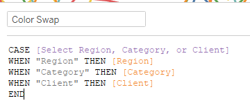
We also want to replace the blue pill on color (Category) with a new blue pill that will change along with this parameter.

New Measure:

New Color:
We replace current fields with the new Swap fields we've made:
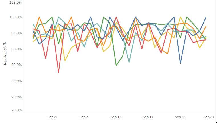
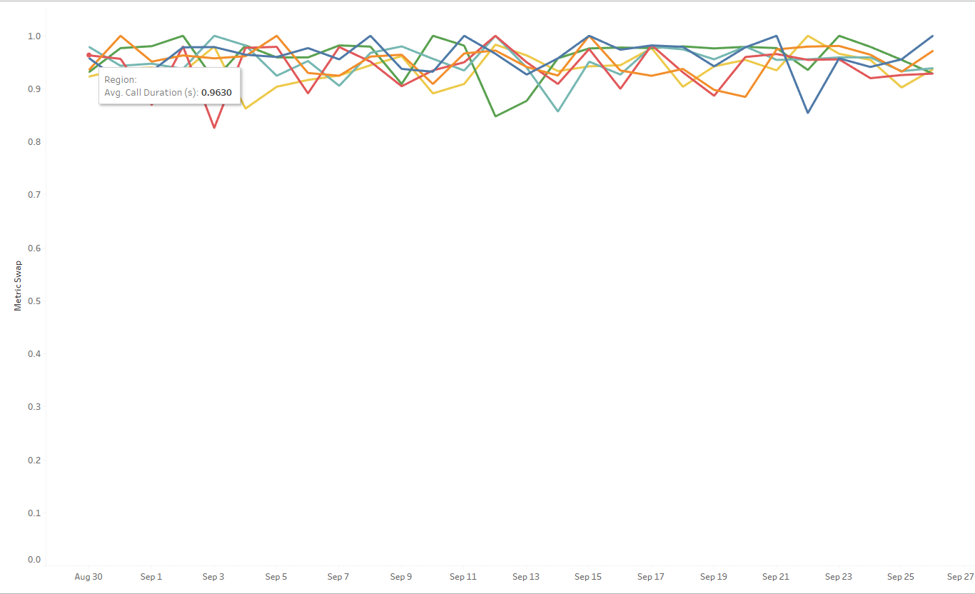
- This still might not be the best option as these three metrics are on different scales (a percentage, up to 180 seconds, and on a scale from 1 to 5).
- In the original, each individual chart had its own fixed axis to avoid a ton of white space.
- In this swap, there is no universal axis range that would work for all 3 metrics so we let Tableau do it automatically.
- Changing the number format will also look nice for one metric, but not necessarily the others - so another reason to be mindful about when you swap metrics in one calculated field.
- Metric swapping is also great when your charts are all the same type - all lines/bars/pie slices. When you want to change the type of chart in the same space on your dashboard, you will be looking at chart swapping with a parameter + filter. (Sadiya wrote this post on how)
Thanks for hanging out with me while on bench! 🪑