


I'm not a huge soccer fan and haven't been following the World Cup all that closely, but I'm always down for a fun data analysis project. A few days ago, my husband shared with me this LinkedIn post on the relationship between how predictable a kicker is and how much pressure they are under when kicking a penalty shootout.
The analysis was well done, but the graph utilized to visualize the whole dataset–all 360 kicks shot between 1982 and 2026, grouped by the zone each was aimed at, and its outcome–in one view wasn't particularly apt for the task.
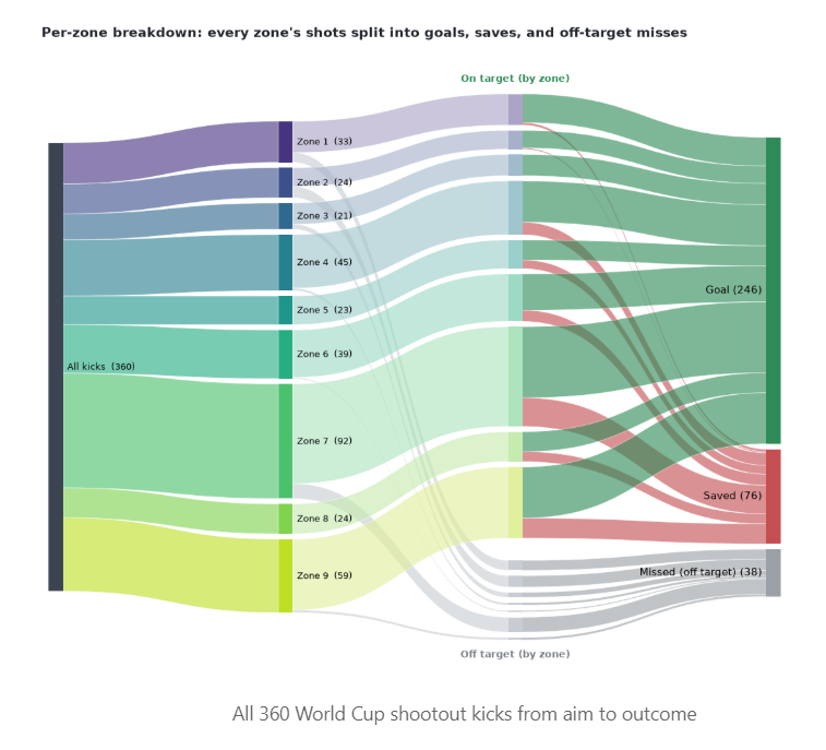
Instead, I thought a visual mapping the shots directly to the goal post would be a nice touch. (I did not include the 2026 data, since I would have had to add it manually, like the original author did.)
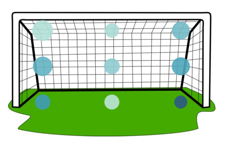
Here's how to create this Zone-Based/Spatial Heat Map:
Step 1: Save a Background Image of a Soccer Goal
First, you need a background image of a soccer goal to plot your points onto. You can find any simple, clean graphic of a soccer goal online and save it to your computer as a PNG, JPG, or JPEG.
Step 2: Create the X and Y Coordinates in Tableau
Because the original dataset I used only had a Zone number (1–9), I had to tell Tableau where to place each zone on a coordinate map.
Create two calculated fields in Tableau:
- [Zone X] - these will be the X-coordinates of the shots in the goal
CASE [Zone]
  WHEN 1 THEN 4
  WHEN 4 THEN 4
  WHEN 7 THEN 4
  WHEN 2 THEN 12
  WHEN 5 THEN 12
  WHEN 8 THEN 12
  WHEN 3 THEN 20
  WHEN 6 THEN 20
  WHEN 9 THEN 20
END
- [Zone Y] - these will be the Y-coordinates of the shots in the goal
Initially, I had set these to the values below, but found that for my specific image they placed the bottom row of marks in the grass, seemingly outside of the goal area. To account for the dimensions of my specific image, instead of shifting the image boundary coordinates, I shifted the values to the second snippet below.
CASE [Zone]
  WHEN 1 THEN 1.33
  WHEN 2 THEN 1.33
  WHEN 3 THEN 1.33
  WHEN 4 THEN 4.0
  WHEN 5 THEN 4.0
  WHEN 6 THEN 4.0
  WHEN 7 THEN 6.67
  WHEN 8 THEN 6.67
  WHEN 9 THEN 6.67
END
Shifted to fit into the goal:
CASE [Zone]
  WHEN 1 THEN 2.2
  WHEN 2 THEN 2.2
  WHEN 3 THEN 2.2
  WHEN 4 THEN 4.5
  WHEN 5 THEN 4.5
  WHEN 6 THEN 4.5
  WHEN 7 THEN 6.8
  WHEN 8 THEN 6.8
  WHEN 9 THEN 6.8
END
Step 3: Map the Background Image
- In Tableau, go to the top menu and select Map → Background Images → [Select your Data Source].
- Click Add Image.
- Browse to find the soccer goal image you saved in Step 1.
- Set the coordinate fields:
- X Field: Select [Zone X]
- Y Field: Select [Zone Y]
- Set the image boundary coordinates (assuming a standard 24×8 ft goal scale):
- X Field Left: 0
- X Field Right: 24
- Y Field Bottom: 0
- Y Field Top: 8
- Click OK and apply the changes.
- Make one last Calculated Field for Conversion Rate. Set it equal to SUM([Goal]) / COUNT([Game_id])
Step 4: Build the Shot Chart
- Drag [Zone X] to the Columns shelf. (Right-click it and change it to a Continuous Dimension).
- Drag [Zone Y] to the Rows shelf. (Right-click it and change it to a Continuous Dimension).
Your background image of the soccer goal should appear, with 9 plotted points matching the grid layout!
- Change the Marks Card type from Automatic to Circle.
- Drag your shot volume measure CNT(Game_id) to Size. You can drag the slider to the right to make the marks more meaningful.
- Drag your calculated Conversion Rate to Color.
- Adjust Colors: Click the Color card, choose Edit Colors, and select your desired palette. Optional: Go to Advanced, and set the Center of your scale to around 0.70 (representing the average penalty shootout conversion rate of ~70%).
- Format the Tooltips to display any desired data.
Step 5: Clean Up the Visuals
- Right-click the X-axis and Y-axis headers on your chart and uncheck Show Header to hide the number scales.
- Right-click the chart background, select Format, go to the Grid Lines and Zero Lines tabs, and set them to None to make your background goal image look clean and unobstructed.
Now you see the goal with mark size representing number of shots per zone and color representing completion rate. I didn't go too deep into formatting but feel free to! You've now successfully built a Zone-based/Spatial Heat Map.